The Advantage of Comparative Research

Brandon Dorn, Former Senior Product Designer
Article Categories:
Posted on
Comparative research is a reliable way of getting your bearings on any type of project.
No matter how new a problem may be to us, we are never the first person to tackle it. There are always examples to learn from. That said, the way we learn from others’ examples can make the difference between uncritical emulation and a solution that fits the unique problem and context we’re facing.
Here I’ll describe what comparative research is, why it’s worth your time, and give an example of how it helped us on a recent project.
Some Fundamentals of Comparative Research
Comparative research is a way to broaden our thinking about product functionality. It answers questions like, “How have others dealt with this kind of content complexity? What is a good way to conduct this kind of interaction? How are different use cases accounted for?” This type of research is particularly useful when trying to identify best practices that haven’t yet solidified into conventions–ones that aren’t likely to be documented anywhere but in products themselves.
When doing comparative research, we’re essentially critiquing others’ product design, reverse-engineering decisions that have been made when navigating tradeoffs and complexities similar to our own. It’s an investigative process that allows us to build on the wisdom (and errors) of designs that have come before us. We figure out what works and what doesn’t, and why, and borrow accordingly.
Relevant patterns often become the basis for a common design language shared between teams and clients, which is particularly significant early on in projects when trying to manage the ambiguity that characterizes early phases of product work. The example below will make this clearer.
An Example: Researching Email Editors
When designing and developing a new email editor for iContact, we confronted a number of design challenges that we hadn’t faced before, or at least not at the same scale and density required by the project. Let it be said that designing visual manipulation products is hard. One of the challenges is determining straightforward interface patterns for content selection and manipulation. What happens if a user hovers over this, and clicks this, or drags this? What if they want to resize this and then duplicate it and move it? We had notions for how features could be addressed, but knew we had to do our homework.
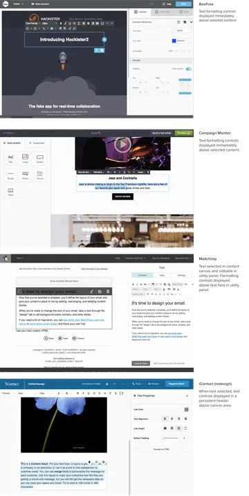
We began by looking at how visual email and website editors dealt with content manipulation. We studied our the design tools we use day-in and day-out. We held a magnifying glass up to Gmail (not really). In almost every instance, a primary editing canvas is flanked by one or more content manipulation panels. Manipulation of canvas content was handled differently in each tool, yet the variations were often subtle. We picked apart these subtleties. For example, Constant Contact’s editor allows users to edit and style text directly in the canvas, while Mailchimp’s editor displays a text field in a utility to the side of the canvas. Each approach has benefits and drawbacks: direct manipulation is to be preferred, yet that can complicate the interface with WYSIWYG styling controls. The pattern in this case was to allow direct manipulation where possible and show styling controls without cluttering the content being edited.
A more complicated problem to address was how to structure email content so that users would be able to easily determine how content is nested and how to create, arrange, and otherwise edit it. To do this, we compared the interface patterns and descriptive language used across a range of tools, and abstracted what we felt was the most straightforward structure that met the requirements of the product. What resulted was a taxonomy of layouts, rows, columns, and blocks, and rules for how they relate. In hindsight, this arrangement seems simple enough, yet it was a challenging process, laying the foundation for the features and variations we knew would have to be accounted for. We argued about and scrapped an additional layer or two that, while they may have added nuance, would have sacrificed usability.
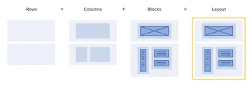
These basic terms – layout, row, column, block – became catchwords on the project, providing necessary distinctions that allowed us to move quickly. When a designer talked with a developer about row manipulation, both knew exactly what was being discussed and how the other components would be affected. When we eventually dealt with theme manipulation, we could talk about how theme attributes would cascade down to each element of the layout. These terms were reflected in the information architecture, visual design, front-end code, and the backend systems that translate the edited code into email-compliant HTML.
This language was essential to the project, and resulted from comparative research we conducted in the first weeks of our work. Instead of replicating the structure of the first product we came across, we weighed the pros and cons of various implementations to suss out an appropriate approach that balanced usability and feature-richness. What could’ve been seen as a questionably-productive phase of the project – from our own or our client’s perspective – proved to be crucial, especially given a tight timeline that didn’t afford us a chance to stumble around in the dark.
Further Considerations
Comparative research can inform projects at early stages, providing fodder and direction for initial design concepts, and in the midst of design iterations when refining content, interaction, and general architectural patterns. Some things to consider:
Comparative analyses can save time. Unless you have the time and budget to learn by trial and error or your own user research, learn from others’ experience. See what the most successful products are doing and try to figure out how they do it.
Focus on primary, complex workflows. Don’t conduct a comparative analysis on form design unless you’re designing a new EMR (which you should, if given the chance). Rely on established conventions where you can in order to devote time and attention to bigger, riskier aspects.
Gather examples widely. Study the work of obvious competitors, but also look outside of the immediate industry. Be inventive and broad-ranging as you collect examples in order to avoid provincial biases and assumptions that may be inherent to industry products. When documenting instances, consider using animated gifs to show interactivity to teammates and clients.
Consider user testing your competitors’ products. For the email product redesign, we started weekly user testing before we had a functioning prototype. Because we knew we’d be dealing with direct manipulation of content and features like drag-and-drop, which can be difficult to replicate in rough prototypes, we decided to use our competitor’s products in moderated usability tests. This gave us a sense for where people succeed – and where they get tripped up – when using industry-leading software.
Practice the habit of criticism. Design criticism ought to be something we do constantly and casually, reflecting on the products we interact with daily. Although we may treat it as a formal activity on projects, the perspective we bring (or don’t bring) to projects is formed by all that we do beforehand. Don’t forget to ask why. Not that you would. You’re a designer, after all.
Note: This article is a reflection on work done mostly by the astute and esteemed Curt Arledge.