The Virtuous Design Presentation Cycle
Brandon Dorn, Former Senior Product Designer
Article Categories:
Posted on
Good design presentation isn’t only important for gaining consensus about ideas; it also sharpens designers’ craft
Designers want their ideas to speak for themselves. As a designer, I know this. I’ve worked to design a straightforward, flexible navigation system that fits the content well, that corresponds to feedback heard during usability testing, that looks nice on a web page. The connections and justifications are clear, the client team is smart; surely I don’t have to explain it.
Sometimes design ideas speak loudly and clearly: the fittingness of a concept comes across without much description or defense on our part. But more often than not, they don’t, especially to non-designers, who are often the audience of design presentations, and especially when client teams need to convey ideas to others. In the same way that a mechanic notices signs of wear and build quality within a few seconds of glancing at an engine, designers who spend all day considering interaction patterns and layout configurations pick up on things that common website visitors don’t.
When presenting our ideas, we need to consider how to help others make informed judgments about the work. Even excellent ideas need to be explained: introduced, revealed, described, and discussed such that clients feel informed, not just impressed. Design presentations are a venue for making others feel smart.
I’m learning to appreciate the skill of design presentation because I’ve seen good ideas - others’ and my own - fall flat in presentations and fail to see the light of day. The way an idea is presented helps or hinders the way in which others assess it, which means that the we talk about our work can have just as much bearing on the progress of a project as the substance of the design itself. To be sure, a poor idea presented well is still a poor idea. But a good idea presented poorly can lead to unproductive feedback that sends a project down a dead-end road.
Designs need advocates, which means that presentation and persuasion are necessary abilities for designers to practice, nearly as important as the technical skills of our craft. And as it turns out, these aren’t isolated skills but are mutually reinforcing; as designers get better at talking about their work, our technique improves. We take part in a virtuous cycle of making, reflecting on, and articulating our designs.
Articulating Intuitions
Reading case studies on agency websites, one could be forgiven for thinking that the design process is orderly and predictable: audiences are understood, problems are defined, solutions are identified and developed. Even the most disciplined, routine-devoted designers will admit, however, that true design is a process of exploration. The end isn’t fully known from the start. We learn and adjust along the way. And because design is exploration, it is also an act of risk, because even the most rigorous research won’t tell you everything you need to know about an audience, and the most in-depth stakeholder interviews won’t reveal all of the factors of the problem at hand. Designers work with partial information, which means that they have to work by intuition.
Intuition is the foundation of design: not user research, not usability testing, not usage analytics. This is not to diminish the importance of these disciplines - or to ignore the fact that they require intuition themselves - but to acknowledge that their purpose is to guide and refine the intuition of a design. Ideas need to exist before they can be tested.
To work by intuition is to work by feel. I don’t know if this layout or navigation system or type choice is the best possible choice, but it feels right. It evokes what the Swiss typographer Jan Tschishold termed Fingerspitzengefühl: “fingertips feeling.” Its form is instinctually satisfying. Yet although that sense might be enough guidance for me to move forward with a design, saying “it has Fingerspitzengefühl!" probably won't help my cause with critical-minded teammates and clients. To figure out if designs are any good, they need to be described objectively, which means that we have to find reasons for what we feel – to reflect critically upon our work in order to move from feeling to knowledge. To put words to intuitions.
This is hard. Design language is slippery. Words like “minimal,” “intuitive,” “clean,” and “simple” are nearly meaningless in design contexts: in more than one round of user interviews I’ve heard the same website described as “minimal” and “cluttered.” It isn’t enough to say that a navigation system “just makes sense,” much as I might feel this to be true. If something is true, it can stand up to the critical inquiry required to uncover the reasons why it is true.
So we dig around for reasons. Maybe they come to mind while at work. Sometimes I’ll try a few ideas and the contrast between them will reveal logic that I wasn’t initially aware of. I’ve gotten into the habit of recording notes like these alongside artboards, to remember them later on when preparing to present:
Other times, we need the perspective of other designers: “Why does this option seem better than this one?” “Which looks better to you?” “Why?” We may have some sense that something is going well, or going wrong, but can’t figure out why while hunkered down in the weeds.
“Why,” of course, is the watchword. It’s how one moves from feelings to knowledge, from intuition to articulation. As we persistently ask “why” – of our own designs as well as others’ that we admire – we become familiar with the underpinnings of good design, and able to describe designs in meaningful language: namely, in terms of problems and solutions.
Analytical Presentation
Design presentations should support the audience’s ability to reason about a concept, which is to say that presentations are both explanatory and instructive. They certainly aren’t about “getting a reaction.” They’re about helping others think through design problems and solutions, and ought to be framed in those terms. I like the questions that I recently heard Tom Greever say every designer should address (or be prepared to address) when sharing their work:
What problem does this design solve? What is its intention? What goals does it address, and how does it address them? Why is it successful in doing so? The design needs a clear reason for existence.
How does this design affect its user? What role does the design play in the context of the product? How will it be understood? What impression will it make? It isn’t enough for a design to solve a problem: it has to be considered in context.
Why is this design better than the alternative? What are the other ways the problem could be solved, and why is this way the best? Anticipating stakeholders’ suggestions and exploring the comparative benefits of different approaches prevents the decision-making process from drifting into hypotheticals.
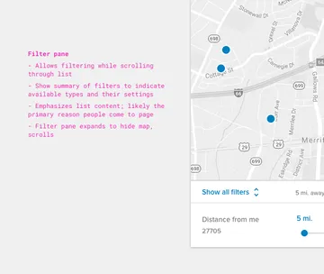
These questions resemble the design process itself: designers begin by identifying a problem and exploring potential solutions, then considering alternatives by weighing implications for the intended audience. The presentation of a design reflects the act of designing. If design is about problems and solutions, design presentations should follow suit. As Adam Connor and Aaron Irizarry argue in Discussing Design, conversations about design are essentially conversations about the efficacy of the work when weighed against established objectives. Here’s my notebook page-sized interpretation of some of their thoughts (PDF):
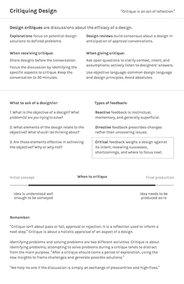
The authors argue that goal of design presentation isn’t to avoid criticism, but to solicit helpful criticism from teammates and clients. If a designer finishes a presentation and hasn’t received input, however minimal, that would meaningfully influence the design, chances are he missed an opportunity make a better thing.
The way designers present their ideas matters not merely for selling their ideas, but for making better designs. A good idea presented well not only makes the case for itself but solicits the best feedback its audience can provide. None of us has enough knowledge or perspective to solve the problems we daily work on: we need considerations from as many relevant perspectives as we can bring to bear.
Recommended Reads
In order to present well, we need to reflect critically on what they’re making – to understand and communicate the conceptual and visual logic of our designs, first to themselves, then to others. It’s not enough to be a good designer; we have to be good design communicators. And as we discuss design decisions coherently, we come to think more clearly about our work. Our language becomes sharper, our empathy expands. We don’t just defend our ideas, we work to make the best idea.
Here are some books that have helped sharpen my presentation language and approach:
Communicating Design, by Dan Brown. One of the best books I’ve come across on the details of design presentation. Brown is admirably comprehensive in his coverage of principles and techniques for presenting all types of digital design projects.
Universal Principles of Design by William Lidwell et al. While Universal Principles isn’t about design presentation in particular, it provides vital language for designers to use when describing their work. Any designer reading this book for the first time will likely have, like I did, at least 3 “wait, there’s a term for that!” moments.
Discussing Design by Adam Connor and Aaron Irizzari. Design critique is hard. Most of us stumble through them, picking up bumps and bruises along the way. But they don’t have to be painful. Connor and Irizzari give pertinent advice about how to lead productive critiques with teams and clients that move designs forward, avoiding the pitfalls along the way.
Visual Explanations by Edward Tufte. Tufte is mostly known for his data visualization principles and trove of examples, yet in Visual Explanations he shows how good presentations are founded on similar concepts. The principles in chapter 3 are particularly useful, for example:
Near the beginning of your presentation, tell the audience
- What the problem is
- Why the problem is important
- What the solution to the problem is.
“Design Reviews: Going Beyond the Surface” by Bethany Fong. Fong lists the questions designers should be asking during design reviews for common stages of design projects (“early conceptual work, mid-stage mock and prototype creation, and late-stage build”). I appreciate her litmus test for good application design: “A great app will have a strong solution. The product’s unique value proposition should be obvious at first inspection, and the design should guide the user easily, both adhering to and deviating from platform and UI conventions with purpose.”
Design presentation is difficult, because it requires designers to think in terms that don't come naturally. Yet by learning to articulate the reasons for our ideas, we come to think more clearly about them. Not only do we discuss them well with others – inviting non-designers into the conversation and building a more objective vocabulary – we're able to detect the intuitive assumptions we're making in our work that don't stand up to scrutiny, doing more thoughtful, well-considered work. Our designs progress as we give voice to our fingertip-feeling, helping others feel it for themselves.