Do Responsive Sites Have to Be so Tall on Mobile?

Height is often overlooked in responsive design. On mobile, pages can get pretty long. Should we address this?
When designing responsive sites, we tend to focus a lot on keeping content nicely formatted within all the various screen widths in the world today. This makes sense given that horizontal scrolling is not particularly user-friendly, so constraining the design to the browser's viewport width is generally a given.
On smaller screens, stacking things into a single column is the go-to move and often, as long as the content stays within the proper width, further thought isn't given to the height of the page. As a result, I've noticed that in my own designs and many out in the wild, mobile page lengths tend to be quite long. This post is a suggestion to at least keep the height of the browser's viewport in mind as you're designing responsive sites.
Let’s look at an example
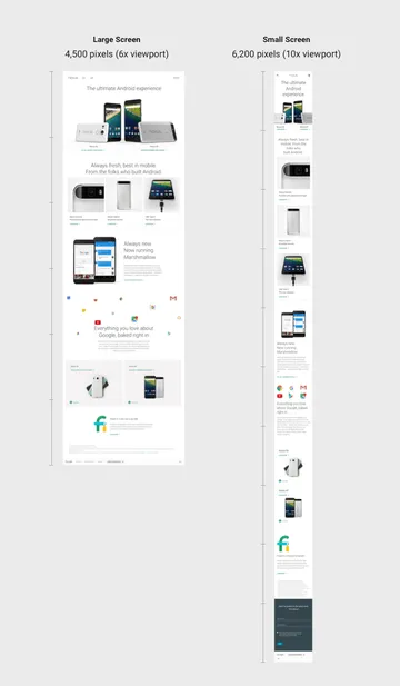
Google’s Nexus landing page is a pretty typical modern, marketing page. It has a nice, clean design and it’s responsive. You can pull it up on any size screen and it’ll format nicely within the screen's width.

But if you pull it up on your phone, you may notice that it takes quite a bit of scrolling to get through the whole page. On my macbook, the page was about 4,500 pixels tall - which is about 6 times the viewable height of the browser window. By comparison, on my phone the page was about 6,200 pixels tall - or roughly 10 times it’s viewable height. This is not inherently bad; there’s no design law that states you have to make websites consistently tall across different size devices, but I think it’s an interesting observation to dig deeper into.

So what’s the problem?
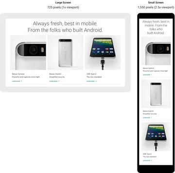
Again, I don’t believe that the overall page length itself is inherently problematic. I have noticed though that in many responsive designs, purposeful groupings of content are easy to spot on larger screens, but get muddled when things start to stack on mobile screens. For example, on the Nexus page, the second section groups three hardware features together. On a large-enough screen, you see these three blocks side-by-side and the section often ends up being exactly the height of the browser’s viewable area. On mobile however, you end up only seeing one of the blocks at a time. As you scroll through the page, it’s not obvious that these 3 things were intended to be grouped together - not the end of the world, but not optimal either.

Is there an alternative?
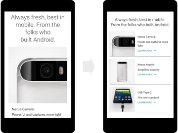
Recently, I’ve been using the height of a devices viewport as a rough guide to help determine how I should lay out content. The intent is to solve the problem I mentioned above where content that is intended to be grouped together can be reasonably viewed at the same time on any device. In the Nexus example, an alternative to their original design might look something like this.

By drastically shrinking the size of the section heading and the thumbnail photos, we are able to fit all the same content from that section into a single viewport. This change by itself might only be a small incremental improvement, but in aggregate I’ve found that following this general guideline leads to layouts that are easier to follow as you scroll through the page on mobile devices.
Stepping back a bit...
There’s nothing special about the design I just showed you. It’s only one of many possible layouts that would have achieved the same goal - keeping the content in a particular section grouped together more obviously. If you decide to use viewport height as a guide for your mobile layouts, you should explore all the different ways you can position content. Depending on the context of your design and the nature of the content, different layouts may work better.

