Bolster Your Editorial Content with Data: Four Approaches

Mitch Daniels, Former Senior Digital Analyst
Article Categories:
Posted on
Newsrooms and brands are continually shifting toward data-driven content as a means of telling compelling stories that inform users, drive engagement, and inspire action.
In recent year, journalism outlets have further embraced data as a primary means of editorial storytelling. Mainstays such as the New York Times, the Washington Post and the Wall Street Journal have built dedicated teams specializing in quantitative data analysis and visualization in service of telling compelling news stories. At the same time, newer outlets such as FiveThirtyEight and Vox tout their data-forward journalism.
This approach to journalism isn’t new. All good journalism uses data, typically qualitative, to inform and inspire. However, modern tools and computing power allow editorial teams to access, analyze and share large quantitative datasets with a speed and efficiency previously impossible.
Data-forward storytelling isn’t a replacement for good journalism. Instead, it’s one part of a toolset that can augment a story by providing meaningful context and opportunities for further audience engagement. There are a few specific ways it can provide unique value:
Provide Context
Quantitative data can help reveal how a story fits into the larger picture. Hearing that a federal department’s budget will grow or shrink by $5B means little without understanding that department’s history and current budget. This story by the The Washington Post uses sparklines and simple charts to illustrate the scale of each federal department and the impact of proposed budget changes.
Make the story personal
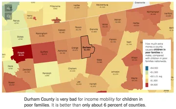
Granular datasets can make even large-scale stories feel deeply personal. In 2015, NYT’s The Upshot published ‘The Best and Worst Places to Grow Up: How Your Area Compares’. The story describes significant disparities in income mobility across America but allows users to totally customize the visuals, tables and article content to place their own county at the center of the story. This approach grants the entire story an immediacy that would otherwise be difficult to achieve.
Similarly, FlowingData’s provocative ‘How You Will Die’ story allows users to input their own personal demographic data to better understand CDC Underlying Cause of Death data. This option makes the underlying trends and data feel deeply (terrifyingly?) personal.
Demonstrate the scale of a story
Humans are wired to be inherently visual. Simply reading a number or statistics may have little impact, but visualizing the scale of that data can impart a much deeper impact. Viget applied this principle in our work to celebrate Lebron James’ entry into the top 10 NBA scorers of all time. By navigating through every one of Lebron’s points pixel-by-pixel, readers get a tactile sense of just how historic his career has been to date, as well as how far he has yet to go to surpass the all-time number 1, Kareem Abdul-Jabbar.
Facilitate audience engagement
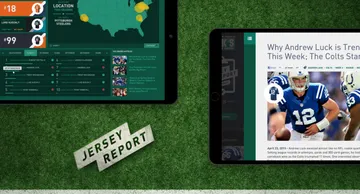
Data visualization on the web can lend interactivity to a story that is otherwise impossible. Even brands can benefit from this approach to storytelling by allowing users to engage directly with stories and datasets. Viget worked with Dick’s Sporting Goods to build The Jersey Report, a campaign that used player jersey sales data to find brag-worthy stories about player and team performance.
Others have built experiences that create a positive feedback loop, requiring engagement from users to generate data, then reporting back on that data to tell a meaningful story. FiveThirtyEight’s reporting on trade wars did just that, prompting users to experiment with trade strategies, then using their usage data to further illuminate human preferences.
Conclusion
Newsrooms and brands are continually shifting toward data-driven content as a means of telling compelling stories that inform users, drive engagement, and inspire action. The examples above are representative of just a few ways that data can make stories more relatable, more meaningful and more compelling. Please share your own favorite examples in the comments below or consider getting in touch if you’d like to work with us to tell data-driven stories in the future!