The Case for Data Visualization

Mitch Daniels, Former Senior Digital Analyst
Article Categories:
Posted on
Visualizations expose the shape and scale of data so that we can understand and act with confidence.
Effective communication is the cornerstone of successful client relationships and is a critical component in driving positive change. The greatest idea in the world will languish if its champion fails to evangelize in a clear and compelling way.
On the Viget Data and Analytics team, we constantly share insights with others via written and oral reports. Whether we’re arguing for changes to UI, more efficient media buys, or improvements to site content, our goal is to leverage data to inform and inspire action.
While our team loves the smell of a cleanly-formatted CSV, our clients are often...less enthused with that raw data. They recognize its value, but staring at tables can make their eyes glaze over.
We’re certainly not the first people to encounter this challenge. Willard C. Brinton, a statistician and engineer, faced the same hurdle more than 100 years ago. He established the conflict in the introduction to his 1914 book “Graphic Methods for Presenting Facts”:
“Though accurate data and real facts are valuable, when it comes to getting results the manner of presentation is ordinarily more important than the facts themselves. The foundation of an edifice is of vast importance. Still, it is not the foundation but the structure built upon the foundation which gives the result for which the whole work was planned. As the cathedral is to its foundation so is an effective presentation of facts to the data.”

Given this fact, it’s our responsibility as analysts to present data in a clear, accurate and compelling way that will ultimately get results.
A Path Forward
The human brain is very bad at gleaning insights directly from raw numbers, even after they’ve been cleaned, massaged and summarized. Instead, our brains have evolved to quickly detect trends and anomalies based on distinct visual cues. These cues, called “preattentive attributes”, allow us to spot things like trends, outliers and shapes with almost no conscious effort.
In his fantastic book, “Show Me the Numbers: Designing Tables and Graphs to Enlighten”, data visualization practitioner Stephen Few offers an exercise to demonstrate the power of preattentive attributes. Give it a shot:
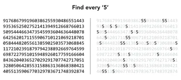
In this instance, the use of the color intensity attribute on the right-hand side allows each ‘5’ to stand out visually and reduces the level of dedicated focus required to complete the task.
Color is just one of many preattentive attributes that also include:
- Length
- Width
- Orientation
- Shape
- Size
- Enclosure
- Hue
- Intensity
- Position
We can share data and insights more effectively by leveraging these various attributes alone or in combination.
The Shape of Things to Come
A similar example, created by statistician Francis Anscombe, provides a more practical demonstration of these attributes in action. The data below contains four X-Y pairs.
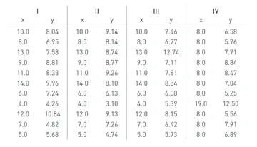
Basic summary statistics across each set suggest they are largely similar:
- Mean of x in each case = 9
- Sample variance of x in each case = 11
- Mean of y in each case = ~7.50
- Sample variance of y in each case = ~4.12
- Correlation between x and y in each case = ~0.816
- Linear regression line in each case is y = 3.00 + 0.500x
However, if we encode this data visually by using a scatterplot, our innate preattentive processing kicks in to discern the unique characteristics of each set.
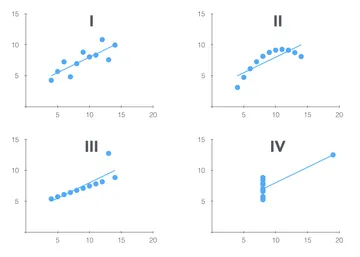
This powerful example further demonstrates how visuals can surface unique insights about the shapes and relationships in our data that might otherwise remain completely hidden, answering questions such as:
- Are there ongoing trends? If so, in which direction?
- Is our data consistent or highly variable? Are there patterns of variation (e.g., seasonality)?
- How is our data clustered? Are there outliers?
An Issue of Scale
Just as visuals can help us to see the shape of our data, they can help us to better comprehend the scale of our data. People generally have trouble wrapping their heads around the size of numbers outside the scale of day-to-day existence.
- How big is...5? Well I have five fingers, so that’s easy.
- 12? I’m just imagining a box of donuts. Yum.
- 30? That’s about the number of people who work at Viget HQ.
- 66,233? How convenient! That’s exactly how many people can fit into Virginia Tech’s Lane Stadium.
- 600,000? That’s...like...nine Lane Stadiums. My brain is starting to stretch at this point.
Notice that, in each case, I’m still reverting to an inherently visual representation of the number to understand it. Given that tendency, and our inherent inability to comprehend very large (or very small) numbers, it only makes sense that visuals can provide a more relatable and actionable view of the scale of our data.
A few recent examples that demonstrate this particularly well:
- 1 to 1,000,000 by Tim Urban of ‘Wait but Why’
- One in 292 Million by Ana Baker at The Wall Street Journal
- The Scale of the Search for Flight MH370 by Richard Johnson and Denise Lu at The Washington Post
These types of visuals can create a lasting impact because they help the reader better comprehend the true scale of data that is otherwise completely abstract.
So…
Here at Viget, my job is to inform and inspire action through the clear and accurate interpretation and analysis of data. While much of my time is spent performing that analysis, it’s in sharing results with others where decisions are ultimately made. Data visualizations are a powerful tool that help us better understand the shape and scale of data, so that we can ultimately make informed decisions and take action with confidence.
Please share your thoughts in the comments and post other examples of powerful visualizations you’ve found or created!