Angled Edges with CSS Masks and Transforms
Jeremy Frank, Former UI Development Director
Article Categories:
Posted on
Easily add angled edges to elements with CSS Masks and Transforms.
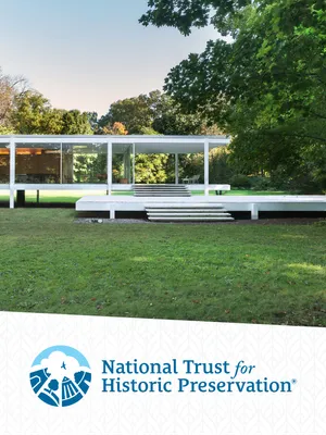
Elements with angled horizontal edges can create a unique visual flow while progressing through a page. Though not commonly seen on the web, we decided to use the treatment on the new website for The National Trust for Historic Preservation. We applied angled edges to several elements in different ways: some were applied to the bottom edge of a large full width images, while others were applied to the top and/or bottom edge of blocks with solid color backgrounds.


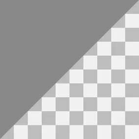
CSS transforms are commonly used to achieve angled edges by skewing a parent element and then unskewing a child element, but this technique is limited to parallel edges. What if you need to apply the effect in different ways – only to one edge, to both top and bottom edges but with reversed angles, or to an image element? Fortunately, there are a few other options.
SavingPlaces.org
View our workCSS clip-path
The first, and easiest option, is to use CSS clip-path. We chose to use this technique on large hero images.
.hero-image__figure img {
  -webkit-clip-path: polygon(0 0, 100% 0, 100% 96%, 0 100%);
  clip-path: polygon(0 0, 100% 0, 100% 96%, 0 100%);
}
This assigns a clipping region to the image and essentially hides the bottom edge at a slight angle.
We also used CSS clip-path on blocks with background images. Unlike the hero image above, the height of this block is variable across breakpoints. In order to maintain the correct angle (not too steep) across viewports, pixel values had to be used for any x coordinates.
.promo {
  -webkit-clip-path: polygon(0 0, 1600px 0, 1600px 87%, 0 100%);
  clip-path: polygon(0 0, 1600px 0, 1600px 87%, 0 100%);
}
In the example above, 1600px represents the maximum possible width of the element.
The only downside to CSS based clip-paths is browser support. As of this writing, they’re only supported in Webkit. Firefox supports them, but only when using url.
CSS Generated Content
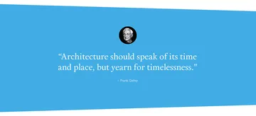
The second option is to use skewed generated content. This technique works great on blocks with solid color backgrounds.
.quote {
  background: #41ade5;
  color: #fff;
  position: relative;
  z-index: 1;
}
.quote:after {
  background: inherit;
  bottom: 0;
  content: '';
  display: block;
  height: 50%;
  left: 0;
  position: absolute;
  right: 0;
  transform: skewY(-1.5deg);
  transform-origin: 100%;
  z-index: -1;
}
This adds a pseudo element at the bottom of the block, changes its point of rotation to the bottom right corner, and rotates it -1.5 degrees, simulating the effect of an angled edge.
To implement another angled edge on the top of the element, it’s as easy as adding another pseudo element with :before, changing its point of rotation to the top right corner, and rotating it 1.5 degrees.
This technique has great browser support, and because of the background: inherit declaration, it works very well with inline background colors (think admin assigned colors).
Angled Edge SASS Mixin
For more flexibility, we created a clever SASS mixin that allowed us to add angled edges to the top or bottom or both edges of a block, as well as reversing the rotation points.
.block {
  background: #41ade5;
  @include angle(after);
}And there you have it! Easy generated content angled edges with a simple but powerful SASS mixin. If you found this helpful or have another technique for skewing edges, let me know in the comments below.