My Typography Talk: Typography is the Foundation of Good Web Design
Samantha Warren, Former Viget
Article Category:
Posted on
The web can be a daunting typographic place for both designers and developers. Current limitations with web typography can frustrate designers who are accustomed to a wide range of typographic options, while many front-end developers find themselves facing a struggle when refining the details of type to be more legible during build-out. The web is a perfect example of designing under constraints, and while we are on the way to a web with less limitations, there are plenty of small things a designer can do to enhance typography now.
After writing several conceptual blog posts and giving similar presentations, I took foks' feedback and decided to put together a talk that demonstrated many of the vague concepts of web typography through step-by step examples.
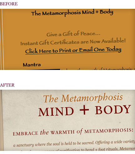
To best illustrate my points, I chose a website that was in sore need of a "typographic" makeover. Knowing I needed to choose a site that was indisputably in need, I scanned my memory and recalled one I came across last year while shopping for a Christmas gift for my sister. With the body-copy typeset in papyrus, this particular website offered a unique service of a printable spa gift certificate, (which was exactly what I needed being that we live in different locations). But FINDING that printable gift certificate was difficult because of the site's illegible copy and undefined hierarchy.
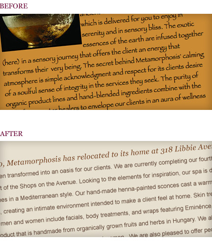
In order to demonstrate the power of typography, I decided to redesign the site only using typography. Below are three excerpts from the redesign that demonstrate my three "pillars of web typography:" legibility, hierarchy, and expression.
Legibility:
Content is why users are on your site; they're seeking information, and they get no value from copy they can't read.

Hierarchy:
The web is interactive. Users engages with the type in order to navigate throughout the site. The order of importance defined throughout the type will allow for a clear path and solid user experience.
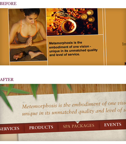
Expression:
Words can only convey so much, so displaying the type in a unique manner will help communicate a feeling and emotion. This is what separates boring information from an experience. In this case, you dont need an "organic" typeface to express the mood of the spa; you can use elements such as depth and texture to enhance the type. Typography is more than what font you choose.
I had the pleasure of giving this talk at Refresh Baltimore, Refresh Pittsburgh, and Mr. Brown’s Web Class at Damascus High School, where I met lots of people enthusiastic about typography. I am grateful for each opportunity and learned a lot in the process.
If you would like to download the entire presentation or read more about it, you can check out on my personal blog.
To see the results of the redesign in its entirety see the before here and the after here.