How To: Make the Viget Inspire Background

Doug Avery, Former Senior Developer
Article Category:
Posted on
Building the nature-based Viget Inspire background in Photoshop, using stock photos and textures.
A few of you have been asking, so here it is: An overview of how we put the Viget Inspire background together. The driving philosophy behind real-texture stuff like this is to fake as little as possible. No matter how many brushes you have or how good you are in Illustrator, there's a quality of unpredictability in real photographs and real, physical elements that adds great subtle qualities to any design.
After coming up with the concept of the sunrise/hikers, the next step was to find two real images to craft it from. We needed a real skyline with a row of trees, and a real bed of watercolor effects with the kind of subtle variations watercolors do best. The two lucky candidates were found on iStock.
The first step was to divide that beautiful photo up into three distinct, flat blocks that we can manipulate further. The sky was easy (just chop around the mountains), but the trees a little more difficulty. Fortunately, with a collage like this, being hyper-detailed isn't too important...a rough cut-out of the trees on the left side and some guesswork on the right were good enough.
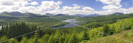 Our victim.
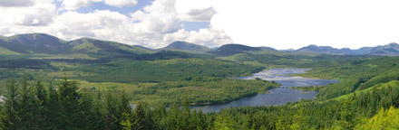 Let's lose the sky completely.
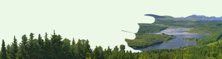 Separate the image into two layers: One with mountains+trees and one with just the foreground trees. (Mountain layer hidden in this image)
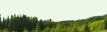 Now we have three layers: Green background, Mountains, and Trees.(Mountain layer hidden in this image)
Adding the textures
Now, to fit the watercolor image we downloaded into the layers we've cut out. After adding the image, two more layers were stacked:
- A color layer with a few similar hues painted in with various grunge brushes. Switching brushes frequently keeps the texture nice and random.
- A Levels layer, for pumping up the resulting images (they were a little light)
 Alt-click the space between the two layers to easily mask one into the other.
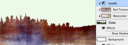 Add a layer of reds, maroons, and a little purple using brushes. Set the layer to "Multiply."
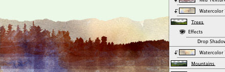 Drop the watercolor texture into the Mountains layer, too. You can move it a little or flip it so the colors don't line up from layer to layer.
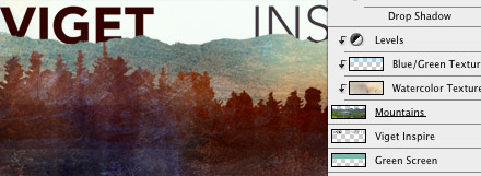
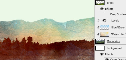 Adding a "Multiply" layer of subtle blue and green gives the mountains some depth.
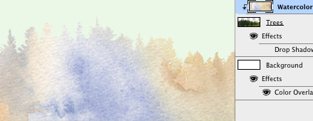
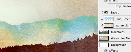 Drop the watercolor texture over the background and multiply it We're getting a lot of mileage out of this image!
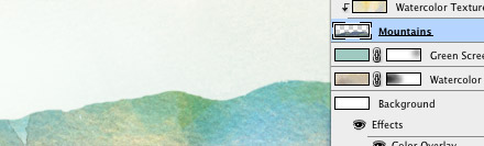 Since the sky needs to be lighter, add a layer of blue-green above it and set it to "Screen." Mask out a spot or two, so the watercolor texture comes through a little stronger in some spots.
Still a little flat
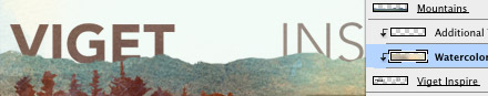
What we have now looks nice, but it stills seemed a flat. We wanted to bring in more detail, but not random paint stuff...the idea was to bring back in some real nature textures, and let the randomness add some visual detail. This was accomplished by creating new, grayscale versions of the original images over the work we've done, and "Multiplying" it.
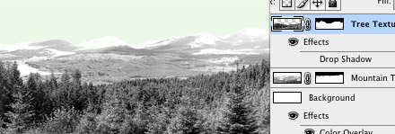 Copy the original tree and mountain layer. Desaturate them, and boost the levels so there's a higher contrast.
 Set both layers to "Multiply" and add some masks. Now, it's time to take out the details that just muddy the design (the sea of blank trees in the middle) by painting over them in the mask a little. This creates a nice flow of details throughout the image, where some pieces stand out more and other seem to fade back.
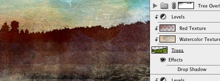 You can see how the details barely show in most of the image, but really come out in the bottom right.
Almost there...
Finally, time to add the name and logo. Two more uses for the watercolor texture: One inside the type itself, and a second use in the Inspire orb.
 The text fits nicely behind the mountains.
 The watercolor, set to 50%, washes out the logo a little.
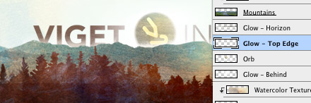 Add the orb (which took a few more layer that aren't included here) and give it a few white glows. One on the top edge to give it a nice sunrise effect, one behind the mountains to wash out the logo a little more, and one behind the orb to add a radiance that covers some of the letters a little.
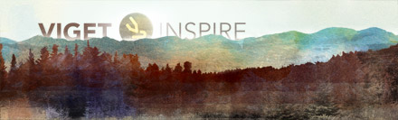 Taaaaaa-daaaaaaaaaaaaaaa.
Just like that?
Of course, the actual process was nowhere near this simple, and involved huge stacks of layers, several versions, many Diet Mountain Dews, and the near-constant second-guessing that makes design such a hazardous profession. While the end result has a pretty simple construction, the process that got us there took sketching, experimentation, and the feedback of the whole design team to get it all across the finish line.
What did I miss?
I know I skipped over a few details here and there, but was if you have any specific questions about achieving the effect,s let me know in the comments! I've had a couple requests for tutorials on making the Viget Inspire portraits, but that'll have to wait for another week.