Can a Website Design Be Inspired by a Chair? This One Was
Samantha Warren, Former Viget
Article Category:
Posted on
Inspiration can find a designer in many unique and wonderful ways. Often, web designers go out seeking inspiration, browsing galleries online and looking at other websites, but in the case of a site redesign for Choice Hotels Scandinavia, I found my inspiration in a chair.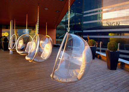
Choice Hotels Scandinavia is a major brand in the Nordic market, operating more than 160 hotels throughout Sweden, Norway, Denmark and the rest of the region. For their new site, they wanted an interpretation of the Scandinavian design and style that is so prevalent in the architecture and interior design of their hotels. When I approached this design, there were many exciting challenges I needed to consider. The site's layout had to be both flexible enough to accommodate multiple languages and functional enough to accommodate maintainance and frequent visual updates by the client and their design team. Numerous seasonal promotions, events, and incentives are a core part of this client's content strategy, so I had to plan for a scalable but interesting structure. The perfect content-focused design would help the client communicate to their audience while still complementing the personality of their strong design-centric brand.

I probably don't need to go much further before you realize the level of stoke I had on this project. Scandinavian design is known for being minimal, modern, functional, and goal-oriented which falls in line with many of my own web design values. Not familiar with Scandinavian design? Think Ikea. Practical and functional at a value. If you are interested in more great examples, Jim wrote a previous post on Swedish design inspiration.
Keeping in mind the client's goals, I began to do research on both Scandinavian design and Choice Hotels properties in the region. Through my research, I found the Clarion Sign, a magnificent Stockholm hotel that embodies all the characteristics of wonderful Scandinavian design. On their unique rooftop terrace, for example, there are a series of hanging "Bubble Chairs" which immediately caught my eye. I knew then that I had found my inspiration.

The Bubble chair was designed in 1968 by Eero Aarnio, a Finnish interior designer who is also well known for designing the "Ball Chair".
"After I had made the Ball Chair I wanted to have the light inside it and so I had the idea of a transparent ball where light comes from all directions. The only suitable material is acrylic which is heated and blown into shape like a soap bubble."
I have never sat in a bubble chair, so I evaluated the reasons an interior designer might leverage it as a key component in a space. HGTV recently featured a short piece on the Venice Beach house of Thomas Ennis, which is made completely of glass and steel. Ennis' house revolves around the notion that the bridge between the outdoors and indoors should be nearly seamless, and includes an enormous glass panel that rolls down like a car window. The house's personality reflects changing weather, and it was because of this versatility that Thomas Ennis chose the understated Eero Aarnio bubble chair to complement the overall design. I tried to apply that same reasoning to decisions I made within the Choice Scandinavia redesign.

I wanted to create a website design that embodied many of the same principles of design as the Eero Aarnio bubble chair, both in form and function. I also knew I needed to keep a few brand constraints in mind to coordinate with the client's current print collateral. While sticking to the strict color pallete required by the brand, I explored shades of colors that dissipated into white, giving the site a light airy feel that complements the rich photography. Subtle shadows and color gradations mimic the delicate silhouette of the transparent bubble chair. Inspired by this photo and photo set of the Sign's deck, I suggested a burst of white light tot higlight the rotating carousel, subtley referencing diffused rays of sunlight peeking through the plastic.
And just as the bubble chair has a clear function, so does a hotel website: to allow users to book rooms. Working with our UX team, I drew emphasis to this core functionality through bolder colors, layout, and depth that promote user interaction.

Through this exercise, I learned that a website design can be deeply inspired by something as simple as a chair. Form follows function, and while the functional goal of a website may be different than that of other design mediums, conceptual and visual inspiration can creatively be taken from anywhere. Architecture, landscape design, industrial design, fashion, crafts and art can all influence online expereinces. Do you have any interesting places where you have found inspiration? Please share!