39 Ridiculous Things To Do With CSS3 Box Shadows
Doug Avery, Former Senior Developer
Article Category:
Posted on
Box-shadow is a pretty powerful property in modern browsers. With just six little values, you can make some really neat stuff. How much neat stuff, you ask? To find out, I set a little time aside each day to play with it. The result is 39 ridiculous little experiments that, due to whatever issues, can only be viewed in Chrome 11 or better.
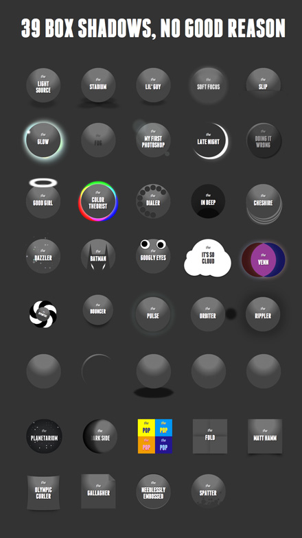
39 Box Shadow Experiments (Chrome only!)
You can navigate with the arrow keys, and I’ve moved the CSS for each object into the object HTML, which should make it easier to look at particular effects. A little about what's going on here:
The Basics
Box-shadow has six properties: inset, left, top, blur, size, and color. Most should be familiar, but there might be a few new ones for some users: Size shrinks or grows a shadow, while inset allows you to wrap the inside of an element with a shadow (but careful — it can slow down draw time significantly).
Some Friends
Aside from box shadow, I leaned a lot on a few other properties:
- :after and :before — As Trevor pointed out, these can be useful for adding effects without putting more markup in.
- transition — Easy tweening between a few states.
- webkit-keyframes — Set up precise, repeating animations with webkit keyframes. (See Jason’s real-world example)
- text-shadow — box-shadow’s dumb little brother, but it can still be used for a lot of interesting things.
- background-image: gradient — Not always fun to work with, but really powerful.
Multiple Values
It's easy to apply multiple box-shadows and text-shadows to elements, which is where a lot of these effects came from. Remember that the first value you apply appears on top, and further layers are stacked underneath. You can use this to create some tricky effects, like on “Pop”, or just layer them like crazy (“Planetarium”).
Cutoff Point
Shadows stop at the element edge, even if the element has a transparent background. You can use this to make a few interesting visuals, such as the semi-circle in the “Venn” example.
Credit
Two of these effects are stolen directly (and tweaked) from Nicolas Gallagher and Matt Hamm, who get huge props for exploring these techniques early on.
Why Only Chrome?
Honestly, it was an effort-to-value thing. Getting 39 demos to work nicely in Chrome was a good chunk of work, and it accomplished all of my goals, which were A: make cool stuff and B: let web people see it. Fiddling with Safari and FF (FF didn’t even have non-beta CSS transitions when I started) would have taken more time, required that I cut some effects entirely, and generally tipped the work-to-value ratio solidly in the wrong direction. With little projects like this, it’s okay to leave out some details in the greater service of Having The Most Fun.
Thoughts?
If you have any questions about particular effects, or box-shadow in general, let me know in the comments.