Welcome to Wondrium

Ally Fouts, Former Creative Director,
Elyse Kamibayashi, Former Senior Brand Strategist, and
Elliott Muñoz, Former Art Director
Article Categories:
Posted on
What happens when a pioneer provider of nonfiction content asks you to reimagine their brand for the streaming age?
Wondrium is an online streaming service that features high-quality, in-depth educational content on everything from the secret life of American plumbing to the mummified cats of the Ancient Egyptians. It’s the place where people go when they want to challenge and expand their minds through mind-blowing moments.
The Challenge
The team behind the service invited us to embark on a complete rebrand of the platform, including a new name, logo, tagline, voice, design aesthetic, and foundational brand strategy.
The Backstory
Nonfiction in the time of streaming. Wondrium is a direct descendant of The Great Courses (TGC), which began in the early 90s by selling VHS tapes of university-grade lectures to insatiable lifelong learners. TGC steadily expanded its course options and delivery methods, transitioning from VHS tapes, to DVDs, and eventually making its courses available via an online platform called The Great Courses Plus.
However, with the growing adoption of online content streaming, it was becoming increasingly difficult to find a comfortable market position amidst the Massive Online Open Courses (MOOCs), platforms like Skillshare and Coursera, and the 800 pound couch in the room: Netflix.
TGC recognized that online consumption was the future of their business, but felt like they were falling behind in the streaming race as sleek new startups — and even universities themselves — began ruthlessly jockeying for prime eyeball position.
Rebranding The Great Courses Plus as a standalone flagship platform would be the key to defending their position as a premier content provider, and would help them double down on their ultimate streaming future.
The Brand Strategy
Keeping it curious. A lot of streaming content exists primarily to help people “check out”. Binge-watching is an escape — a way to power down your mind after a long and stressful day.
But people love Wondrium content specifically because it turns their minds on, not off. The courses are smart, exhaustive — in some cases dabbling in pure nerdery — and always riddled with fascinating information.
A Wondrium subscriber is someone who loves to learn, and to connect with that audience, the Wondrium branding needed to authentically and believably celebrate “that thing” about learning that people truly love.
The New Branding
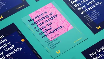
Mind=Blown. Most brands use their voice to communicate an idea or personality. Wondrium's branding was designed to communicate a feeling — specifically, that feeling you get when you encounter a new idea.
It’s what we call a “mind=blown” moment. That moment when you find out that breaking fingers used to be an ancient Olympic sport, or that fern spores have complex, drama-ridden social lives. It’s that thing that happens when you learn something new and a small part of your brain reverberates with joy, then promptly asks for seconds.
The Wondrium brand exists to remind people exactly what that moment feels like.
Exuberant, a little awkward, joyful, and always intellectual, Wondrium’s branding looks and feels suspiciously like one of its most ardent subscribers. It’s here to encourage people to embrace their inner nerd, whatever that slightly sweaty bear-hug might look like.
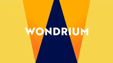
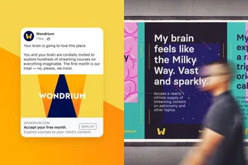
Our name says it all. Changing the name to “Wondrium” allowed the brand to better demonstrate what subscribers really get out of the service: access to a place that is full of ideas and wonder. The inviting “pathway” logo beckons you into a world of discovery that is bedecked with bold illustrations and a robust color palette. A typeface that flexes from sophisticated to mind-blown is the perfect medium for a voice that is the quintessential eccentric intellectual.

A door, a pathway, a W.
A promise.
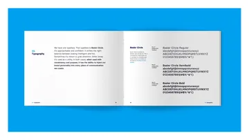
The always intelligent, and occasionally intense, Basier Circle.

Standing out whilst also fitting in.
Wonderfully weird.
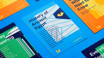
A style that supports everything from cat mummies to water towers.
Wondrium University
Higher education. The Wondrium brand is a huge departure — in style, tone, and messaging — from anything the TGC team had done before.
So to prepare for the rebrand rollout, the team enrolled in Wondrium University — a month-long series of workshops that focused on everything from writing headlines to mapping out a successful relaunch plan.
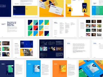
As a complement to Wondrium U, the new brand guidelines were also developed as more of an interactive how-to manual than a static documentation booklet.
To set the new Wondrium branding up for success, the entire staff enrolled in WON 101: An Introduction to Wondrium, to provide background, vision, and Q&A opportunities for folks who weren’t key stakeholders during the rebranding process. More specialized courses followed for writers and designers, HR, marketing leadership, and the individuals tasked with planning the rollout.
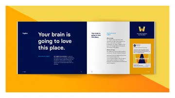
The Wondrium brand guidelines are designed as companion reading to the Wondrium University course load. They outline the standard branding “whats” — colors, fonts, attributes, and logo — but also dig into the branding “whys” and “hows”, breaking down the strategy behind the executions, and taking readers step-by-step through the writing and designing process.
The Outcome
Off to learn something new. Wondrium's branding continues to celebrate its passionately curious subscribers and to remind us that learning can provide a sense of joy that simply can’t be found anywhere else.