Tips for Running a Short Research Engagement
Samara Strauss, Former User Experience Designer
Article Categories:
Posted on
Earlier this Spring, I had the opportunity to work on my first research-only project. Normally, we have to keep research lean to allow plenty of time for UX, design, and development, so it felt positively luxurious to get to focus solely on research. This was a great chance to spread out and stretch my research muscles.
The project — conducting user testing on an app used by government contractors — had an aggressive 5-week timeline. Given the brevity of the engagement, Curt and I were assigned to tag-team the project, which included designing the test script, testing 20 participants, analyzing the results, and presenting design recommendations. Here are some lessons we learned along the way.
It’s OK to leverage client-customer relationships in recruiting
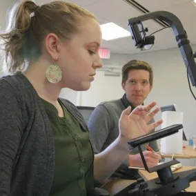
Normally, we handle all recruiting needs for our research efforts, but this client had such specific participant requirements that it would have been impossible for us to find the right people within the short timeline. Instead, the client leveraged existing customer relationships and made initial calls to people on our behalf. From there, we handled scheduling and further correspondence, but this initial client effort saved us so much time. We just simply would not have been able to identify participants who matched our criteria as closely without the client's help.
 This is our schedule from the week of user testing. With a tight project timeline, we enlisted our client’s help to make initial contact with potential participants. From there, we used our homegrown PowWow application to make appointments and maintain our schedule.
Remote testing is your friend
In a perfect world, we would have been able to conduct all of our sessions in person, but that was impossible given the timeline and the location of many of our participants. Instead, we offered two options: 1) remote testing; or 2) a single location where participants could come to us if they were able. This worked really well and allowed us to plow through 20 one-hour sessions in a week.
Not all tasks need to be split 50/50
Naturally, with two UX designers on the project, we aimed to split work 50/50. However, instead of splitting every task evenly, we often found ourselves splitting up tasks so that we were 100% responsible for one thing at a given time.
For example, while Curt led on designing the test script, I led the way on recruiting. When it came time for testing, Curt and I had planned to alternate between administering the test and taking notes, but it ultimately made more sense to have him take lead on conducting the test and for me to take lead on note taking. For analysis, we split the results 50/50 but did it in a way such that I was fully responsible for 10 sets of results while Curt was responsible for the other set of 10.
Splitting work this way allowed us to focus and get into a groove with whatever task we were working on at that time. Things simply would not have gone as efficiently had we tried to have both sets of eyes on every task.
Sticky notes really are magical
I know sticky notes are the most cliche thing in the UX world (besides using sharpies), but I can not stress how much sticky notes were our friend on this project. Instead of trying to make sense of tons of pages of notes, Curt and I transferred our findings to sticky notes so we could see a high-level picture of our results. This made it very easy to work through a massive web of information and made me feel more OK about embracing my inner UX cliche in the future.
 Our sticky note wall.
Organizing recommendations by severity works well
It probably goes without saying that a report or presentation, whether for a research engagement or otherwise, should exhibit good information architecture. User testing always reveals a huge amount of insights, both good and bad, and simply listing them all in a report is going to result in something a client never reads.
For our engagement, it made sense to organize findings based on the different sections of the app. In addition, we used a severity scale that helped us communicate priority for the problems we found. This made our report scannable, and it helped guide which recommendations got some design attention.
 The severity scale we used to help organize our research observations.
You can’t solve all the things
We set aside the final week and a half of the project to discuss our findings with the client team and to make design recommendations. With such a short timeline, we needed to be realistic about what we could get done in that time.
There were two things we did that helped this phase run smoothly. First, we determined what problems should receive a verbal recommendation and what problems were worth showing solutions in design. Next, we were honest with ourselves and the client team about what problems could and could not be solved in a week and a half. The problems that had to do with the fundamental underpinnings of the app or that would have involved a major overhaul of a feature were simply too big to approach in our engagement. The client team was receptive to our recommendation to stay away from those, and that allowed us to focus our attention on areas where we could make a big difference in a short timeline.
----
Interested in research at Viget? Check out our Research & Testing page for more information on our process and past projects.