Smog-Pocalypse? Using Data Visualization to Understand Pollution
David Rice, Former Digital Analyst Intern
Article Categories:
Posted on
Yes, we've read the news about global pollution- but how bad could it be?
7:00 AM, November 14, 2013
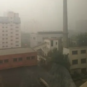
Beijing No. 80 High School, Beijing, China
I was awoken from my dream by the scream of the dormitory’s guardian.
“大卫,起床了!” (David, wake up!)
I blearily opened my eyes, rolled out of bed, and began to get ready for the day. My daily morning routine consisted of all the traditional steps, such as brushing my teeth and showering. One step, however, was quite different: Going online to check the US Embassy’s Air Quality Index (AQI). If the rating were over 200, I would have to wear a N95 respirator throughout the day.

During the entire 2013-2014 academic school year, I studied and lived at Beijing No. 80 High School through the US State Department’s National Security Language Initiative for Youth (NSLI-Y) full scholarship. Whether eating 串儿 (chuan'r, meat skewers) from a street vendor, playing basketball with locals in a nearby park, or exploring the 胡同 (hutong, narrow alleyways prominently featured in Beijing), I quickly began to fall in love with life in Beijing. One unique aspect of the city, however, was quite difficult to adapt to: the pollution.
Beijing’s terrible pollution has long been documented by international news outlets. While photos of the pollution are startling, upon returning stateside I felt that this representation did not fully explain to what extent Beijing’s pollution was worse than the air back home in Northern Virginia.
Inspired by Mitch’s article “The Case for Data Visualization,” I decided to utilize a visualization to represent and compare Beijing’s PM 2.5 levels with various international cities (According to the EPA, PM 2.5 is the term for fine particles, the smallest and most dangerous of particulate matter as they can become deeply lodged into lungs). I selected Shanghai, Delhi (one of the world’s most polluted cities), Mexico City, Los Angeles (one of the United States’ most polluted cities) and Alexandria, Virginia (the PM 2.5 monitoring system closest to my home).
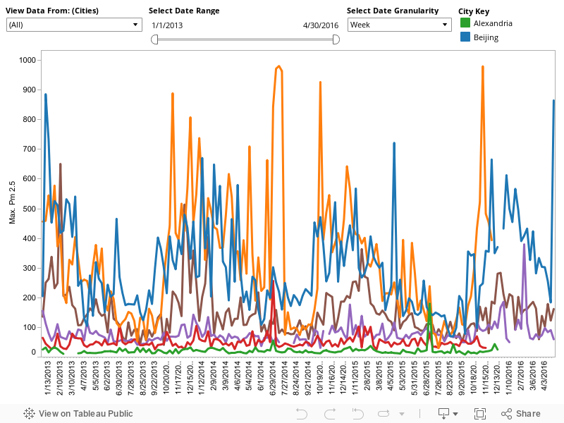
After collecting, cleaning and formatting the data, I plotted each city’s weekly max PM 2.5 reading from January 1st 2013 to April 30th 2016. I used Tableau to explore and create clear and visually appealing data visualizations. While weekly, monthly, or yearly views are far less granular than the daily max reading, they allow the user to better distinguish the various cities’ data.
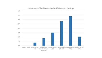
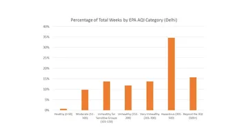
For reference, the EPA has divided the AQI into seven categories: Good, Moderate, Unhealthy for Sensitive Groups, Unhealthy, Very Unhealthy, Hazardous, and Beyond the AQI. “Good AQI” is a PM 2.5 reading of 0 to 50. At this level, the pollution poses no risk to people outside. “Very Unhealthy AQI,” however, is 201 to 300. This level of air pollution would present an environment where “everyone may experience more serious health effects.” An AQI above 500 is defined as “Beyond the AQI” and is extremely dangerous for one’s health. With these AQI categories in mind, the results are staggering.
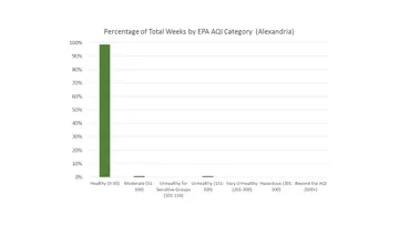
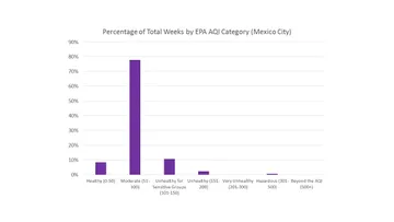
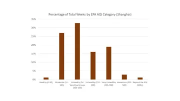
Below are histograms of the cities’ weekly max levels from January 2013 to April 2016 in terms of the seven EPA AQI categories.

Feel free to play around with the data yourself in the interactive visualization below! I have also included some of my observations of the data under the visualization. In addition, click here to view a variety of other interactive visualizations I created using this data, such as a “Geo Dashboard” and "Line/ Box-and-Whisker Dashboard."
- Delhi is by far the most polluted city on the visualization. While industrial growth and an increase in cars certainly has an impact on the pollution, according to the Times of India, biomass burning for heating and cooking is perhaps the country's largest cause of pollution.
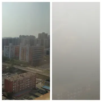
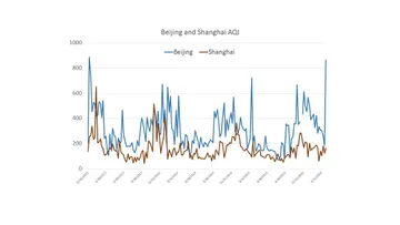
- Despite both being located in China, Shanghai is far less polluted than Beijing. After seeing this, I decided I’m definitely going to study abroad there instead of Beijing (Below).
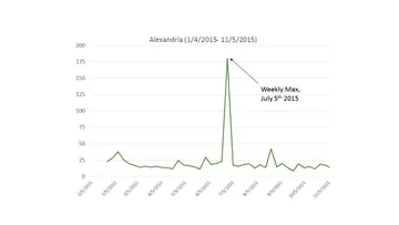
- During the week of July 5, 2015, Alexandria had a high of 180.4. I wonder what celebration happened that week that might have caused the monitor to detect such a high number? (Below)
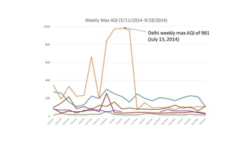
- The highest reading recorded was 981 during the week of July 13, 2014 in Delhi. The average daily high temperature during July in Delhi is 35°C (95 degrees Fahrenheit). Yikes. (Below)
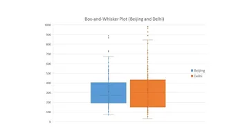
- The median of Delhi’s and Beijing’s weekly max values are quite close: 302 and 271, respectively. Delhi’s standard deviation, however, is far larger than Beijing’s: 212.2 and 153.1, respectively. Delhi’s wider distribution of AQI values is evident through the box-and-whisker plot below.
These alarming pollution levels pose a tremendous long-term health risk to the cities' inhabitants. If you would like to learn more about the topic or how you can make a difference, please click on any of the following links: