Responsive Logos, Part 1: Tips for Adapting Logos for Small Screens
Jeremy Frank, Former UI Development Director
Article Categories:
Posted on
From what I’ve seen, logos typically receive the short end of the stick when it comes to responsive web design practices. Take a look through responsive galleries, and you’ll see that, in most examples, the logo is just shrunk to fit within available space.
For rectangular logos with simple and minimal details, this approach can work just fine. But if the composition or proportion of a logo is anything else, simply reducing its size for small screens may make small details unrecognizable, and small type unreadable. Fortunately, it doesn’t have to be this way.
Style guides and branding guidelines
Well-designed identities often have different logo variations available. Horizontal vs. vertical, short vs. tall vs. stacked, with and without marks, etc. Whatever the case, alternate logo variations are often presented and outlined in a style guide or a branding guidelines document. Look to these guidelines for rules on how to best present a logo within certain size constraints.
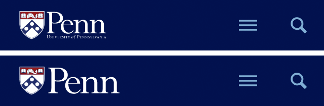
This was the case recently while working with the University of Pennsylvania. Their logo style guide specifically provided an alternate format of the University logo that could be used in smaller areas.
The small version of the logo simply has the logotype removed and the mark expanded to match the height of the shield. Looking at how each of these options would look in a condensed header on a 320px wide small screen, it’s clear that the smaller format (bottom) is more legible and less cluttered.
No logo style guide? Proceed with caution.
Not all identities have accompanying guidelines that outline alternate logo formats and use cases. In these scenarios, you may need to propose adjustments specifically for the constraints of small screens. Be aware that there are typically sensitivities around identities, mostly relating to a sacred view of an identity and rigidity in its presentation. These factors will need to be taken into account when making propositions. Brand recognition and identity will likely not be lost if small and minor adjustments are made due to physical constraints. Flexibility can actually support and enhance the identity as a whole.
Here are a few tips to get you started:
Detail Reduction
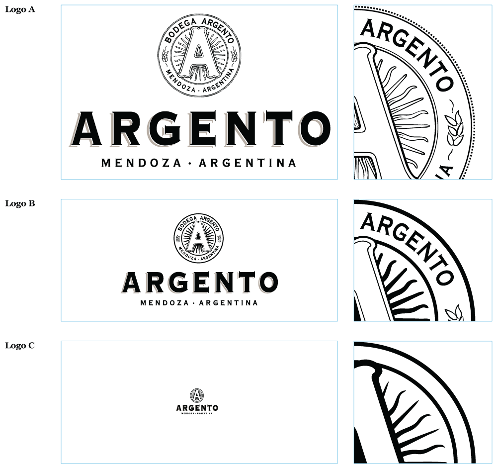
Logos and marks with intricate details are rare, but in these cases, reducing the level of detail can greatly enhance legibility at small sizes. Detailed shapes can be smoothed out, thin strokes can be made thicker, outlined elements could be inversed and filled in. The Argento logo and corresponding style guide is a perfect example of this.
For each reduced size of version of the logo, the level of detail is also gradually reduced, which greatly enhances the legibility of the mark at small sizes.
Stacked & Horizontal
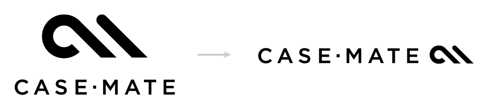
This is by far the most simple and common technique for adapting a logo for a varying size constraints, where the mark is moved from above the logotype to the side. The Case-Mate logo illustrates this perfectly.
Incremental Subtraction
For logos with small type features, a stepped removal of small type can work great for smaller sizes. The emblem for the National Oceanic and Atmospheric Administration (NOAA) is a prime example of this. There’s A LOT of text encircling the main graphical emblem, and it would be illegible at small sizes. Hypothetically, a smaller format for this logo could have the outer text removed, and an even smaller format could have the text within the emblem itself removed.
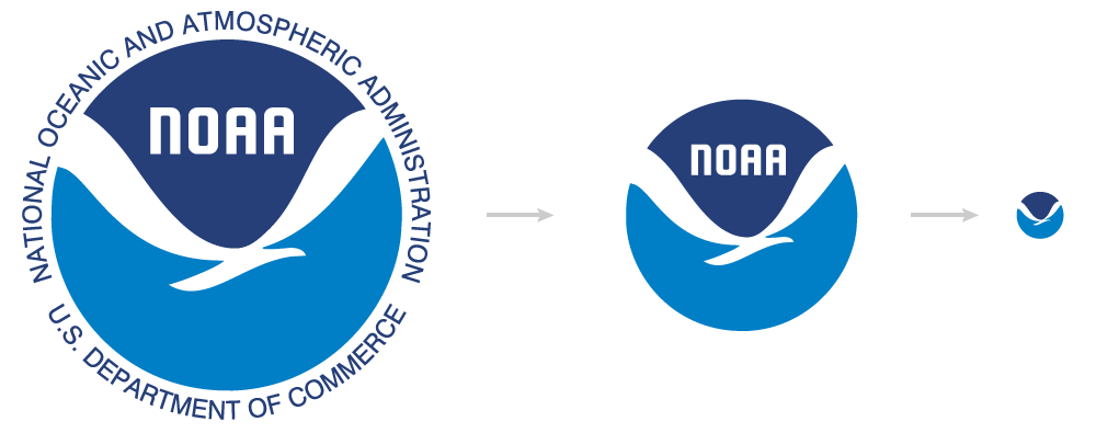
In each of these variations, brand recognition is is still maintained.
Conclusion
Opportunities abound for implementing more legible and recognizable logo variations given the small screen constraints of today. At Viget, we’re thinking about and employing this thinking in our design process. It’s my hope that we’ll start to see flexible logo solutions being implemented more frequently on the web in the near future.
In part 2, I’ll be implementing these examples on the front-end, in an effort to show how responsive logos can be responsibly and efficiently achieved.