Responsive Logos, Part 2: Making Logos Truly Responsive with Inline SVG
Jeremy Frank, Former UI Development Director
Article Categories:
Posted on
In Responsive Logos - Part 1, I made the case that applying responsive design thinking to logos and allowing for subtle flexibility can actually support and enhance a brand’s identity. Several tips were then presented, on how logos can be adapted to better fit small screen constraints.
This post shows how to efficiently implement responsive logos on the front-end, using the examples from part 1.
CSS Sprites and Image Swapping
The most common technique used for displaying different images at different breakpoints is CSS sprites. It works well, but requires creating a sprite image with each variation of the logo, and potentially additional images for each pixel density you are targeting. Another option is to use one of the new responsive image techniques, however, they aren’t yet well supported and they require creating separate image files for each variation of the logo. Neither of these options is super efficient.
Inline SVG Adaptation
Fortunately, there’s a much better way, which gives us resolution independence, and true single file implementation. Inline SVG adaptation utilizes a single SVG file for the logo, CSS media queries for adjustments, and if necessary, just a touch of JavaScript. It goes like this:
- Logo is present on page as inline SVG.
- Adjust the size of logo for each state using media queries in CSS.
- Adjust the position, size, color, visibility, etc. of individual logo elements for each state using media queries in CSS.
- If the proportions of the logo change in any way, then adjust the SVG viewBox property for each format using JS.
For the examples below, resize the browser window or click the size buttons to see the technique in action. Be sure to check out the full Codepen examples to see actual code samples.
Example 1: University of Pennsylvania
This example displays two versions for the logo: large being the default, and small having the logotype removed and matching the height of the shield and mark.

See the Pen Responsive Logo - University of Pennsylvania by Jeremy Frank (@jeremyfrank) on CodePen.
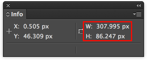
Since the mark in the small version needed to be slightly taller to match the height of the shield, the viewBox property on the SVG element had to be adjusted so that the mark would not be cut off on the right side, due to a wider overall width. To get this value, I simply made the above size adjustment in Illustrator, and then rounded up the value from the info panel.
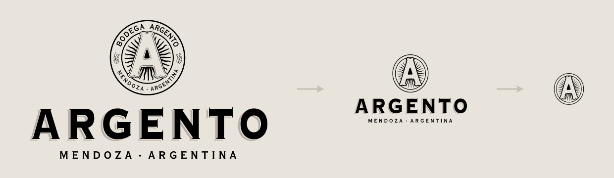
Example 2: Argento Wine
This example uses three states for the logo: the large state being the default, the medium state using a reduced detail version of the roundel, and the small state displaying the roundel only.
See the Pen Responsive Logo - Argento Wine by Jeremy Frank (@jeremyfrank) on CodePen.
This example is the most complicated in that there are 2 versions of the roundel contained in the SVG. The differences in version B and C outlined in the style guide were enough to warrant an additional grouping in the SVG element. As in the previous example, the viewBox property needed to be adjusted for each version to match the size of the displayed elements.
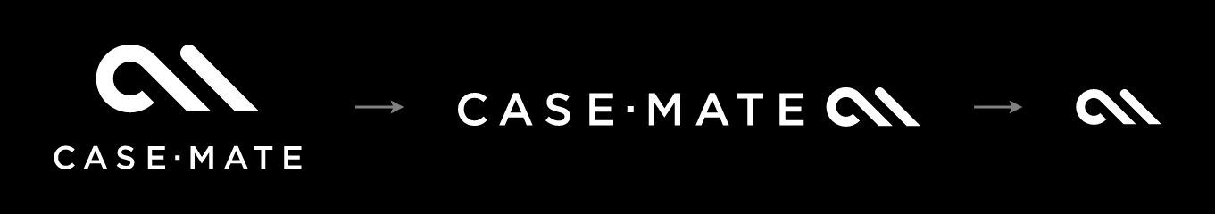
Example 3: Case-Mate
This example uses three states for the logo: the large state using the stacked version as the default, the medium state rearranging the mark and logotype into the horizontal version of the logo, and the small state displaying the mark only.
See the Pen Responsive Logo - Case Mate by Jeremy Frank (@jeremyfrank) on CodePen.
As in the examples above, the viewBox property on the SVG element had to be adjusted due to different proportions for each state of the logo.
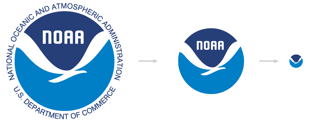
Example 4: NOAA
This example uses three states for the logo: the large state being the default, the medium state hiding the encircling type, and the small state displaying the mark only without type.
See the Pen Responsive Logo - NOAA by Jeremy Frank (@jeremyfrank) on CodePen.
This example is the simplest in that CSS opacity is the only adjustment necessary for each state. No JavaScript is required since the proportions are always square. The SVG’s viewBox property can remain unchanged.
Bonus - SVG Injection
For an even more streamlined approach, you could implement SVG injection. This essentially uses a standard img tag to reference an external SVG file, and JavaScript to load and inject the appropriate SVG markup. This allows for a greater separation of concerns between the logo markup and the page markup. I highly recommend using Iconic’s lightweight SVGInjector library for this purpose.
Conclusion
SVGs are a perfect fit for resolution-independent logos. Combined with CSS media queries, a touch of JavaScript, and SVG injection, you have a robust solution for implementing responsive logos!