Native or Not? The Untapped Power of Web Apps
Dan Tello, Former Senior Front-End Developer
Article Category:
Posted on
This post was adapted from a talk I've been giving this year (BD Conf and Forge were awesome and you should register next year!). If you're interested in the slides, you can find them here: https://slides.com/dantello
Why another web vs native discussion?
When I started as a Front-End Dev at Viget four years ago, building for "mobile" was still sort of a novelty. Today, everything we build is responsive, but it's been a slow journey figuring out how to translate the "wow" factor we have on desktop down to the tiny touchscreens in our hands.
While researching for a previous talk on mobile-first design, I found it incredibly hard to find exemplary, mold-breaking, mobile web experiences. Many "award-winning" sites featured on places like the FWA or awwwards.com either had no mobile experience at all, or displayed a dumbed-down version that lacked whatever it was that made the desktop experience stand out.
Why is there such a disparity between native and web apps?
Meanwhile, all the native apps coming were beautiful. Designs were crisp and clean, interactions were slick, animations and transitions were smooth and well thought out. Everything was perfectly sized for your screen, and the content and navigation were focused and easy to get to. Why was I seeing such disparity between native apps and web apps? It seemed disproportionate to any limits of technology that might exist between the two.
This isn't a limitation of technology. The web app versions are just less designed. Why? The answer is in where our focus lies.
Native app designers have the benefit of leaving all the desktop baggage behind, engineering every interaction and piece of content specifically for the little touch screen in your pocket.
When building for the web, however, our focus is often split between the desktop design that our clients are asking for (and our designers are more comfortable creating), and figuring out how to "make it responsive." It's not that we lack the technical capability to deliver the same high-quality design and interactions our native counterparts produce, it's that our attention, budget, and process are heavily directed towards desktop. As seen in the examples above, it's fairly obvious when mobile is an afterthought.
Misunderstanding is holding us back
Until our clients and teams clearly understand how powerful and capable mobile web apps can be, that time and budget will not materialize—and neither will the full potential of the products we're creating.
Before we talk about just how powerful web apps can be, though, let's get their limitations out of the way. The list is shorter than you might think.
What mobile web apps can't do (yet)
- Native platform integrations
- Background processes and push notifications*
- Full hardware access
Native Platform Integrations
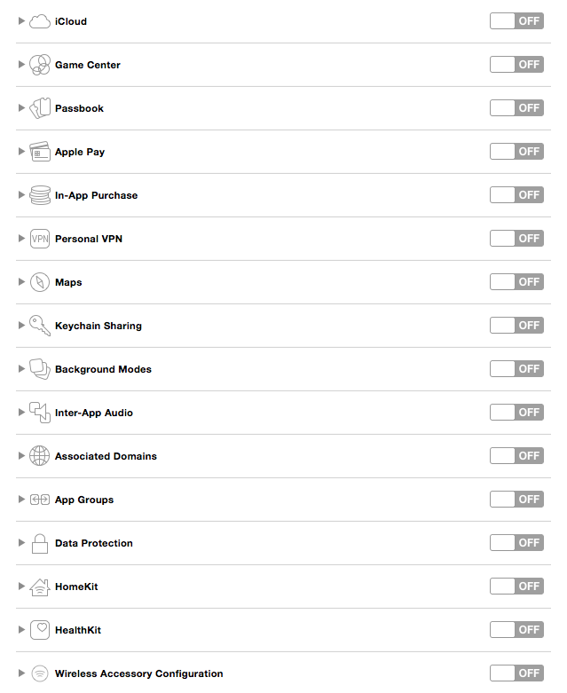
The browser does not have access to most system level applications and data. For example, your web app can't currently import someone's address book or sync data with iCloud. To get a feel for a few of these integrations, crack open the "Capabilities" in an iOS project in Xcode.
In short, if you need access to native data or services not available through a web API, you'll need to build natively or use a native wrapper like Cordova.
Background Processes and Push Notifications*
In the past, background processes (like checking for new emails, even when your mail app is closed, etc.) and push notifications weren't possible in a web app. This remains true for iOS; however, service workers are changing this, and Android already supports it. You could send push notifications from a web app to a Samsung Galaxy today, for example.
Full Hardware Access
While we do have access to things like motion sensors, speakers, camera (partially) and a multi-touch screen, we don't get full access to everything. We can't do things like control the LED flash, vibration (except on Firefox and Chrome for Android), record audio through the microphone, or access light sensor data (though maybe on Firefox on Android?) or Bluetooth.
See? That list wasn't too bad. Onto the fun, much longer list of awesome stuff we CAN do from the browser on your phone.
What mobile web apps can do (a lot!)
- Full screen animation at 60 frames per second
- Geolocation
- Touch Gestures
- DeviceMotion access
- WebAudio API (not to be confused with the HTML 5 audio element)
- WebSockets
- Run as home screen apps
- Offline modes
- App Icons
- Splash screens
- Full Screen
- Push Notifications (on Android)
- Camera Access (partial)
Check out whatwebcando.today to test what your device specifically supports!
Animation
First up? Animation. Smooth, meaningful animation has an incredible impact on the way users feel about our apps. @rachelnabors gave a great talk last year highlighting why this is. She pointed out that the world we live in doesn't abruptly snap from state to state. We travel through time and space from one place to another. Day transitions to night. Objects transition in and out of our line of vision, providing us with the spacial awareness of where they came from, where they went, and where we are in relation to them. In short, the natural world doesn't hiccup or glitch, and neither should our app.
If it does, it's going to be obvious and disconcerting. Running animations at 60fps (the refresh rate of most devices) is incredibly important. It's also achievable. There is a ton of content available on the topic, but let's quickly surface a few of the most important points.
Understanding how the browser renders
The best thing we can do to improve our animation is to get a basic understanding of how our browsers render content.
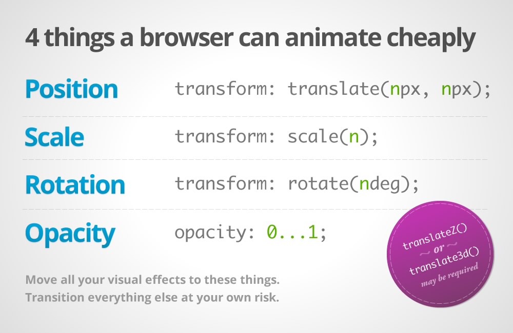
I stole this graphic from Paul Lewis and Paul Irish's excellent article on "High Performance Animations." In it, they point out there are at least four things a browser can animate cheaply: position, scale, rotation, and opacity— which are represented by the css `transform` and `opacity` properties. In 2015, we can also add the css `filter` property to the list.
Move all your visual effects to these things. Transition everything else at your own risk.
- The Pauls
Elements with these properties applied can be "promoted" to their own render layer, independent of the rest of the page. As you transform and animate your element, the browser can safely ignore the rest of the page, and just manipulate the image already painted to that layer, without needing to recalculate style or repaint. In addition, processing for the animation can be offloaded from the the main processing thread to the GPU. Promoting elements to their own layers before the animation starts is crucial. Otherwise, you may experience stuttering as the layer switches back and forth between rendering modes. One admitted hack to force layer promotion is by applying `translateZ(0)`, `translate3d(0,0,0)`, or `backface-visiblity: hidden` to an element.
This code pen contrasts how the browser handles animating these properties differently:
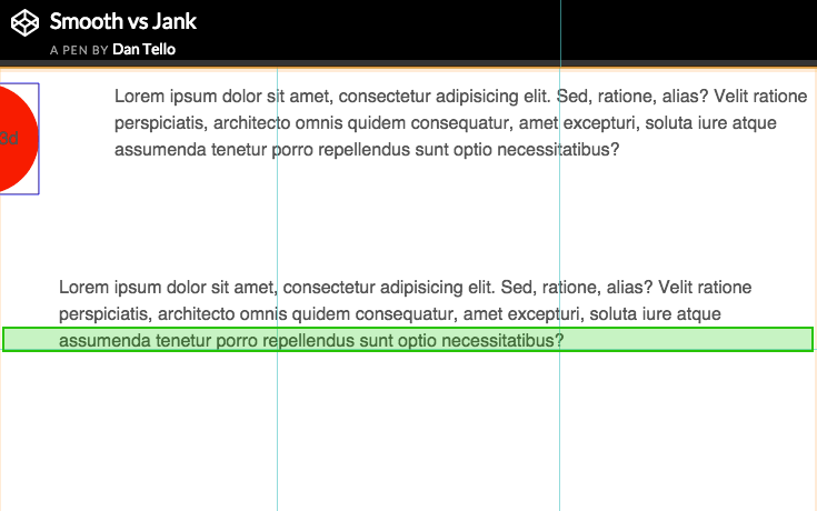
In bottom example, for each frame of the animation, the browser has to recalculate and repaint not only the circle, but the rest of the layout it's affecting. In the top example, where the layer has been promoted and we're animating using our "safe" properties, you can see that nothing is being repainted in that area (no green boxes). The layer is being manipulated by the GPU independently.
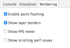
To see the redraws in the browser yourself, enable the following settings in Chrome Dev tools:
Let's pull up an example that applies these smooth animation principles in real life:
Graba.io (static prototype)
http://code.viget.com/graba-client (pull it up on your phone if you can).
This is a static React prototype for a tool we're building for quickly grabbing conference rooms! None of the data is connected to anything in this demo, so click around all you want. All the animations and transitions use `transform` with `translate3d` or `scale`, and the background color changes by animating `hue-rotate` value of the css `filter` property.
Natural (smooth, eased, transitional) animation is part of what gives apps that nice "native feeling." One key component to that is transitioning between content. The transitions here in Graba are based on direction and flow. When you start the booking process, completed steps move off screen to the left, and we move forward to the right. If you hit back, the reverse happens. Non-sequential navigation uses zooms to replace content, so you know you're somewhere completely different.
If we think back to the natural world, objects enter and exit our view. To get to a new room, we have to leave one and walk into the next. Our vision doesn't just flash white for a second suddenly, we're in a completely different place. To make our apps feel natural, abrupt context changing (page reloads, UI changes, etc.) need to be replaced with graceful exits and entering.
Rendering with <canvas>
We're not done with animation yet. Another tool you can use for performant animation is the `canvas` element. I'm sure you've heard the DOM is slow. At least it was too slow for Flipboard, so they wrote a react library that re-implements the DOM with `<canvas>` to get around animation issues with scrolling. Those are some insane lengths to go to and completely breaks accessibility, among other things—but it does highlight just how fast canvas can be.
Example time. I demoed these on my iPhone 5c, and they all ran butter smooth.
Run Puma Run
http://code.viget.com/run-puma-run/
I gave a talk on game development with JS and canvas a couple of years ago, and featured this game we built for the homepage of Puma.com back in 2012 during the Summer Olympics. In 2012, this actually ran pretty well on my old iPod touch. It wasn't 60fps, but it was totally playable. Puma.com wasn't responsive at the time, so we didn't do as much as we could have for mobile, but without any special optimization it worked pretty well. In 2015, devices have become both faster and more efficient at rendering, and we're getting 60fps easy. And remember, every pixel on the screen is being redrawn 60 times a second!
For more on canvas, here's a repo with some examples I put together for a talk at ConvergeSE 2014. In the event that you're not building an NES-style side-scroller for your client, canvas may still be a great way to add more subtle or enhancing animations to your UI like animated icons or touch effects.
Run Puma Run was built without any canvas or game dev libraries, mostly because there weren't a lot of options at the time. Now there are! Here are a few to check out:
I encourage you to play with some of the libraries out there and find ways to bring life and movement to your apps.
Touch Gestures
One thing you may need to implement depending on the nature of your app are touch gestures. Native apps have a number of gestures built in; iOS, for example supports:
- Tapping (any number of taps)
- Pinching in and out (for zooming a view)
- Panning or dragging
- Swiping (in any direction)
- Rotating (fingers moving in opposite directions)
- Long press (also known as “touch and hold”)
In the browser, we don't get these gestures for free (yet), but all touch event data is available to infer these gestures, and a few libraries have already connected the dots for you. Hammer.js is one of the most popular. It's pretty lightweight (3.96kb) and implements all the native gestures we previously mentioned, as well as a few more.
The Wildlife Alert App
Wildlife Alert is a web app built at Viget that has been packaged up for the App Store and Google Play store with Cordova. We needed to implement in a native wrapper to get File System access for storing large photos to be used offline. But under the hood, this is a web app built with JS, CSS, and HTML, touch gestures included.
This particular implementation used PinchZoom.js and Owl Carousel to enable pinch zoom, double tap to zoom, and swiping on the images.
Camera Access
Let's talk about camera access—we've got it! You can utilize the camera in a web app through a file input, but for now, you're limited to basic camera access and file uploading, and can't control camera settings or read a live video feed.
<input type="file">
This allows you to open your camera and take a picture, or select another photo or file, then upload it to your web app. We did this on a recent project for a startup called PostCreator. This was desktop focused project, with a tight budget, but we discovered that there was really not that much preventing a usable mobile experience with some minor adjustments.
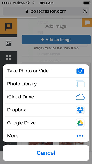
On iOS clicking a <file> input pops a menu allowing you to take a photo or choose an existing file from your library. Android functions the same way. This opens up opportunities to build Instagram-like image uploading/editing/sharing apps in the browser.
Audio
Two ways: <audio> and AudioContext
Another type of media we can have fun with in mobile browsers is audio. There are two ways of playing audio in the browser. You are probably familiar with the first way: the `<audio>` element introduced in HTML 5. It's pretty straight-forward. You create it, give it a source, and you can call things like `play()` and `pause()`.
Back when I built Run Puma Run, this was the only option out there. And it worked great on desktop browsers, but mobile browsers (specifically on iOS 6 at the time) only allowed one audio source to play at a time. That meant you couldn't play overlapping sound effects or background music at the same time. We ended up cutting audio altogether for mobile.
But good news everyone! We now have a second option for audio: the incredibly powerful (and well supported) Web Audio API. This enables us to do all sorts of crazy things with audio in the browser, including pump virtually unlimited streams of audio into something called an AudioContext, applying manipulations and effects along the way.
Here's how it works:
Inputs (audio sources) -> Effects (volume, distortion) -> Destination (audio output)
// Create an Audio Context
var context = new AudioContext()
// Create a source
var source = context.createBufferSource()
// Add Volume Node
gainNode = context.createGain()
// Tell the source which sound to use
source.buffer = someAjaxLoadedBuffer
// Set the volume
gainNode.gain.value = 11
// Connect the source to the volume effect
source.connect(gainNode)
// Connect the volume node to the speakers
gainNode.connect(context.destination)
// Play the sound
source.start(0)
Sources can be HTML 5 `<audio>` elements, audio files loaded via ajax, or most impressively, sounds generated from scratch. One of the most impressive demonstrations I've seen is this real-time guitar synthesizer. There are no source audio files in that demo—it's pure JavaScript generating that sound!
Motion, Orientation, and Location
Audio by itself is fun, but it gets even better when we tie it to user interactions. One of the coolest options we have is motion. From the smallest twitch of your phone, we can detect device orientation, rotation rate, acceleration, and even compass heading. All of these movements output numbers we can use to control what our users see and hear on their devices.
Pull up the following demo on your phone and watch how the values change as you move your device:
code.viget.com/device-motion-demo
DeviceOrientationEvent
alpha (z access 0-360) twisting around the z axis (phone laying flat, facing the sky)
beta (x -180 to 180) front to back (facing you)
gamma (-90 to 90) left to right (facing you)
webkitCompassHeading (360°)
DeviceMotionEvent.acceleration
x east/west
y north/south
z up/down
DeviceMotionEvent.rotationRate
alpha (z access 0-360) twist around z axis
beta (x -180 to 180) front to back
gamma (-90 to 90) left to right
Last year, we used `rotationRate` to turn people's phones into handbells for our Jambells.com pointless project. Another equally fun thing to link `DeviceMotion` to is animation. On the homepage of Rigetti.com, I created an iridescent gradient that shimmers and subtly changes as you rotate your phone (or MacBook Pro!).
Geolocation
Not only can we access data about the position and movement of the device in our hand—we can also access our device's position and movement on our planet through geolocation.
 <code>navigator.geolocation.getCurrentPosition(function(position) {
 do_something(position.coords.latitude, position.coords.longitude);
});
navigator.geolocation.watchCurrentPosition(function(position) {
 do_something(position.coords.latitude, position.coords.longitude);
})</code>
On the list of web apps I regularly use is Forecast.io. Try adding it to your home screen—it's pretty amazing (and a different experience than you get in a desktop browser). The web app has access to my GPS if I grant it, and could also infer general location through my IP address. In addition to geolocation, there are a few other great things to point out on this site: the full screen, single-page design, the snappy interactions, and the nice canvas animations. Be sure to check out the animated weather map on your phone.
Another fun example using geolocation is Compass.js (not to be confused with the Ruby Sass library). If you were paying attention in the DeviceMotion section, you may have noticed `webkitCompassHeading`. While iOS devices report this, Android does not. However—Compass.js can polyfill compass heading by using DeviceOrientation and Geolocation:
We can enable GPS and ask user to go forward. GPS will send current heading, so we can calculate difference between real North and zero in deviceorientation event. Next we use this difference to get compass heading only by device orientation.
Pretty brilliant. It would be pretty interesting to build a little geo-caching or scavenger hunt app with this.
WebSockets
So far we've focused on the things we can tap into within a single browser to create an engaging experience. That's great, but we can take this a step further and literally multiply the effect by tying multiple browsers together, giving your users a shared interactive experience. WebSockets lets us do just that.
Traditionally, communication between your browser and a server goes something like this:
client: "Hey server, gimme some data."
server: "Data."
client: "Hey server, a user just submitted a form!"
server: "Ok."
The server never initiates the conversation. If you want to know if something changed on the server, you have to ask. Not ideal for getting fast real-time updates.
WebSockets open a two-way connection, allowing updates to go back and forth in real time:
server: "Hey browser, a million users just sent this person a message."
client: "Woah, I'll display that on the page! PS, this user just ate a taco."
server: "Cool, I'll let those million people know right now."
To implement this, you need code running both on the server and in your browser to send and receive events. I've found Socket.io to be a great way to get started. It runs on Node, and since most of us are already familiar with JavaScript, it's really easy to get going.
This opens up all sorts of fun possibilities like multiplayer gaming, collaborative editing, chat—whatever you can think up. One of my favorite examples in the wild is the Google Racer Chrome Experiment. Up to four players can join a single game, line up their devices side by side to create one big slot car track, and race across each other's screens! On top of that, each phone plays a different layer of the sound track. All this in a browser on your phone. And despite the "Chrome Experiment" title, it works just fine in Safari and other non-Chrome browsers. We were heavily inspired by this concept on our own multiplayer mobile browser experiment, Jambells (more details in this blog post).
Home Screen Apps
To complete the experience, you'll want to make sure your web app is set up nicely for usage as a "home screen app" (when a user opts to "Add to Home Screen"). Home screen apps sport app icons and splash screens, but most importantly can open fullscreen as their own entity, rather than in the default web browser. A very basic implementation would look something like this:
 <code><meta content="yes" name="mobile-web-app-capable" />
<meta content="yes" name="apple-mobile-web-app-capable" />
<link href="app-icon.png" rel="icon" />
<link href="app-icon.png" rel="apple-touch-icon" />
<link href="/startup.png" rel="apple-touch-startup-image" /></code>
Offline Modes
I don't have much experience with this YET, but I highly recommend you look into it. This article on offline web apps is a great place to start, and this one the philosophy of "Progressive Apps" is a must read.
Advantages of Web over Native
So far we've talked about some pretty awesome things you can do in a web browser on your phone. But so what? Just because we can do something in the browser doesn't by itself mean we should. Why choose web over native if you could build the same app on either platform? Let's dive a little deeper into a project I mentioned earlier to find out.
Case Study: Jambells
Jambells was a Pointless Project we built last year that brought together much of what we've talked about in this article:
- Mobile focused design
- Animation
- Web Audio
- Motion Sensing
- WebSockets
I won't re-hash the entire case study here, but I do want to highlight at least three advantages web has over native that became clear through this project .
1. Rapid development for a wide audience
In a week's time, we were able to think of and launch a game that works on any screen size, or platform: Mac, PC, iOS, Android, etc. Development on a single codebase is obviously more efficient than maintaining multiple, and avoiding app stores meant our users are always accessing the latest version without messing with releases/downloads/updates. The web is an incredibly great platform for trying out ideas and getting them in front of people quickly.
2. Instant engagement
Perhaps the biggest advantage the web has over native apps is how quickly users are able to engage. All that's between the user and your content is one click. No redirects to the app store, nothing download, and find on your home screen, no passwords to enter. This makes social media sharing especially effective. Every person who sees a Jambells tweet is as close to engaging with the app as if it were downloaded and installed on their home screen. It's just one click. Not only that, but it can be one click from anywhere. Their grandma's PC, or their little sister's iPad. Access isn't tied to their personal device.
On multiple occasions, when I would tell friends or family about Jambells, and ask if they wanted to play a game, this is the response I got.
Sorry, I'm not going to download another app.
Citing either laziness, or a lack of space left their phone. There was always a pleasantly surprised, "Oh! What's the url?" when I told them they didn't have to, and moments later, we were playing.
3. You stand out when you're different
I think one reason Jambells received so much love was that it defied expectations. People are accustomed to immersive experiences on native apps, but a motion-sensing multiplayer handbell game is not what people expected to experience in the browser on their phone. If it had been a native app, it would still be cool, but wouldn't necessarily stand out in the crowd. Remember the Run Puma Run example I showed earlier? While I'm pretty proud of how it turned out, the game itself wasn't a unique concept. If we had released it as a native app, it would have to compete with hundreds of other endless running games like Jetpack Joyride and Temple Run. The game was a success, not because the gameplay was particularly innovative or spectacular, but because it broke the mold. It was unexpected, delightful, instantly engaging and shareable.
In Conclusion
There is so much untapped power in this space, and so much misunderstanding about what's possible. I hope you've been inspired and equipped with some nuggets to get your clients and teams excited about designing and building great experiences. Now go make something cool!