Monitor Site Speed With Chrome UX Report and Google Apps Script

Liz Roknich, Former Digital Analyst
Article Categories:
Posted on
Leverage the Chrome User Experience Report and Google Apps Script to monitor your site’s page speed.
An oft-overlooked measure to compare before and after a website redesign is site speed. We’ve assembled a comprehensive guide to allow you to monitor the percentile under which your site falls, relative to most other websites:
- Intro to the Chrome UX Report
- Accessing data through BigQuery
- Connecting BigQuery to Google Sheets
- Reporting in Google Data Studio
Chrome UX Report
While we’ve written articles that detail options for evaluating site speed before, this article takes a deeper look into the Chrome User Experience Report, which collects loading performance data from real Chrome users. The Chrome UX data is available through the PageSpeed Insights report. It can also be accessed directly through BigQuery, which offers the flexibility to analyze raw data for most websites.
Through BigQuery, we can pull in custom benchmarking data for clients’ loading performance and compare it to the dataset as a whole. The Chrome UX report has a number of different metrics available, but this approach focuses specifically on FCP, or First Contentful Paint.
What is FCP and how can we use it?
According to Google, “First Contentful Paint reports the time when the browser first rendered any text, image (including background images), non-white canvas or SVG. This includes text with pending webfonts. This is the first time users could start consuming page content.” FCP is one of the main metrics displayed on the Page Speed Insights report, shown below:
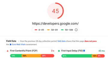
This report shows the breakdown of fast (<1 s), moderate (1 ~ 3 s), and slow (>3 s) load times for the example page, with the option to view data for the entire origin as well. It also shows a discrete value for FCP— in this case, 3 s— which is the 75th percentile of FCP for the page. The Chrome UX report focuses on the p75 value instead of a median or average value to give an idea of the user experience when factoring in “the most difficult device and network conditions.”
Custom Reporting through BigQuery
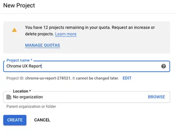
Custom BigQuery queries will allow you to see the FCP distribution for an individual site (origin) or compare its p75 value to others. To pull these metrics, go to BigQuery and create a new project:
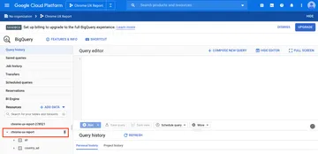
After setting up your new project, navigate to the Chrome UX Report through the Cloud Console. From there, you’ll see a view of the query editor and the chrome-ux-report data tables:
At this point, you’ll be able to write custom SQL queries to pull any data from the Chrome UX report. The dataset has a Metrics Summary table that can be particularly useful for pulling high-level reporting information. For example, you can use the following query to find the p75 value for a given site:
SELECT
  p75_fcp
FROM
  `chrome-ux-report.materialized.metrics_summary`
WHERE
  yyyymm = 202008
  AND origin = 'Site URL'
where 202008 is the year and month of the report you want to use (in this case, August 2020) and ‘Site URL’ is the origin you want to use (for example, ‘https://example.com’).
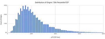
While you could remove the origin constraint from the query above to get the p75 values for all sites in the dataset by origin, there are more efficient ways to pull this data in aggregate. Rick Viscomi, a Senior Engineer at Google, created a query that counts where in the FCP histogram origins have a given percentile. The following query returns the distribution of of p75 values across the dataset:
SELECT
  p75,
  COUNT(0) AS numOrigins
FROM (
  SELECT
    origin,
    MIN(start) AS p75
  FROM (
    SELECT
      origin,
      bin.start,
      SUM(bin.density) OVER (PARTITION BY origin ORDER BY bin.start) AS cdf
    FROM
      `chrome-ux-report.all.202008`,
      UNNEST(first_contentful_paint.histogram.bin) AS bin)
  WHERE
    cdf >= 0.75
  GROUP BY
    origin)
GROUP BY
  p75
ORDER BY
  p75
This query returns the count of origins at each indexed p75 value. Visualized, the data looks like this:
The query below shows a given site’s percentile rank among origins, or where it falls on the distribution above:
SELECT origin,
percent_rank
FROM(
SELECT
  origin,
  PERCENT_RANK() over (
  order by p75_fcp desc
  ) percent_rank
FROM
  `chrome-ux-report.materialized.metrics_summary`
WHERE
  yyyymm = 202008)
  where origin = 'Site URL'
The beauty of connecting to the Chrome UX report through BigQuery is the amount of customization and control you have over the data you’d like to extract. The CrUX report Github is a great repository of queries that others have used to pull custom data.
Connecting to Google Sheets
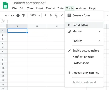
In the context of a site redesign or optimization effort, it’s most useful to observe how site speed changes over time. Our team leverages Google Apps Script within Google Sheets to automate monthly site speed data queries. To get started with Google Apps Script, create a new spreadsheet and open the script editor within the Tools dropdown.
A code editor will then open where you can modify your spreadsheet by adding in JavaScript and connecting to APIs such as BigQuery.
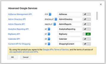
To integrate with these APIs, select Advanced Google Services from the Resources dropdown menu. Toggle the BigQuery API on to allow your script to connect to your BigQuery project.
Once you’re connected to the BigQuery API, it’s time to start writing your code! For example, the code below will let you report your site’s p75 percentile rank from BigQuery to Google Sheets:
var MILLIS_PER_DAY = 1000 * 60 * 60 * 24;
var NOW = new Date();

function firstFunction() {
    // Get the date 45 days ago in yyyyMM format
    var reportSheet = Utilities.formatDate(new Date(NOW.getTime() - 45 * MILLIS_PER_DAY), 'GMT', 'yyyyMM');
    var activeSpreadsheet = SpreadsheetApp.getActiveSpreadsheet();
    var yourNewSheet = activeSpreadsheet.getSheetByName(reportSheet);

    if (yourNewSheet != null) {
        activeSpreadsheet.deleteSheet(yourNewSheet);
    }
    // Create a new sheet titled with last month's date
    yourNewSheet = activeSpreadsheet.insertSheet();
    yourNewSheet.setName(reportSheet);
    runQuery();
}


function runQuery() {
    // Replace this value with the project ID listed in the Google
    // Cloud Platform project
    var projectId = 'Your Project ID';
    var reportDate = Utilities.formatDate(new Date(NOW.getTime() - 45 * MILLIS_PER_DAY), 'GMT', 'yyyyMM');
    // Replace origin value with your site URL
    var request = {
        query: 'SELECT origin, percent_rank FROM (SELECT origin, PERCENT_RANK() over (order by p75_fcp desc) percent_rank FROM `chrome-ux-report.materialized.metrics_summary` WHERE yyyymm =' + reportDate + ') where origin = "Your Site URL"',
        useLegacySql: false
    };
    var queryResults = BigQuery.Jobs.query(request, projectId);
    var jobId = queryResults.jobReference.jobId;

    // Check on status of the Query Job.
    var sleepTimeMs = 500;
    while (!queryResults.jobComplete) {
        Utilities.sleep(sleepTimeMs);
        sleepTimeMs *= 2;
        queryResults = BigQuery.Jobs.getQueryResults(projectId, jobId);
    }

    // Get all the rows of results.
    var rows = queryResults.rows;
    while (queryResults.pageToken) {
        queryResults = BigQuery.Jobs.getQueryResults(projectId, jobId, {
            pageToken: queryResults.pageToken
        });
        rows = rows.concat(queryResults.rows);
    }
    if (rows) {
        var reportSheet = Utilities.formatDate(new Date(NOW.getTime() - 45 * MILLIS_PER_DAY), 'GMT', 'yyyyMM');
        var spreadsheet = SpreadsheetApp.getActiveSpreadsheet();
        var sheet = spreadsheet.getSheetByName(reportSheet);

        // Append the headers.
        var headers = queryResults.schema.fields.map(function (field) {
            return field.name;
        });
        sheet.appendRow(headers);

        // Append the results.
        var data = new Array(rows.length);
        for (var i = 0; i < rows.length; i++) {
            var cols = rows[i].f;
            data[i] = new Array(cols.length);
            for (var j = 0; j < cols.length; j++) {
                data[i][j] = cols[j].v;
            }
        }
        sheet.getRange(2, 1, rows.length, headers.length).setValues(data);

        Logger.log('Results spreadsheet created: %s',
            spreadsheet.getUrl());
    } else {
        Logger.log('No rows returned.');
    }
}
Running this script creates a new sheet each month with your updated p75 percentile rank. This code can be customized by changing out the query request to pull the data you’re interested in.
Data Studio Integration
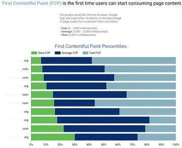
Google Data Studio is a great tool for visualizing and reporting site speed data. You can connect CrUX data directly to a Data Studio dashboard, or you can connect a Google Sheet. You can then create custom versions of some of the visuals shown in the PageSpeed Insights report, like we’ve done below to compare our site against competitors—
—or to create your own custom visualizations. Thanks to the flexibility of data you can access through BigQuery, the reporting options are endless.
Ready, set, report!
With a BigQuery account configured to access the Chrome UX report and an idea of how to integrate it with monitoring and visualization tools, you’re ready to start reporting on your own site speed! This approach will let you understand how your ongoing page speed optimizations improve the experience for real users. If you’re looking for a partner to make those site enhancements, get in touch!