How We Mapped the Journey of a Career in the NFL

Curt Arledge, Former Director of UX Strategy
Article Categories:
Posted on
We helped the NFLPA create an 8-foot map of the NFL Career Journey. Here's how we did it (and why).
Organizations often need help zooming out to see the big picture of the user journey. This was particularly important for our client, the NFL Players Association, who provide support and resources for professional football players at every stage of their careers and throughout retirement.
As part of our effort to redesign nflpa.com, we interviewed players and delivered our insights as a rich, non-linear, and really big (8 feet long) map of the NFL player career journey.

Why map the player journey?
Making a journey map for the NFLPA served two main goals. First, it helped bring alignment among internal stakeholders at the NFLPA, who are naturally tuned into their own specific interactions with players. There is no other single document that contains all of the information included in our journey map and organizes it around the player experience.
The second goal was personalization. We learned from NFLPA staff that players often reach out with the same recurring questions. The NFLPA’s website answers most of those questions, but players often don’t know where to look or even how to ask. Theoretically, if we could personalize the website experience for players based on their current career moment, we could anticipate their needs and bubble up relevant information when they need it – or better yet, before they know they need it.
NFL Players Association
View our workStep 1. Interviewing Players
A focus of our user research was on learning about the stages and situations that make up an NFL player’s career. After gathering as much information as possible from working sessions with NFLPA staff, we dug deeper during our interviews with NFL players. We wanted to know more about the needs and emotions that motivate players in those situations, and how their mental models of those situations might differ from the NFLPA’s.
Step 2. Analyzing the Data
After collecting our data, we had to make sense of it. We used Airtable to connect interview quotes and insights to specific situations, and we developed a taxonomy of situation types. For example, some situations recur every year on a predictable schedule, others are milestones that happen just once or twice in a career, and a third type are “contingencies” that can happen at any time, like getting injured to moving to a new city. We also grouped situations by career stage. Some situations are only relevant to rookies, or free agents, or veteran players after their third accrued season, for example.

Step 3. Visual Prototyping
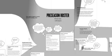
From the moment we began collecting data, we sketched out ways that we might present it as a linear journey map. We soon learned that the player journey is anything but linear. Players enter and leave the NFL in a variety of different ways and spend time in in-between states like injury reserve, practice squad, and free agency. Our journey map needed the ability to show twists, turns, cycles, and branches.

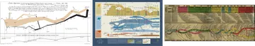
For inspiration, we looked beyond traditional UX journey mapping templates to the world of data visualization. One particular inspiration was Charles Joseph Minard’s Carte Figurative depicting Napoleon’s 1812 Russia campaign, which combines six different types of data into a single visual hybrid. Ultimately, our approach was dictated by the shape of the data itself, and our data analysis took place hand-in-hand with our visual explorations.
Step 4. Making the Map
The final step was arranging the data visually with Figma. The complexity of the diagram didn't fully reveal itself until this step, but Figma gave us the flexibility to iterate all the way to the final version.
The journey map reads from left to right on a timeline. The middle section (representing the yearly rhythm of Preseason, Regular Season, Postseason, and Offseason) is meant to be read as a “loop” for each year of a player’s career.
Each filled-in shape represents a “pathway” – a group of players with a similar status. The width of each pathway approximates the total number of players with that status at a given time. Each of the main pathways is presented with a different shade of grey.
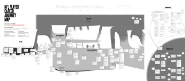
Along each pathway, common touchpoints are presented in boxes. These are moments that a player interacts with the NFLPA, the NFL, the Benefits Office, etc. In some cases, the touchpoint channel is indicated with a red icon (in person, phone/text, email, website, print, postal mail).
The right side of the diagram includes touchpoints that do not happen at a predictable time for different players. These touchpoints are grouped thematically and not presented on a timeline.
Conclusion
Mapping the NFL player journey helped our clients at the NFL Players Association see a holistic, player-focused picture of the player experience, and by extension, how the NFLPA fits into it. The insights we gained from this process informed the design of a personalization system for the new nflpa.com, which we hope will result in players feeling more informed and supported by their union.