How We Designed & Built a View Transition Demo
Eric Fuhrmann, Former Senior UI Developer
Article Categories:
Posted on
How did 1930s-era National Park posters, two AI video generators, a designer, and a developer combine forces to demonstrate the power of view transitions?
The new View Transitions API is one of the most exciting updates for the web in years and is beginning to land in stable browsers. It introduces the ability to do smooth page transitions on the web – similar to a mobile app experience – in a simple and approachable manner. Until now, frontend developers would need to look towards complex JavaScript libraries like Barba JS to be able to mimic these types of transitions. Now, we can move much of the labor to the browser and control it nearly entirely from within CSS. In my mind, view transitions are truly going to be revolutionary for design and development, and will become a common trend found on all different types of pages across the web.
At the moment, there is no better framework for playing with view transitions than Astro (v3.0 and later), the first major web framework to support the new View Transition API natively. Astro’s approach to the View Transitions API is to provide sensible default features for users to leverage, while maintaining accessibility and fallback support at the forefront. One particularly distinctive feature is its support for persistence, which showcases one of the most captivating effects that can be achieved with view transitions.
The Objective #
Our goal was to create a demo that would highlight the benefits of view transitions and showcase the most exciting features, such as persistence. We wanted to experience true designer and developer collaboration on this project, so Senior Designer Andew Greeson and I paired up from the very beginning to conceptualize and execute on a demo.
We started by looking through various examples of view transitions across the web and identifying particular interactions that really emphasized the effect. While transitioning a single scene with something like a picture was neat, it was the culmination of multiple elements moving around the page that really got us excited. Maxi Ferreira's View Transition demo in particular really struck a chord with us because of how complex it looked. We knew that something along those lines would be a great place to start, so I sought to re-create this demo with Astro's newly introduced view transition API and see how close I could get it.
Straight away you’ll notice a few things such as the avatar, username, and add button all moving, resizing, and repositioning seamlessly between the views. Second, you’ll notice that the video is playing persistently regardless of going forward and back between the pages; the combination of these interactions makes for a truly interconnected experience. This is what I then shared with Andrew to serve as guidance and inspiration on what was possible, technically. We were then able to iterate over our initial concepts and land on something that would really emphasize view transitions.
The Design #
So, now that we had a vision for what direction we wanted to go for presenting view transitions, we still needed to land on an overall look for it.
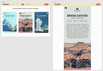
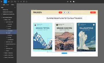
Each year at Viget, we hold an internal "hack-a-thon" called Pointless Corp where we spend a couple of days in teams creating fun and exciting projects. Back in 2020, we had a team that conceived an outdoor hiking app called TrailBuddy, which would help people looking to explore the outdoors, find trails, and track the conditions of said trails. We thought that this might be a great opportunity to spin off the original design and concept and apply some view transitions over top. We leveraged some incredible National Park illustrations from the Works Progress Administration (WPA) (created between 1936 and 1943) as the anchor to our concept. Then, we applied some trail-related backstory and metadata overtop that could be used as the crux for our animation transitions; suddenly, we had a concept which would showcase view transitions nicely.
Adding Motion #
With the static design mostly realized, we wanted to come up with some way to introduce motion to the overall concept so that we could demonstrate persistence. This is where things became a bit experimental as I sought various AI tools which could take in a static image and apply some form of motion to it. I first played around with the tool LeiaPix Converter, which applies motion and depth of field to static images. The effect is pretty incredible! I recommend that anyone who is even slightly interested go try it out, as it's very easy to use and free to try. In this case though, I felt that the effect was a bit too heavy-handed for what we were going for.
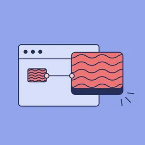
Instead, I landed on a generative AI called Genmo which similarly took in a static image and then added motion to it based on a text prompt. This required some further tweaking — as you can see in the example below, the AI mistook some of the mountains as vehicles and just started merging them into some sort of car-boat-mountain thing.
Fortunately, with some fine tuning, I was able to get it to stay closer to the source material while still providing decent motion. Again, it was pretty fun playing around with this and I would encourage others to experiment with these tools themselves. In the case of this demo, I think it adds a really nice subtleness to the overall aesthetic and conveys the passage of time, something quite befitting of nature itself.
Building the Demo #
At this point, we had all of the pieces together and just needed to build the thing. I'm not going to go into great detail on the general development of the demo itself, but will touch on how to go about applying view transitions within Astro. For those of you who’d like to dig a bit deeper into the code, you can check out the GitHub repository here.
Astro does a really nice job of abstracting a lot of the markup necessary to facilitate the View Transition API. To get started, we enable view transitions within Astro by importing the ViewTransitions routing component and simply add it into the <head> of our layout.
---
import { ViewTransitions } from 'astro:transitions';
---
<html lang="en">
  <head>
    <title>My Homepage</title>
    <ViewTransitions />
  </head>
  <body>
    <h1>Welcome to my website!</h1>
  </body>
</html>
Without doing anything more, you will now have a website that crossfades between sections and for all intents and purposes, might be good enough for some websites.
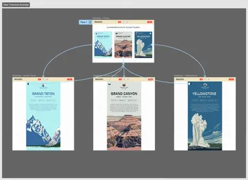
In our case, we want to bind elements together between views so that they make for a more seamless experience. To do that, we will add some more markup to the elements we want to connect. But first, we have to identify what we would like to bind between the scenes. This is where looking at both scenes side-by-side in Figma can come in handy.
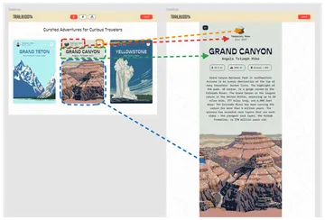
Once we identify which elements would make sense to transition, we can begin to hook them up within the code itself. In this case, I wanted to specifically transition the user info, the add button, the heading, and the image between both views. Let's see what that would look like using the heading as an example.
<!-- index.astro -->

<div transition:name={`card ${slug} heading`}>
  <h1>
    {title}
  </h1>
  <h2>
    {subtitle}
  </h2>
</div><!-- [slug].astro -->
<div transition:name={`card ${entry.slug} heading`}>
<h1>
{entry.data.title}
</h1>
<h2>
{entry.data.subtitle}
</h2>
</div>In this case, I am targeting the parent wrapper containing both the title and subtitle and giving it a property of transition:name followed by a string. I’ll want to be sure to provide an identical transition:name to both instances of my heading, one of which is in the card, and the other of which is on the page itself. Note that all transition pairings need to have a unique name so that the view transition API understands how to connect them. Since the slug is a unique identifier for each collection, I know that the name I provide will be unique to the pairings.
So, with those two heading pairings now bound, they will transition from one view to another with no additional work. That’s it. That’s how simple it really is to get started.
That said, figuring out how best to structure your project and what elements to connect is a whole other challenge, as certain transitions may not work exactly as you hope. For instance, in the case of typography, you’re generally going to be best served outlining the type and serving it up as an image since there can be some peculiarities involved with transitioning text between scenes, especially if the text is changing size.
Another such peculiarity was in relation to the card's background color. As it turned out, the card’s background transitioned better when broken out into its own div, as opposed to using the parent element. These quirks require a fair amount of trial and error, so bear that in mind when working with view transitions yourself.
<article class="relative">
  <!-- card background -->
  <div
    class="card__background"
    transition:name={`card ${slug} background`}
  ></div>

  ...

</article>
In the case of adding persistence to the videos, we simply only needed to change the transition property from transition:name to transition:persist and then provide it a unique name. Similar to the background transition, I actually found that the animation was most smooth when adding a wrapper element to the video and then transitioning that while only handling persistence on the video element itself.
<div
  transition:name={`card ${slug} media box`}
>
  <video
    poster={`${video}-poster.jpg`}
    autoplay
    loop
    muted
    playsinline
    transition:persist={`card ${slug} media`}
  >
    <source src={`${video}.webm`} type="video/webm" />
    <source src={`${video}.mp4`} type="video/mp4" />
  </video>
</div>Once again, it's pretty remarkable just how simple this is for a seemingly complicated transition. In this final example, I also added some custom animations to the content appearing when the card is expanded. If you're interested in learning more about using some other animations or how to create your own custom animations for view transitions, UI Development Director Jeremy Frank's article goes into some more detail about that process.
Designing for View Transitions #
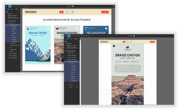
Ok, so that's enough about code. Now, let's discuss what a designer can do to facilitate conceptualizing a view transition mockup from within Figma itself. Some of you who are more familiar with Figma prototyping may be drawing some parallels with Figma's Smart Animate feature, and if so, good on you – because view transitions seem to work remarkably similar to it. With this notion in mind, I wanted to see just how effectively I could get a Figma prototype to be representative to view transitions on the web.
To get started, we need to set up our frames to animate by providing unique layer names to the pairings between scenes, just like we had to do on the web for elements.
Once this is done, we can then begin hooking up the prototype to make it so that clicking on a card will Smart Animate into the new view. I'd also recommend playing around with the easing and duration as it can make quite a difference for the feel of the animation.
This works quite well and is pretty close to what we see happening on the web with view transitions, especially in regards to the heading, avatar, and username. Not bad! Similarly, I found that when transitioning text between scenes, outlining the text resulted in a substantially better transition, something definitely worth keeping in mind when working with these types of animations.
The one place where Smart Animate falls apart a bit is in respect to handling newly introduced content, such as the metadata or introduction text in our demo. To circumvent this, I found that hiding the element on the initial scene in the position you want it to animate from tends to result in a better overall experience. That said, though it works, it feels bad having to introduce fake or hidden markup just to help convey the animation.
I’m hopeful that Figma will continue to refine Smart Animate as view transitions become more mainstream. Nevertheless, it's reassuring to have a functional tool for showcasing and experimenting with them in the design context. This representation effectively demonstrates how view transitions operate on the web and offers a straightforward means to communicate a designer's vision to a developer with minimal design input. Just look at how easily this prototype facilitates the animation. Not bad at all!
Pitfalls #
While there is much to be excited about regarding view transitions, there are some pitfalls to be mindful of based on my own experiences.
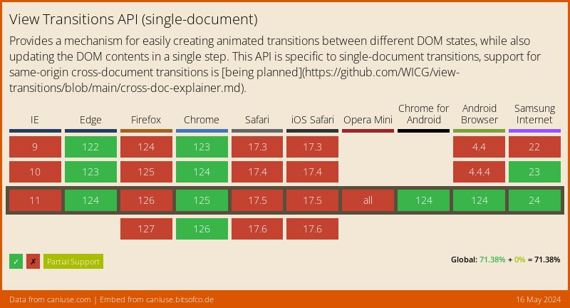
Browser Support #
First and foremost, it’s important to remember that this is very much a cutting-edge browser enhancement. It may be years, if ever, before we have parity in how these transitions work between browsers. It is pretty well supported in Chrome and Edge today, and Safari and Firefox have both signaled their support of the API – but you never know. As it currently stands, it’s a progressive enhancement that can possibly result in some bad experiences in browsers that don’t have as many features supported.
Fortunately, Astro does have some built-in fallback control for its view transition implementation which is another good reason for using view transitions in Astro. And while it doesn't make the experience perfect on unsupported browsers, it does bring them into a bit more of a consistent form with those that are supported.
Devtools Performance Problems #
While working on view transitions in the browser, I could not help but notice how degraded my entire browser experience became while having my devtools opened during a transition. In fact, the experience was so bad that I was not able to properly assess the transition at all without closing the devtools ahead of time. This seems like something which will get patched up in the near future but is definitely a hindrance during development for the time being.
Composition #
When conceptualizing view transitions, I really want to emphasize just how important it is to consider the composition and transition between pages, and the transition on different screen sizes. You might want to avoid having transitions which crisscross elements with each other, or transitions which may appear well out of the viewport. To get the most out of view transitions, you will want to be considerate of what will be in view and how those things will interact with each other. It doesn't need to be perfect, but the best transitions will be those that properly account for all of the dynamics of the content on the screen.
A New Era #
The View Transitions API marks a significant leap forward in frontend development. Astro's native support for this API tears down many barriers and complexities for creating seamless and dynamic page transitions akin to mobile apps. As we've seen, combining motion with static designs can yield captivating results and enhance user experiences. Likewise, designers can leverage their own tools, such as Figma’s Smart Animate, to usher in this new era of web development with relatively little effort. With continued refinement and wider adoption, this API is poised to reshape the landscape of web development as we know it today.