How to Visualize a Series of A/B Tests

Conveying the results of a single A/B test is a reasonably easy task. Any good A/B testing tool will have some basic tables and graphs built in that show a snapshot of how variants within an experiment performed relative to each other. For example, here's how results look in Optimizely.
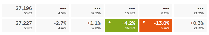
The above table shows two variants competing across five goals with the second variant winning for one (green) and losing for another (orange).
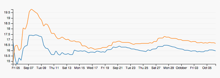
The above chart shows two variants competing for a single goal over a one-month period of time.
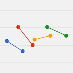
Of course, running only one A/B test doesn't make sense. A rigorous testing and design process should include many design variants and multiple rounds of tests, but this leads to a new problem for us: how can we show clients the results of a series of testing rounds? Our simple solution is to create line-charts that connect variants across multiple rounds of testing.
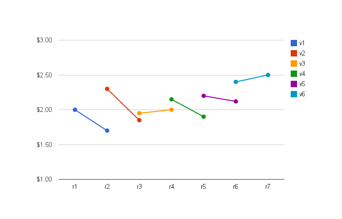
In the above chart, seven rounds of testing have occurred (r1 - r7) with a total of six design variants (v1 - v6). The metric used here is revenue per visitor, but the same chart would work with another metric like conversion rate. With this chart, it is easy to see where the same design variant was run across multiple rounds; for example, v2 (red) competed in both rounds 2 and 3.
But while this chart helps a bit, it is still tough to see if overall progress is being made and if so, the scale of that improvement. One way to help with this problem is to run the original design (v1) through every round of testing over a period of time. This will of course further split traffic in each round, which will mean running rounds longer to get significant results.
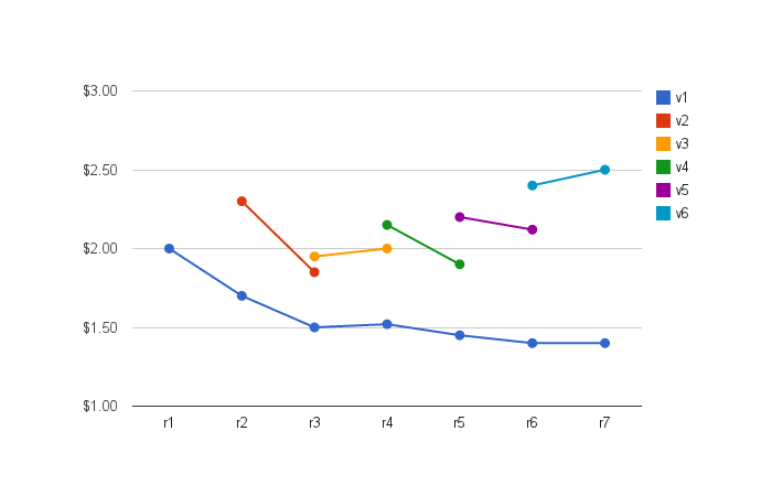
By adding the control (v1), we can now see in this example that revenue per visitor was declining steadily and that the results of v6 are in fact more impressive than the previous chart conveyed.
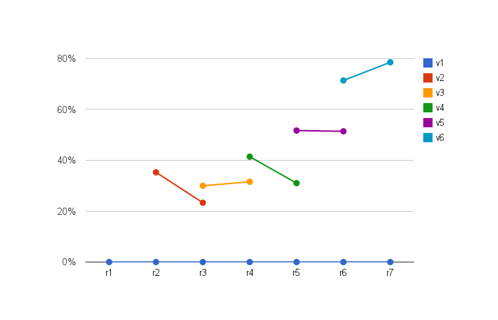
Taking this a step further, we can normalize all the results to the control and get a clear sense of progress (in percent) from round 1 to round 7.
While these charts certainly aren't the only way to visualize a series of A/B tests (nor are they the fanciest), they are simple to produce and, in my experience, easy to explain to clients.