Getting Started with CSS Grid: Three Coding Approaches
Ola Assem, Former Front-End Developer
Article Categories:
Posted on
A step-by-step tutorial on understanding and building two-dimensional layouts using Grid’s flexible syntax.
In part 1 of Getting Started with CSS Grid, we saw when to best use Grid layout, key parts, and how to inspect a build. This tutorial will take all the concepts we covered and put it into practical use by coding a design from scratch using Grid.
Breaking Down a Design into a Grid Layout
In Grid, we can achieve the same layout using different syntax for defining grid columns, rows, and areas. We are going to look at three different coding approaches to achieve the same layout.
First, let's determine the general layout for this articles block which we will be building to illustrate Grid coding approaches. In addition to determining the number and size of grid rows and columns, there are five article items in the block that need to be assigned to grid areas.

When looking at a design layout, we can usually visualize the number of grid rows and columns based on how grid items are positioned. For our design, we can see a 3-column x 3-row grid. Remember that grid lines are always the number of columns/rows plus one. So, for our articles block, both column and row grid lines will start at 1 and end at 4.
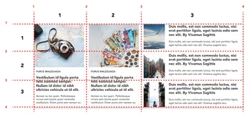
All three rows are equal height. The first two columns are the same width while the third column occupies twice as much space as columns 1 or 2.
Breaking down a design in this manner will make coding Grid layouts infinitely easier since it allows us to see exactly where grid items are going to be located based on grid tracks and lines! Now that we know what our tracks (columns and rows) look like, here are the grid areas that each of the article items will occupy:
- Article 1: Rows 1 ,2, and 3 of column 1.
- Article 2: Rows 1, 2, and 3 of column 2.
- Article 3: Row 1 of column 3.
- Article 4: Row 2 of column 3.
- Article 5: Row 3 of column 3.
In the next section, we will walk through three different ways we can recreate a simple build of the articles block. The three approaches are:
- Grid line numbers.
- Named grid lines.
- Named grid areas.
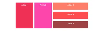
This is the intended final result:
Coding Grid with Flexible Syntax
We will be using the Codepen below for all three coding approaches. I have already set up our markup and base styles. The articles block (.articles-container) is our grid container. All five articles (.article and article-<number>) are our grid items.
Open the pen in Firefox and open the DevTools’ CSS Grid Inspector to get started with the first coding approach.
1. Grid Line Numbers. #
Activating Grid
Anytime we want to use a Grid layout on an element, we give that element (the grid container) the display value of grid.
.articles-container {

   ...

/* Add Grid Properties */
  display: grid;
}
Did you catch what just happened? As soon as we activated Grid, we now have an 1-column x 5-row implicit grid. Nothing changed visually because <li> elements are vertically stacked by default. But if we check Grid inspector, we see in the HTML and CSS panes that the "grid" icon now appears next to the articles-container element. By clicking on either "grid" icons, we can also toggle the grid overlay view which displays the grid lines on top of our build.
This implicit grid is the browser's Grid auto-placement algorithm working since we didn’t explicitly set grid columns and rows. So let’s set them! We will look at three common methods to do so.
Columns and Rows
To set grid columns and rows, use the grid-template-columns and grid-template-rows properties.
The first method is to enter the value for each row and column we want for the grid. Each value defines a column's width or row's height. Each value is separated by a space. Note that you may use as many spaces as you want between values - it will not affect your code - but one space is standard.
.articles-container {

   ...

/* Add Grid Properties */
  display: grid;

 /* Columns & Rows | Method 1 */
  grid-template-columns: 200px 200px 400px;
  grid-template-rows: 100px 100px 100px;
}
The second method is to use Grid's repeat() function. The repeat() function basically creates a pattern by repeating a value as many times as we want it to. The first parameter is the number of times to repeat the pattern and the second parameter is the value to be repeated (repeat( # of times to repeat a value, value )).
.articles-container {

   ...

/* Add Grid Properties */
  display: grid;

 /* Columns & Rows | Method 2 */
  grid-template-columns: repeat(2, 200px) 400px;
  grid-template-rows: repeat(3, 100px);
}
The third method uses Grid’s fr unit or fractional length unit. A fractional unit represents the fraction of a space that a column or row can be occupy inside all remaining space in a grid. In the example below, we are saying, from the available vertical space in the grid, give Columns 1 and 2 equal width tracks and give Column 3 double the space of the first two.
.articles-container {

   ...

/* Add Grid Properties */
  display: grid;

 /* Columns & Rows | Method 3 */
  grid-template-columns: repeat(2, 1fr) 2fr;
  grid-template-rows: repeat(3, 100px);
}
Gaps (Gutters)
We saw how to set up grid gaps in part 1 of the tutorial. Let’s use the shorthand syntax here. Remember, the first value is the grid-row-gap and the second value is the grid-column-gap.
.articles-container {

   ...

/* Add Grid Properties */

   ...

  grid-gap: 30px 18px;
}
Setting Items to Grid Areas
We’re going to look at five different ways to assign grid items to grid areas using grid line numbers. This is where the articles block design breakdown exercise that we worked through earlier becomes super handy! We will use a different method on each of the five article items. Be sure to tick the Display line numbers checkbox under Grid Display Settings in the Grid Inspector to view the grid overlay and see the grid areas come to life in realtime.
1. CSS Grid Properties
Setting grid areas is straightforward. Use the grid-column-start and grid-column-end properties to define the exact column grid line numbers that a grid area will start and end within. Similarly, with rows, use the grid-row-start and grid-row-end properties to define the row grid line numbers that a grid area will occupy.
.article-1 {
    background-color: #ef3155;

   /*  Article 1 takes Rows 1 , 2, and 3 in Column 1.  */
    grid-column-start: 1;
    grid-column-end: 2;
    grid-row-start: 1;
    grid-row-end: 4;
  }
2. Using Shorthand
Grid-row is the shorthand property for grid-row-start and grid-row-end. Grid-column is the shorthand property for grid-column-start and grid-column-end. Shorthand properties take the start line, a forward slash ( / ), then the end line.
article-2 {
   background-color: #fc46aa;

  /*  Article 2 takes up Rows 1 , 2, and 3 in Column 2.  */
  grid-column: 2 / 3;
  grid-row: 1 / 4;
}
3. Grid-area property
The third method uses the grid-area property to define… grid areas! Grid-area always takes row-start / column-start / row-end / column-end values in that order.
article-3 {
  background-color: #fe7d68;

 /*  Article 3 takes up Row 1 in Column 3  */
  grid-area: 1 / 3 / 2 / 4;   /* row-start / column-start / row-end / column-end */
}
4. Using the span Value
When span is assigned as the second value in grid-column-end or grid-row-end, it means we want a grid area to span as many grid row/column lines as the number value we assign it. For example, grid-row: 2 / span 1; is the equivalent of saying, "span one more grid row line after grid row line 2" or grid-row: 2 / 3;.
.article-4 {
  background-color: #fc4c4e;

  /*  Article 4 takes up Row 2 in Column 3  */
  grid-row: 2 / span 1;
  grid-column: 3 / span 1;
}
5. Using the -1 Value
If a grid item will span all the way to the last row or column grid line number, use -1 for your grid-column-end or grid-row-end value. -1 stands for the last grid track line in the grid.
.article-5 {
  background-color: #a04242;

  /* Article 5 takes up Row 3 in Column 3  */
  grid-row: 3 / -1;
  grid-column: 3 / -1;
}
2. Named Grid Lines #
The second way to set grid items is by using named grid lines. Named grid lines work the same way grid line numbers do except that we assign names to grid line numbers. We may use any name we want to name grid lines but it is recommended that the names be semantic and signify the items that will be housed within these lines. For example, Article one is housed inside of grid lines 1 and 2. It makes the most sense to then name grid line 1 :[article1-start] and grid line 2: [article1-end].
But wait! We can also give a grid line more than one name. This is most valuable for grid lines that serve as ending and starting points for adjacent grid areas. For example, grid line 2 is the ending point for Article 1 but also the starting point for Article 2. Grid line 2 can then be assigned the grid line names: [article1-end article2-start]. We can then use grid line names to define grid areas instead of grid line numbers.
Below is a starter example of how to use named grid lines to achieve the same layout for the articles block. A little challenge for you is to complete assigning grid names and grid-area values and replacing the grid line numbers with grid line names. Note that it is possible to mix grid line names and numbers.
Once finished, you may compare your code with this completed example CodePen.
.articles-container {

  ...

  display: grid;
  grid-gap: 30px 18px;

/* Named Grid Lines */
/* Complete naming the grid lines below: */
  grid-template-columns: [article1-start] 200px [article1-end article2-start] 200px 400px;

  grid-template-rows: [row1-start] 100px [row1-end row2-start] 100px 100px;
}

.article {

  ...

}

/* Replace all grid line numbers with grid line names */

.article-1 {
  background-color: #ef3155;

  grid-column: article1-start / article1-end;
  grid-row: row1-start / 3;
  }

.article-2 {
  background-color: #fc46aa;

  grid-column: article2-start / 3;
  grid-row: row2-start / 4;
  }

.article-3 {
  background-color: #fe7d68;

  grid-column: 3 / 4;
  grid-row: 1 / 2;
}

.article-4 {
  background-color: #fc4c4e;

  grid-column: 3 / 4;
  grid-row: 2 / 3;
}

.article-5 {
  background-color: #a04242;

  grid-column: 3 / 4;
  grid-row: 3 / 4;
}
3. Grid Area Names #
The third approach to building Grid layouts uses grid area names. We define grid areas inside the grid-template-areas property. Each line of code inside of grid-template-areas represents a grid row. The number of values (names) inside each row represents the number of columns. To create a grid areas, give each grid cell that is part of the same grid area the same grid area name. Similar to named grid lines, we may name grid areas anything we want, but it is best practice to give them semantic names that signify the contents of the area.
In the end, the names in grid-template-areas should visually represent the grid cells in the grid layout. We basically recreate the layout with grid names. This makes assigning grid items to grid areas a breeze! Simply give the grid-area property for each items its corresponding grid area name.
.articles-container {
  list-style: none;
  margin: 40px auto;
  max-width: 1000px;
  padding: 0;


/* Grid Properties */
  display: grid;
  grid-gap: 30px 18px;

  /* Grid Area Names */
  grid-template-areas: "article1 article2 article3"
                       "article1 article2 article4"
                       "article1 article2 article5";

.article {
  color: white;
  font-family: sans-serif;
  font-size: 24px;
  padding: 20px;
  text-align: center;
}

.article-1 {
  background-color: #ef3155;

  grid-area: article1;
  }

.article-2 {
  background-color: #fc46aa;

  grid-area: article2;
  }

.article-3 {
  background-color: #fe7d68;

  grid-area: article3;
}

.article-4 {
  background-color: #fc4c4e;

  grid-area: article4;
}

.article-5 {
  background-color: #a04242;

  grid-area: article5;
}
Next Steps #
CSS Grid introduces new specifications that allow us to easily build two-dimensional layouts using flexible syntax. In this tutorial, we covered the core concepts that should enable you to start building other design layouts. There are many more amazing Grid features such as redefining layouts using media queries, responsive design without using media queries, and overlapping grid areas that covering here would have made this article 10x as long. So, I encourage you to explore these features and experiment by adding them to the layout we built in this article.
Many thanks to Reneé Cagnina Haynes for the graphics, to Andrew Greeson for the logo, and to Greg Kohn and Henry Bley-Vroman for the review and support.