Getting Started with CSS Grid: Anatomy
Ola Assem, Former Front-End Developer
Article Categories:
Posted on
An overview of when to use CSS Grid, all the parts that make it whole, and how to inspect your layouts.
Note. This article assumes you have basic working knowledge of CSS Flexbox and other general CSS layout properties.
Do you like playing tic-tac-toe? I do! Let’s start a quick game. I claim the O. We know the layout of our tic-tac-toe grid: we need an equally sized 3-column x 3-row grid container. So, the first step is to draw our grid using grid lines. We generally have an idea of where we want to place our X and O items inside the grid container. The second step is to place our items inside the desired grid cells.
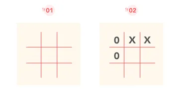
On a very rudimentary level, I like to think about CSS Grid as a tic-tac-toe grid technique for website layout. We first define the columns and rows for our grid container. Then we place items into the desired cells within that grid. But instead of a standard 3x3 tic-tac-toe grid, we can define as many rows and columns and their sizes as needed, make it responsive, quickly place items in the exact areas that we want, and have the advantage of many more efficient layout techniques with fewer lines of code.
When to use Grid?
If you are familiar with other layout techniques - especially Flexbox - you may wonder when to use one layout method over the other. This depends on the layout. You may be presented with a design pattern in which any CSS layout technique would do the job well. Other times, you will want to use the technique that best meets the design layout requirements. There will even be scenarios where you may want to combine layout methods as needed (for example, a Grid item that is also a Flex container). As with all CSS layout properties, a best practice is to utilize properties’ strengths to create a simple, fluid, and customizable layout experience.
In terms of when to specifically use Grid versus Flexbox, there are two things to take into consideration:
- A two-dimensional or one-dimensional layout.
- A layout-first or content-first approach.
Grid is two-dimensional and is best for lining items in two directions (columns and rows) at the same time. Grid is also a great choice for a layout-first approach. This means you would likely want to use Grid when you already know the layout structure since you have to determine your layout first by defining the columns and/or rows, and then place the content in the predefined grid areas.
Flexbox is one-dimensional and can only calculate and line items in one direction at a time - either positioning items in rows or columns, but not both at the same time. Flexbox shines if we want to use a content-first approach where we distribute and make the available space respond flexibly to content.
Anatomy of a CSS Grid
Grid introduces several new concepts and properties. In this section, I will explain the core concepts with accompanying example syntax. Don’t worry if you don’t quite grasp the syntax just yet! In part 2 of this breakdown, we will reinforce these concepts by coding together different approaches to building Grid layouts.
.grid-container {
  display: grid;
}
Explicit and Implicit Grids
In Grid, there is the idea of an implicit versus an explicit grid. An explicit grid is when we explicitly define the size and number of a grid’s columns and/or rows. Also, when we explicitly place elements into a grid cell or area.
An implicit grid is when we do not define the size and number of a grid’s columns and/or rows. This is when we rely on the browser’s Grid’s auto-placement algorithm to decide where to create the grid columns and or/rows and where to place items inside the grid.
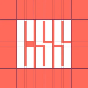
Grid Lines
Grid lines are the vertical and horizontal lines that separate a grid into rows and columns. They are valuable because we can reference them to explicitly place grid items inside a grid. Grid lines are determined by the number of columns and rows that we explicitly set for a grid or those that are implicitly auto-placed by the browser.
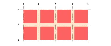
Grid lines are numbered from a container’s edge to edge starting with 1 and ending with the number of columns or rows plus 1. In the example below, there are four columns. As a result, column grid lines start at 1 and end at 5. Similarly we have two rows, therefore row grid lines start at 1 and end at 3.
Grid Track
A grid track is the space between two grid lines. In other words, columns and rows.
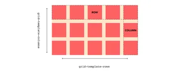
We define the number and size of grid tracks using Grid’s grid-template-columns and grid-template-rows properties.
.grid-container {
  display: grid;

  grid-template-columns: repeat(4, 1fr);
  grid-template-rows: repeat(2, 170px);
}
Grid Gap #
Grid gap (or gutter) is the space between two tracks and is set using Grid’s grid-column-gap and grid-row-gap properties.
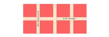
The shorthand CSS property for column-gap and row-gap is grid-gap where we define the grid-row-gap followed by the grid-column-gap. If setting the same size for all gaps, then we can just use one value.
.grid-container {
  display: grid;

  grid-template-columns: repeat(4, 1fr);
  grid-template-rows: repeat(2, 170px);

/*  Setting column and row gaps  */
  grid-column-gap: 40px;
  grid-row-gap: 40px;

/*  Shorthand  */
  grid-gap: 40px;
}
Grid Items
All the direct children of a grid container are called grid items.
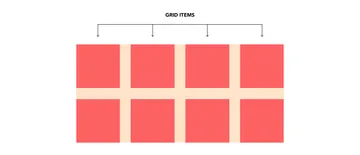
Like Flexbox, any element that is not a direct child of a grid container will not be affected by grid properties. These return to the normal flow of the page. If we want to use Grid on non-direct grid container child elements, we give these elements the display: grid property, creating nested grids.
However, there is exciting progress on the horizon. The CSS Grid Layout Module Level 2 specification now includes subgrid. Subgrid allows grid area and cells to track and inherit the row and column sizings of the parent grid container. This means that soon enough, we will not need to nest grids. Note that this feature is only currently available for testing on Firefox Nightly.
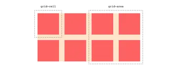
Grid Cell & Grid Area #
A grid cell is the area between four intersecting grid lines and is the smallest area inside a grid that we can place items inside. A grid area is the area that is the result of one or more grid cells. Note that we can only have rectangular or square grid areas. An L- or T-shaped grid area is not possible.
Inspecting & Debugging Grid
There is a little handy tool that makes using Grid (and coding through part 2) very zen: Firefox DevTools’ CSS Grid Inspector. This tool provides a variety of ways for developers to inspect and debug any Grid element.
Open this CodePen in Firefox and follow the instructions before continuing reading.
Welcome back. As soon as we uncomment display: grid; we see in the HTML and CSS panes that the grid-container element has a “grid” icon next to it.
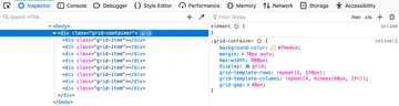
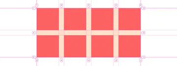
Clicking on the HTML and CSS panes’ grid icons toggles on and off a grid overlay on top of the grid element. The overlay displays the grid tracks and lines.
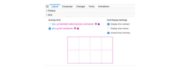
Overlay Grid allows you to also toggle the grid overlay by ticking the checkbox next to the grid element. This is especially useful if you have more than one grid element. Under Grid Display Settings, you have the option to display grid line numbers and extend them infinitely. If you are using grid names to set the location of your grid items, you can also toggle displaying area names.
Now that we have set the stage, we will examine three Grid approaches to coding the same layout in part 2!
Many thanks to Julia Thummel for the graphics, to Andrew Greeson for the logo, and to Greg Kohn and Henry Bley-Vroman for the review and support.