Going Fullscreen: Scale and Define Focal Points for Responsive HTML5 Video

This January, we teamed up with Dick's Sporting Goods to launch Gear in Action, a digital lookbook featuring products for the 2014 Baseball season. As you can see on this page of the finished site, video of the products in action displays at full height and width. This occurs regardless of browser size, and without distorting the video's original aspect ratio.
Because video is central to the site experience, video quality was a top priority. We couldn't risk cropping out critical subject matter, but we still needed video with a 16:9 aspect ratio to fill the screen, even on portrait tablets like the iPad.

Techniques
For reference, snippets below are based on the following markup and styles. We also created a demo site for previewing each technique.
 <body>
 <video id="player" autoplay preload data-origin-x="20" data-origin-y="40">
 <source src="video/pitcher.mp4" type="video/mp4">
 <source src="video/pitcher.webm" type="video/webm">
 </video>
</body>
 body {
 height: 100%;
 margin: 0;
 overflow: hidden;
 position: absolute;
 width: 100%;
}
Pure CSS
One of the first fullscreen solutions we tried uses pure CSS. It sets the video min-height and min-width to 100%:
 video {
 min-height: 100%;
 min-width: 100%;
 position: absolute;
}
This technique is simple and works fairly well, but sizing can be an issue. When the browser viewport is smaller than native video dimensions, the video stops scaling down. In our case, this led to undesired cropping.
Transform: scale
CSS transforms are capable of doing a lot of things. But can videos scale? The answer is yes.
 video {
 height: 100%;
 width: 100%;
 transform: scale(1.2);
 -webkit-transform: scale(1.2);
}
This solution is more flexible, but we needed Javascript to determine the right scale values for different browser sizes.
 // Basic 'gist' only. See demo source for more.
var scale = 1;
var videoRatio = 16 / 9;
var viewportRatio = $(window).width() / $(window).height();

if (videoRatio < viewportRatio) {
 // viewport more widescreen than video aspect ratio
 scale = viewportRatio / videoRatio;
} else if (viewportRatio < videoRatio) {
 // viewport more square than video aspect ratio
 scale = videoRatio / viewportRatio;
}
Transform-origin
Scaling with transforms is an improvement, but what if video content isn't always perfectly centered?
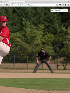
You may have noticed the demo focuses on a pitcher in his throwing motion. Unfortunately, the pitcher is pretty far from the middle of the video. This isn't very noticeable at wider aspect ratios, like a typical laptop screen or monitor, but we start to lose content as the screen becomes more narrow. On an iPad's portrait orientation (16:9 video on a 3:4 screen), we miss out on a lot of details:
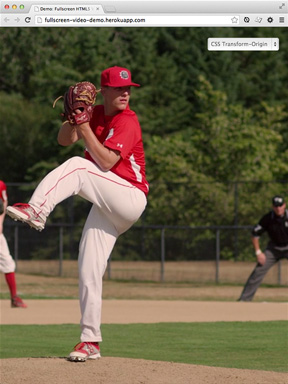
If not explicitly set, the default transform-origin is the element's center, 50% 50%. The scale applies like a center crop or zoom. To get the pitcher back in focus, we needed to update the transform-origin property.
 video {
 transform-origin: 20% 50%;
 -webkit-transform-origin: 20% 50%;
}
This gets the pitcher back in focus.
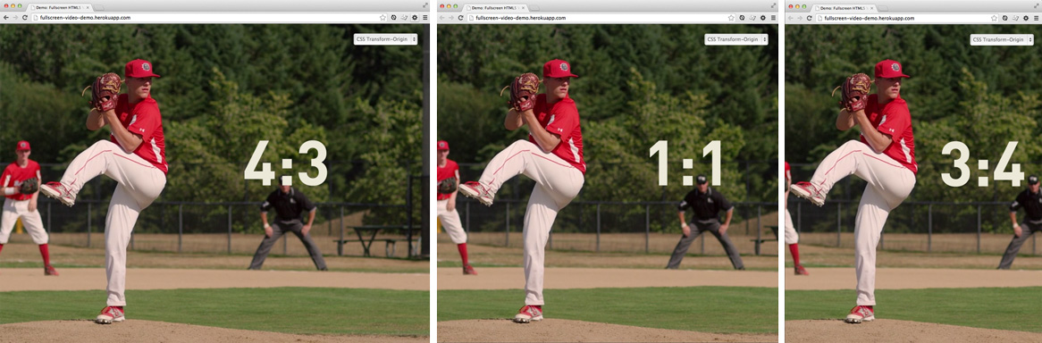
The transform-origin is extremely useful because the effect is relative to the transform itself. Note the difference in these screenshots, all with the same transform-origin applied.
Don't forget to check out techniques (and code) for yourself in the demo. If you're using fullscreen video in your projects, we'd love to hear about it in the comments.