Figma Tips For Non-Designers, Part 2: Components, Styles, Frames and More
Mindy Wagner, Former Design Director
Article Categories:
Posted on
Not sure where to get started? I'll walk you through the most-used features in Figma.
In Figma Tips For Non-Designers, Part 1, I dug into Figma’s structure and UI to help you find your way around. In Part 2, I’m going to introduce the key features that make Figma so powerful.
Components
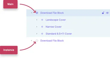
Components are UI elements that can be reused across your design file and even shared with other files. Main is the initial or “parent” component. Instances (copies) of the Main component will update based on changes to the Main. The diamond icon used in the layer palette indicates whether something is a Main or Instance.
Some properties, like text and color, can be overridden in Instances. Others, like layer order, positioning, and constraints, cannot. I create Components for nearly every element in my pattern library, but they’re especially useful for things like headers, footers, navigation, icons, buttons, etc. Components can be nested, so for example you might have a Button component nested inside a Header component. Components can also carry prototype links. Done well, they're very powerful.
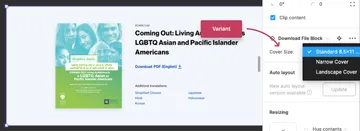
Variants
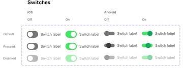
Variants is a newer feature that allows you to make multiple forms of a single Component. Set up right, Variants make it easy to do things like swap out a primary button for a secondary button or switch which icon you’re using on the fly. For example, one button Component might have 40 button Variants capturing alternative sizes, colors, stroke weights, labeling, icons, etc. Variants make organizing and swapping elements simple. They’re great for UI elements that need various states, such as button states, header states, headline types, form notification banners, etc.
Styles #
In Figma, designers can define Styles for Grids, Color, Fill, Text, Drop Shadows, Insets, and Blurs. These Styles are shared across all Files in the Project. The global Styles list is easily accessible by clicking on an empty spot in the project canvas or clearing the actual selection [ESC]. It’ll show up in the Design Panel on the right.
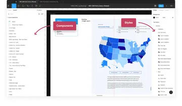
Libraries
Libraries are a collection of all the Components and Styles defined in a project. Figma automatically creates one for every project. If a designer is intentional about how they use Components and Styles, it should be a comprehensive parts kit / style guide that can be shared across files. It works similar to the way design tokens and a parts kit work in code. The value of a Library for large projects is hard to overstate. I recommend that our designers create and use a well organized Library for any medium or large size project and any project that may have a future “phase two” or significant extension. It’s easy to develop Components and Styles for a Library as you go, and incredibly inefficient to create it at the end of a project. (Trust me, I learned this the hard way.)
Groups #
Groups [⌘ + G] are primarily organizational elements. They allow you to combine multiple layers together. The elements can then be resized or moved around as a group. The group bounds are determined by the elements in it.
I use Groups for:
- Grouping objects I want to move around together
- Grouping similar objects to keep my layer panel organized
- Grouping objects I want to scale together
Frames #
Frames [⌘+Opt+G] are structural containers for other elements. Frames are a canvas or “artboard” with constraints. You can (and should) nest frames. The frame bounds are adjustable, and resizing a frame does not necessarily resize elements within it. Elements within the frame will follow the rules set up in “Constraints”.
I use Frames for:
- Page comps
- Page blocks
- Things that need a bounding box for output, like icons
- Any Component (As soon as you make something a Component, it is automatically given a Frame)
Hopefully this is a helpful kickstart to help you feel more comfortable and competent in Figma. With all the new features launched at Config, I see another post in my future!
If you haven't already, check out Figma Tips For Non-Designers, Part 1: Structure & UI Basics