Designing for Accessibility: 3 Things To Watch For
Mindy Wagner, Former Design Director
Article Categories:
Posted on
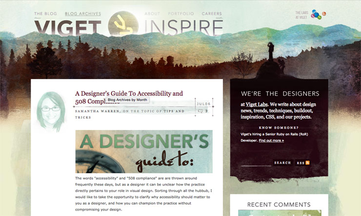
Accessibility has long been an interest for our designers. Back in 2009, Viget design team alum Samantha Warren wrote a post about designing for accessibility right here on the Inspire blog. It remains one of our most trafficked blog posts, and lately we’ve been making an even bigger push to design with accessibility in mind so it's worth revisiting. A lot can change in 6 years… for proof, we need look no further than the Viget blog design circa 2009:
Awareness about accessibility has certainly improved in the last 6 years. At Viget, it's something we're now constantly thinking about and working to improve on every site we launch. And much like responsive design, it's easiest to plan for it from the beginning - which is why every designer should get familiar with the guidelines.
I recently worked on a large-scale (soon to be launched) content site with Viget Front End Developer Jeremy Fields. He’s a very vocal champion of accessible design. He made an interactive version of the Web Content Accessibility Guidelines (WCAG) so that you can easily filter to see which guidelines are most important for designers. He speaks on the subject both internally and externally, writes open source code to improve accessibility, and started Viget’s a11y Slack room to keep us all up to date on best practices. So when I heard we were paired up, I knew I’d be learning a lot.
The first thing he had me do was reacquaint myself with the WCAG guidelines. I spent some time sorting out what each level of compliance required, and what the key differences were. There are three levels of compliance - A, AA, and AAA. They build on each other, meaning Level A requirements are the most basic and crucial guidelines to meet and AAA guidelines are what some might consider “nice to haves”.
After doing my research, I asked a bunch of questions about how Jeremy and other Front End Developers on our team interpreted the guidelines. Some of them feel pretty vague without additional context. How to meet these 3, for instance, was not very clear to me upon first read:
- Guideline 1.2 - Time-based Media: Provide alternatives for time-based media.
- Guideline 2.2 - Enough Time: Provide users enough time to read and use content.
- Guideline 2.3 - Seizures: Do not design content in a way that is known to cause seizures.
Is parallax considered time-based? What about animations? What are the recommended alternatives? What is “enough time” to read something, and how do we measure that? And, oh my, what content causes seizures?!
Jeremy gave me a lot of great follow-up information and walked me through options for some of the biggies (like that time-based one) until eventually I felt like I understood them all. Here are my three biggest takeaways:
1. Contrast is Key
Guideline 1.4.3 - Contrast (Minimum) - “The visual presentation of text and images of text has a contrast ratio of at least 4.5:1”
This one has to be considered in two key places: color contrast between text and background, and the contrast of text over images.
Testing color-on-color combinations isn’t hard - there are plenty of tools that will do the math for you. I used this one: http://jxnblk.com/colorable/demos/text/ There are plenty more listed in Tom’s post on contrast. But when you start your first few designs, you’ll find yourself checking new combinations pretty frequently.
For me, hitting the ratio meant letting go of my “this text isn’t as important, let’s keep it light” shades of gray, making most of my buttons a few shades darker or lighter, and finding different ways to maintain hierarchy and simplicity in my layouts. Light gray text has become a major part of the online aesthetic because it’s the simplest way to make layouts less heavy… but that lighter look comes with a cost, so it’s time to drop the habit.
Farewell, my subtle friend...
Text over images is a more difficult beast to tame. The trend for big hero images with overlaid headlines is not going away anytime soon, but making sure that text is readable and meets contrast standards can be tricky. There are a few ways to avoid trouble, aside from bucking the trend and putting a solid background behind all text.
One simple solution is to put a dark overlay on images with white text over them, avoiding the “light background white text” washout phenomenon. (Or a light overlay on images with dark text over them.)

If that doesn’t work - say, for instance, you want the vividness of the images to come through - a gradient behind the text or a drop shadow on the text can also ensure the necessary contrast.
A combination of both a dark overlay and a slight drop shadow is usually my preferred method - that way images keep their life and color and your drop shadow can be more subtle.

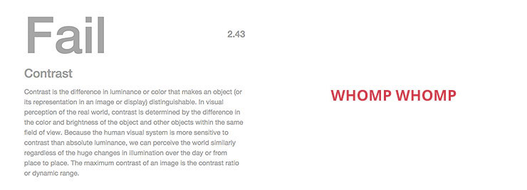
One additional consideration for addressing contrast, although not specifically named in any guideline, is in the typeface you choose. We all love the look of a super thin sans serif (thanks, Apple) but for someone with low vision, they can be impossible to read at smaller sizes or when applied over an image.
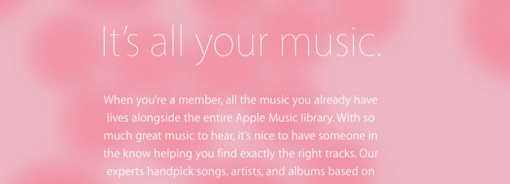
Apple Music's fail: thin text and a light background would make this hard to read for people with vision impairments.
The same applies for text that is too blocky or condensed, which can be just as unreadable as text that is too thin. Let common sense (and maybe a squint test) be your guide.
I’m not gonna lie - designing with proper contrast was hard for me to get used to at first. But as your palette and your visual system shape up, you’ll find yourself battling contrast issues less and less.
2. Don’t Rely on Color To Convey Information
Guideline 1.4.1 - Use of Color - Color is not used as the only visual means of conveying information, indicating an action, prompting a response, or distinguishing a visual element.
In simple terms, this just means you should always have a backup visual indicator for people with various types of color blindness. Sounds easy enough, but this one can add tension when you’re also trying to keep the UI clean and free of distractions.
For example, I find that an overload of underlined links can make text more difficult to read. I sometimes opt to forgo the underline as my second indicator in favor of an alternate method, such as bolding the text. I always keep the underline on hover since it is the most universally recognized cue that something is indeed a link.
This “two indicators” issue often comes up in forms and alerts as well. If you’re indicating a failed form field through color (for instance, making it red) make sure there’s also an error icon, text label, tool tip, or some other visual indicator so that someone who is colorblind can still see what the problem is.
Here’s an example of a quick change that would improve accessibility. Below, a hotel rental form showing two states - one where the dates were available, and one where they are not.
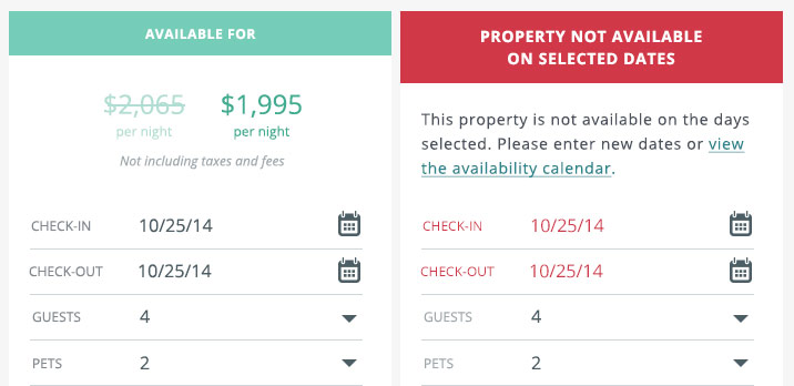
To someone with average vision, the problem area is quick to see. The form has visually changed from green to red, and the failed fields are red. Without reading any of the text, it's still easy to see what needs changing.
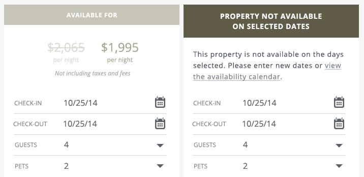
The image above is what the form states look like to someone with protanopia color blindness. The point of failure is less clear and requires reading.
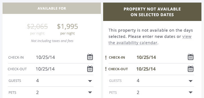
By simply adding an icon and bolding the text, a color blind user could still easily see where the errors are:
3. Be Mindful of Animations, Parallax, Videos and Other Fancy Things
Guideline 1.2 Time-based Media: Provide alternatives for time-based media.
Guideline 2.2 Enough Time: Provide users enough time to read and use content.
Guideline 2.3 Seizures: Do not design content in a way that is known to cause seizures.
Like I said, these feel vague. I didn’t really pay much attention to them until Jeremy pointed out that a plan I had for an animated text headline was going to need some additional thinking. For example, someone with dyslexia, ADHD, short term memory problems or cognitive delays that affect reading comprehension might find it hard to read the headlines before they faded out, even if I thought they were moving slowly. Guideline 2.2 says you must provide users “enough time to read and use content”. Since “enough time” could be vastly different for some users, we decided to include a simple control that would allow the user to stop and start the animation. When the animation is stopped, all of the text will be shown at one time on a static, animation-free panel.

In the case of time-based media like audio and video, the aim is to “support all senses” by accounting for someone with a hearing or vision impairment. The main design task is just to plan for how a user will find the alternative formats. A video might require a transcript, for instance, and need a text link below it. It might also need captions, and space for these may need to considered in the lower third. Ambient background video and audio does not require an alternative presentation. An interesting example of of an alternative format is this Stevie Wonder music video, which has both the music track and a second audio track where Busta Rhymes describes the accompanying visuals.
And as for those seizures… WCAG states that “Individuals who have photosensitive seizure disorders can have a seizure triggered by content that flashes at certain frequencies for more than a few flashes.” This site, for instance, makes even me feel dizzy: http://awesome.ai/ In simplest terms, you should restrict any flashing element to less than 3 flashes per second. Or, you know, just skip the flashing altogether, because I can think of very few cases where this effect would be enjoyable to anyone!
Across the board, the main thing to consider with multimedia elements is how you can give the user maximum control over them.
Go Forth...
Those were the most critical design considerations I ran into as I worked through on my latest project. And as you can see, they’re all pretty easy to address or avoid. Meeting guidelines doesn’t have to mean a huge sacrifice for designers. We’re all very skilled at designing within constraints, and often it’s those constraints that push us toward more creative solutions.
Sharing time - do you have examples of beautiful sites that meet the WCAG standards? If so, post below!