Designing Beacon: Maintaining Organization at Scale

Tyler Berg, Former Senior Product Designer, and
Matthew Mocniak, Former Senior Product Designer
Article Categories:
Posted on
How our team organized the design production for Project Beacon, an app that significantly increased the COVID-19 testing operations for the state of Massachusetts.
Through the COVID-19 pandemic, we’ve learned that moving quickly and being flexible in healthcare processes can make a huge difference in decreasing the spread of infection – and increasing the availability of testing. As our team was building Project Beacon, an application that helped the state of Massachusetts drastically increase their testing operations, we applied this same mindset of quick iteration and adjusting on the fly to our design process.
In this article, we’ll detail some of the methods that worked well for us in managing and organizing the design production for a large client-side web app. We’ll also discuss some of the challenges we faced designing an app at scale in the public health sphere, in the midst of a global pandemic.
Sidebar Revision
We use Figma for all of our UI design at Viget for a variety of reasons – its smooth collaboration, prototyping tools, and intuitive structure keep us organized as a team and moments away from working together. File structure is important on every project, but even more so on a project of this size. Because there could be multiple designers, developers, project managers and members of the client team working in or viewing the file at any point in time, the file needed to be organized enough (in a way that was maintainable for future work), but not so rigid that it inhibited an efficient workflow.
The original design file had a dedicated page for each designer, but lacked a clear space for files to go when they were complete. We had a production page for designs that were coded, but some designs required additional changes after they were live... where would those go? We were also in need of a shared, collaborative page to iterate on ideas together. Some of our design meetings are structured to let us work side by side in real time, so having a dedicated space to work together was something we wanted to include.
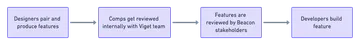
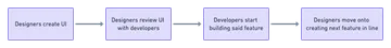
We simplified the pages in our Figma file to focus on an approval-based workflow, while providing individual and collaborative spaces for experimentation. The project was very agile in nature, but there was still a chain of feature approvals.
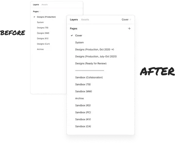
System
This is where our reusable components live. When a component or piece of a user flow gets used more than a few times, we take the opportunity to convert them to a Figma component.
Sandboxes
Each designer on the project gets their own sandbox. There is also a collaborative sandbox page for working on ideas together. This is where a lot of the user flows take shape before being finalized for review.
Ready for Review
Once a design or workflow is ready for an official review with comments, we move it to the Ready for Review page. This page is kept to only what is ready for review at the time to prevent things from looking too busy. Project managers and stakeholders are invited to leave Figma comments directly on this page.
Production
Once we have finalized the design after receiving feedback, we move the artboards to the production page. Anything in the production page is considered ready for development and should not receive any further updates. (We have two production pages because we wanted to make sure our developers’ access to existing designs was not interrupted). We took a snapshot of designs up to a certain date and made that its own page.
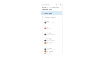
To avoid slowing down the file’s performance, we routinely used Figma’s version control to archive old, irrelevant work that would slow down the file.
Adding In-Line Documentation
Since the natural pace of our design process tended to move in front of development, there were situations where the development team wouldn’t be ready to review new design features yet, because they were working on building the previous ones. And once they were ready to build new features, how would they know where to find the most recent version in the design?
These different workflow streams sometimes led to confusion and overlapped work. To alleviate this, we created a documentation header that now accompanies each artboard. Documentation headers provide additional context for the designs below them, with support for things like:
- Design status
- The title of the design
- A brief description, if it's needed
- A link to a respective GitHub ticket
- When the design was created
For now, we're sticking with 3 design statuses:
- Yellow / Work In Progress: Early designs undergoing iteration. Not ready for official review, but may be included in early chats or meetings about a particular feature.
- Blue / Under Review: Ready for comments from our project managers or stakeholders. These designs should be in good enough shape to present as-is, before the final touches are made.
- Green / Ready to Develop: No other design changes expected, the specs should be in their latest form. In other words, these designs are ready to go.
If you would like to add an extra layer of documentation to your own design workflow, you can find a copy of this documentation header component available on the Figma Community.
Additional Redline Documentation
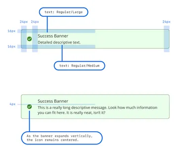
In addition to the in-line documentation, we sometimes include redline documentation to show specific examples of components or user states. These extra pieces of documentation help us describe what is going on with a design and its intended outcome. We also call out specific spacing when it matters.
Figma provides a code inspector tool that translates design elements directly into CSS, but we found that applying specific annotations directly onto the comps was a clearer way to document our work and leave nothing open to interpretation.
We’d love to hear from others on how your team organizes your Figma projects and files on large projects – our methods have worked so far, but they’re a work in progress and can always be improved.