How We Approach Native App Design at Viget
Matthew Mocniak, Former Senior Product Designer
Article Categories:
Posted on
Take a behind the scenes look at how we approach the initial design phase of native app development at Viget: starting with wireframes and working toward design components.
We've spent the past two months working on Scurry: one of this year’s Pointless Corp projects that aims to bring the traditional scavenger hunt into the comfort of your own home (and your city, once it reopens).
We love to share these internal projects because it gives us the opportunity to provide a glimpse into our workflow and how we collaborate as a team that we don’t always get to share when we work on client work. In this article, we'll go over our design process and how we move from an early concept to a final, handoff-ready design.
Scurry builds on initial progress made during Pointless Weekend, our company-wide hackathon where we dedicate a Friday and Saturday to working with new technologies and dreaming up products and services. (Check out our past Pointless Projects here.) We had a good starting point: a rough collection of screens we knew we needed to include for the final application, but little in terms of a visual direction or theme for how the game was played.
This is where our design process began: identifying the key screens from the original design we wanted to keep, and which ones to discard. Once we had narrowed down the screens, the next step was to think about the plethora of user states and instances of that screen — something we didn’t have much time to focus on during Pointless Weekend. From a user experience perspective, this was my main focus this project sprint.
As I worked on the wireframes, I shared progress with our dev team to get a feel for what would be feasible during the sprint and what should be pushed to a future release. At the same time, I met with our designers to nail down the visual style for Scurry. Should its visual style feel arcady? Should it harken to a visual style of 'Ready Player One'? What about a sharp, neon color palette that would feel right at home in the world of Bladerunner?
Yes.
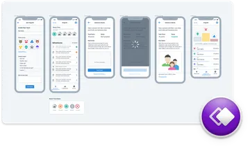
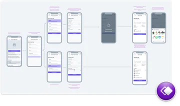
The screen mockups I created in Whimsical anchored these discussions. Because we had wireframes, we were able to think about the app in the context of the key screens that were required for the MVP release. This helped us identify repeatable components early in the design process around which we could establish a shared, visual theme.
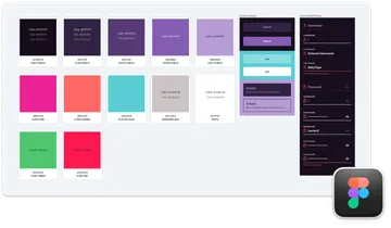
Once our team locked in the visual theme, we held 30-minute meetings two to three times per week to talk about the handoff between UX and Design. Being able to reference wireframes and the high-fidelity progress helped us visualize what was left for us to work on. It was also during these meetings that we explored a unique visual style for temporary configuration modes in the app to make them stand out from the other screens.
Our workflow was refined to the following:
- Create initial wireframes in Whimsical
- Check-in with the development team to test the feasibility of the wireframes
- Incorporate the Scurry visual style for those wireframes
- Review the usability and how each screen fits together in the final app design
- Prepare the handoff to developers
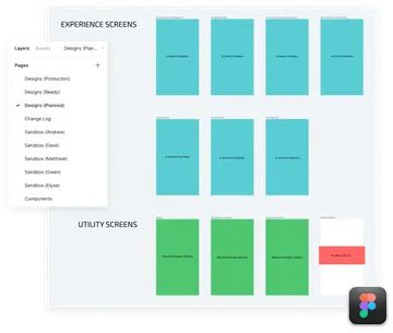
Figma helped us facilitate this entire workflow. Each team member involved with the app design had their own sandbox page to work on their assigned screens and test out new ideas and interactions. We listed all key screens in a Designs (Planned) page to visualize our progress. As team members completed designs, they moved the artboards to the Designs (Ready) page.
We've written about this Figma workflow before, and it proved to be successful, yet again, during the development of Scurry.
Even though we are near the end of our Scurry design sprint, we plan to continue adding ideas and use this Figma file as a reference for features we would like in the future. It works as our source of truth and makes it easy for other team members to jump on the project if needed.
How do you organize files on your team? Do you share everything from the beginning, or do you start in silos and work toward a shared repository? At what point in the creative process does your team sync up? Let us know in the comments!
And if this type of workflow sounds interesting to you and you’d like to talk more about it, you can reach out to us or consider hiring Viget for your next project.