Color Outside the Lines with Partial Circular Gradient Image Borders
Jeremy Frank, Former UI Development Director
Article Categories:
Posted on
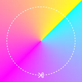
Using a conic-gradient background and a radial-gradient mask, you can achieve stunning partial gradient borders that give your images a distinct style.
Applying gradient borders to elements is fairly straightforward these days with CSS border-image and color functions. However, applying the effect to other use cases might require other approaches. For example: applying a simple border-radius, applying the effect to an image with padding, or creating a partial border that does not fully surround an element.
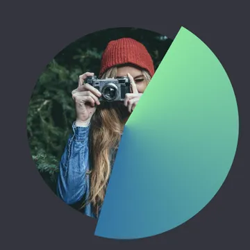
The design treatment below, for example, has all of the above constraints. The border is offset from the image and it only partially surrounds the image.

To replicate this effect in code, we’ll need to do several things:
- Use a wrapper element
- Apply a conic-gradient background to a pseudo element
- Apply a radial-gradient mask to the pseudo element
Use a wrapper element
Since the effect requires the use of a background with a mask (described below), we’ll need to use a wrapper element.
<div class="img-wrapper">
  <img src="https://picsum.photos/id/823/720" width="360" height="360" alt="">
</div>
.img-wrapper {
position: relative;
padding: 30px;
}
img {
border-radius: 999px;
display: block;
}
Apply a conic-gradient background to a pseudo element
The conic-gradient CSS function creates an image consisting of a gradient with color transitions rotated around a center point. This is exactly what we need for starting the border at one color and transitioning it to another. Applying the background directly to the wrapper element could work, but to achieve the gap between the image and the border, we need to apply a mask. Since the mask would also conceal the image, we need to make sure the conic gradient background is applied to a pseudo element instead.
.img-wrapper::after {
  content: '';
  border-radius: 100%;
  display: block;
  position: absolute;
  top: 0;
  left: 0;
  height: 100%;
  width: 100%;
  background: conic-gradient(
    from 30deg,
    #6be89b,
    #0076a5 46%,
    transparent 46%
  );
}
This conic-gradient function is simply setting the gradient’s start position (30deg), starting color (#6be89b), ending color (#0076a5) and position (46%), and finally the color of the remaining portion of the gradient (transparent).
Apply a radial-gradient mask to the pseudo element
Finally, we apply a radial-gradient CSS function as a mask to the pseudo element containing the conic gradient background.
.img-wrapper::after {
  /* ... */
  -webkit-mask: radial-gradient(
    farthest-side,
    transparent calc(100% - 3px),
    #fff calc(100% - 2px)
  );
  mask: radial-gradient(
    farthest-side,
    transparent calc(100% - 3px),
    #fff calc(100% - 2px)
  );
}
This radial-gradient function simply draws a thin stroke as the image mask around the circumference of the circle. Note that as of this writing, the -webkit prefix is required in Chrome and Edge.

And there you have it – an incredibly unique stylized border achieved with a combination of CSS functions and masking!