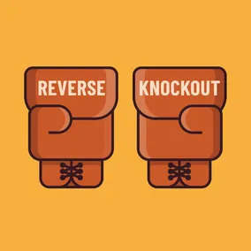
Reverse Knockout Text Mask Effect with SVG
Jeremy Frank, Former UI Development Director
Article Categories:
Posted on
A simple approach for knocking-out portions of an image with text.
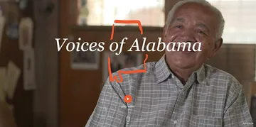
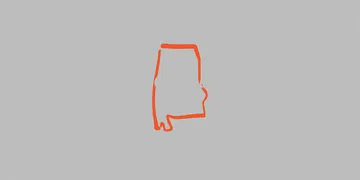
A recent project called Voices of Alabama used a state outline and text overlay which knocked out the outline around the edges of the text characters (shown below). The solid shape of this graphic combined with text make it a prime candidate for SVG! Here’s how it works.
First, the basic shapes
Fortunately, this graphic only requires a text element and two path elements for the state outline (path data omitted for brevity).
<svg xmlns="http://www.w3.org/2000/svg" viewBox="0 0 1000 400" width="1000" height="400" preserveAspectRatio="xMidYMid meet">
  <g>
    <path fill="#ee572f" d="..."></path>
    <path fill="#ee572f" d="..."></path>
  </g>
  <text transform="translate(500, 200)" text-anchor="middle" font-size="100" font-family="Georgia" font-style="italic" fill="#ffffff">
    Voices of Alabama
  </text>
</svg>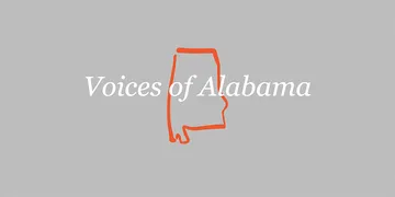
Second, the Mask
When SVG <mask> elements are applied to another shape, they hide by default, the objects that they are applied to. We need to essentially reverse this to show by default, then choose which areas to hide. We’ll use a simple <rect> shape with a white fill to show the entire area, and a <text> element with a black fill to hide, or knock-out that area.
<svg xmlns="http://www.w3.org/2000/svg" viewBox="0 0 1000 400" width="1000" height="400" preserveAspectRatio="xMidYMid meet">
  <defs>
    <mask id="text-mask">
      <rect width="100%" height="100%" fill="#ffffff"></rect>
      <text transform="translate(500, 200)" text-anchor="middle" font-size="100" font-family="Georgia" font-style="italic" fill="#000000">
        Voices of Alabama
      </text>
    </mask>
  </defs>
  <g style="mask: url('#text-mask')">
    <path fill="#ee572f" d="..."></path>
    <path fill="#ee572f" d="..."></path>
  </g>
  <text transform="translate(500, 200)" text-anchor="middle" font-size="100" font-family="Georgia" font-style="italic" fill="#ffffff">
    Voices of Alabama
  </text>
</svg>
In the image below, but you can see along the left and right sides, where the black text has hidden parts of the shape (with the original text element above hidden):
Finally, the Knockout
We need to extend the bounds of the text mask, so that when we add the visible text element back, we can see both the text and the knockout effect. There are two ways to achieve this.
SVG Stroke
Normally, a stroke would not work for a “glow” effect since the stroke draws on both the inside and outside of a shape. However, since the text element within the mask is not actually visible, it doesn’t matter where the stroke sits.
Text mask with stroke applied:
<svg xmlns="http://www.w3.org/2000/svg" viewBox="0 0 1000 400" width="1000" height="400" preserveAspectRatio="xMidYMid meet">
  <defs>
    <mask id="text-mask">
      <rect width="100%" height="100%" fill="#ffffff"></rect>
      <text transform="translate(500, 200)" text-anchor="middle" font-size="100" font-family="Georgia" font-style="italic" fill="#000000"
        stroke="#000000" stroke-width="40" stroke-linejoin="round">
        Voices of Alabama
      </text>
    </mask>
  </defs>
  <g style="mask: url('#text-mask')">
    <path fill="#ee572f" d="..."></path>
    <path fill="#ee572f" d="..."></path>
  </g>
  <text transform="translate(500, 200)" text-anchor="middle" font-size="100" font-family="Georgia" font-style="italic" fill="#ffffff">
    Voices of Alabama
  </text>
</svg>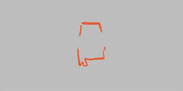
With the visible text element back in:

feMorphology Filter
Another option is to use the feMorphology filter primitive instead of a stroke. The feMorphology filter works to apply a morphing effect to an object, modifying its shape. In the case of text strokes, feMorphology is a way that enables us to add an outline without affecting the size or thickness of the original text in the process. Codrops has a great article on the feMorphology filter that digs into this approach. Essentially, the feMorphology filter is set to use the dilate operator with a radius, and gets applied to the text within the mask.
<svg xmlns="http://www.w3.org/2000/svg" viewBox="0 0 1000 400" width="1000" height="400" preserveAspectRatio="xMidYMid meet">
  <defs>
    <mask id="text-mask">
      <rect width="100%" height="100%" fill="#ffffff"></rect>
      <text transform="translate(500, 200)" text-anchor="middle" font-size="100" font-family="Georgia" font-style="italic" fill="#000000"
        filter="url(#dilated-text)">
        Voices of Alabama
      </text>
    </mask>
  </defs>
  <filter id="dilated-text">
    <feMorphology in="SourceAlpha" result="DILATED" operator="dilate" radius="20"></feMorphology>
  </filter>
  <g style="mask: url('#text-mask')">
    <path fill="#ee572f" d="..."></path>
    <path fill="#ee572f" d="..."></path>
  </g>
  <text transform="translate(500, 200)" text-anchor="middle" font-size="100" font-family="Georgia" font-style="italic" fill="#ffffff">
    Voices of Alabama
  </text>
</svg>
It’s important to note that while this approach looks nearly identical, it does not work in Firefox at the time of this writing.
Accommodating Long Titles
For cases where the graphic needs to display multiple lines of text, we have to set text in a slightly different way, since text elements in SVG do not wrap the same way they do in HTML. With SVG, your text element must contain <tspan> elements for each row of text.
<text font-size="72" font-family="Georgia" font-style="italic" fill="#ffffff">
<tspan x="0">
<tspan x="0">Ben Moore Hotel & Malden</tspan>
<tspan x="0" dy="72">Brothers Barber Shop</tspan>
</tspan>
</text>The Finished Product
Summary
SVG masks are great for showing an image in a non-square format, but they are just as good, if not better, for knocking-out portions of an image with text. Reversing the colors in the mask and adding a simple stroke is all it takes! If you’ve seen this knock-out effect in the wild, let me know in the comments below.