Behind the Redesign: pow wow (100% More Wow)

pow wow's new design, informed by three years of research and feedback, is better (and cuter) than ever.
We designed and built pow wow here at Viget for anyone who needed an easier way to coordinate appointments. In pow wow, you create a calendar with blocks of time when you’re available, then send it out to everyone you have to meet with. They pick and choose from your time blocks and add themselves to your schedule. It was a fun tool to design back in 2013, and even more fun to redesign and just recently relaunch. (Read about the all-new pow wow in our case story here!) When we first launched pow wow in 2013, the design was fun, but more than a little stiff. It wasn’t responsive and it didn’t easily adjust for the new features and functionality we wanted to add. So when it was time to update the back end of pow wow last year, I was excited for the chance to completely revamp pow wow’s design and brand to better suit our needs and growing audience.
The biggest thing we’d learned over the past three years about pow wow’s users was that they loved the tool. It made a part of their job that was usually a big hassle super simple and easy and they have been very verbal about how grateful they are. The brand needed to reflect that level of emotional connection. pow wow is loved by its users, therefore it should look and feel pretty darn lovable.
Time for a cute animal mascot. There was no way around it.
Love the Tool, Love the Mascot
Cute mascots are, of course, already ubiquitous. For web-based companies especially, who have no tangible product that exists in the real world, a mascot grounds your brand and gives users something concrete to connect to. That emotional connection has become huge for a lot of brands for whom it’s not enough to feel professional and trusted, they want to be lovable too. When a mascot is well-designed and carefully chosen, it can go a long way to communicating very quickly the core of who a company is.
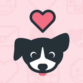
That said, cute animal mascots are not always the answer. And definitely shouldn’t be used if they feel forced. I was just about to give up on the idea of a mascot for pow wow when my research hit on a perfectly fitting animal: a border collie. Border collies are bred to be herder animals. But instead of rounding up sheep, our puppy rounds up appointments for you. And so pow wow the pup was born.
On very exceptional days, my job is looking at pictures of puppies and drawing them.
We use pow wow the pup throughout the site. He explains features, gives the tool a personal voice when it’s needed, and even dresses up to represent different audiences
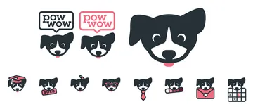
The many faces of pow wow the pup.
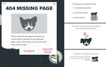
pow wow being helpful throughout the site… and sometimes sleepy.
Tell a Better Story
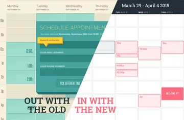
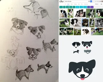
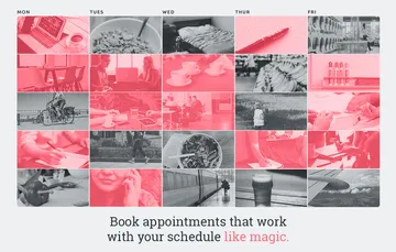
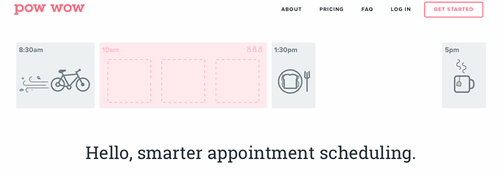
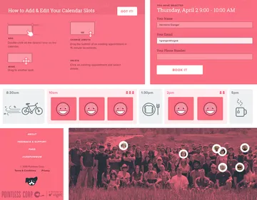
What pow wow essentially does is pretty straightforward, but still a bit of a mouthful to explain. On the original homepage, we relied on long paragraphs of text and screenshots to do the explaining. Which isn’t ideal on the web, where people do more skimming and less actual reading. With this redesign, it was important to figure out how to convey what pow wow does immediately and visually, with little to no reading required. My very first exploration used a very busy, way too pink calendar:
Over time, after we settled on a mascot, using illustrated elements and icons started to make more sense.

The final homepage uses animation to bring these elements to life and illustrate the idea of pow wow in action. Without a word, you can start to see how pow wow makes appointments easy and keeps your schedule under control.
Standing Out
Yet another determining factor in the direction of this redesign was the competition. Since 2013, several calendar coordinating, schedule simplifying apps have emerged. During our research, they all had a very polished, professional, sometimes almost corporate design. Cool, neutral blues and greys dominated. In order to stand out, we needed to lean even further into the idea of a design that you felt emotionally connected to.
Bright pink is about as far from neutral as you can get. The pink is warm, personal, and distinct. Soft grays and deep maroons keep the design from turning into a pastel nightmare. On a practical level, the monochrome color scheme is also much more flexible and works better with pow wow’s new features, like customizable color schemes for calendars.
Gotta have soul to have a personality
Cutesy copy, puppies, and pink everywhere are certainly easy to go overboard with. What ties it all together to be a cohesive, thoughtful brand (and hopefully helps us steer clear of turning into a Sanrio on Valentine’s Day) is the core idea and guiding light of the new pow wow:
“pow wow is a tool for making lives easier. It removes friction for its users and between people. It facilitates human connection. Meetings, appointments, interviews, catching up over coffee, are all a little more simple and joyful and a little less of a burden because of pow wow. As a facilitator, it is clear, simple, straightforward. It communicates and works naturally without being coy or too quirky to be clear. As a tool about human connection, it is warm, enjoyable to use and interact with. Users connect to pow wow as much as they do their real-life appointment bookees.”
(If this level of detail is your idea of a good time, feel free to peruse pow wow’s full brand guideline.)
Being able to bring this level of focus to the project helped inform everything from the visual design, to how we talk about pow wow on its marketing site, to the tweets we write, to the flow users go through to create a calendar, to the language we use in confirmation emails, to how we handle customer support. We’re really excited this new pow wow is finally live and already helping people wrangle their schedules! Check it out now.