Are Hollow Icons Really Harder to Recognize Than Solid Icons? A Research Study
Curt Arledge, Former Director of UX Strategy
Article Categories:
Posted on
Data from over 1,000 test participants paint a nuanced picture about the effect of icon style on usability.
Last summer software designer Aubrey Johnson published a post on Medium with a specific critique of Apple’s brand new mobile operating system, iOS7. Johnson suggested that Apple’s new “hollow” icons, being more visually complex than “solid” icons, create cognitive fatigue for users that will eventually lead them to tire of the interface and stop using it. The timely, bite-sized post was shared and discussed widely, with some designers affirming it as sensible advice and others criticizing it as overblown, oversimplified, and lacking valid evidence.

As a graduate student in human-computer interaction and a UX intern at Viget, I saw an interesting opportunity to test Johnson's claim with evidence from real users. To find a definitive answer to the question of whether hollow icons require more cognitive effort for users, I created a web app that measures users’ speed and accuracy in selecting icons with different visual styles. By studying the data from more than a thousand test participants, I found that hollow icons are not necessarily less usable than their solid counterparts. However, the results are actually a bit more complicated.
The Icons
First of all, it's important to note that this discussion is focused on a particular type of icon: the flat, single-color icons known as tab bar icons or simply bar icons. These are the icons that you usually see in a row of four or five at the bottom of the screen in mobile apps. Because bar icons serve as navigation to other sections of the app, it’s important to indicate which section is currently active by highlighting its icon in some way. With the release of iOS7, Apple began showing these states by using two complementary icon styles: a solid version to show an active/selected state and a hollow version to show an inactive/unselected state. To my knowledge, Apple is currently the only major software maker to use two styles of the same base icon for this purpose.
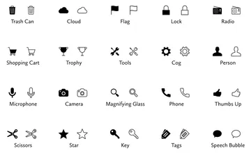
I should briefly acknowledge that the distinction between a solid and hollow style is loosely defined. A single icon can have both solid and hollow characteristics. For this reason, I hand-picked a set of icons for my study that showed a fairly unambiguous difference between solid and hollow versions. Each of these icons also represents a concrete object and use a literal label, which limits the amount of cognitive effort test participants need to match a name with its icon.
The Test
With the help of some indispensable technical guidance from Viget’s Nate Hunzaker, I built a Rails app to administer an unmoderated icon recognition test on the Web. It’s easier just to take the test yourself than for me to explain it, but here’s my attempt at a brief description:
Before the test, participants are asked to familiarize themselves with the 20 labeled icons. Then, participants are led through 24 icon recognition trials in which they are presented with the name of one of the 20 icons and asked to select the matching icon as quickly and accurately as possible from a circular array of 19 other distractor icons. Each trial uses one of the 20 icons as its target, and the first four trials are considered warm-ups, which are excluded from data analysis. The test app randomly determines the sequence of target icons, the position of each icon in the array, and whether all icons are shown in a solid or hollow style. The test takes about five minutes to complete.
Go ahead and take the test yourself at icon-test.net for a better idea of how it works. I've been told that it's actually kind of fun!
Results
Over a 10-day data collection period, 1,260 tests were completed, for a total of more than 25,000 individual icon recognition trials. The demographics skewed towards young (18-40), tech-savvy Apple users. The mean selection time was almost exactly three seconds, with a standard deviation of 1.5 seconds.
Averaged across all 20 icons, hollow icons were selected about 0.1 second slower than solid icons, which would seem to support Johnson’s assertion that hollow icons require more cognitive effort to recognize than solid icons (if only a very small amount more). However, the picture isn’t yet complete.
I haven’t mentioned yet that my study actually included another aesthetic variable in addition to icon style: icon color. Each trial in the test actually showed icons in one of four style-color combinations: solid black-on-white, hollow black-on-white, solid white-on-black, or hollow white-on-black. (Side note: the question of whether or not black and white should be considered colors sparked a lively debate in the designers' chat room at Viget.)

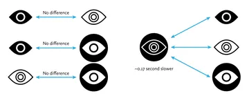
Breaking the data into these four groups allowed me to use a really cool-sounding statistical technique called a 2-way ANOVA to take a closer look at icon selection speeds. Using this technique, I discovered a more nuanced result: hollow, white-on-black icons were selected about 0.17 second slower than icons of the other three style-color combinations, with no other statistically significant differences between the other three style-color combinations. In other words, for black-on-white icons, whether the icon was shown in a solid or hollow style had effectively no impact on selection speed. Similarly, for solid icons, whether the icon was shown in black or white had no impact. However, when a hollow style was combined with a white-on-black color scheme, selection times increased by a small amount.
This is a pretty tiny effect, but data from more than 1,000 users shows that it does exist. A reasonable takeaway is that if we consider solid black icons as something of a default aesthetic, adding layers of stylization has a compounding effect on icon usability. This probably seems fairly intuitive.
But there’s one more wrinkle to this conclusion. To get an even more detailed look at the data, I examined each of the 20 icons individually for effects of style and color. What I found was an inconsistency that belies the clean results presented above. Almost half of the icons (9 of 20) showed no effect of icon style at all, meaning solid and hollow styles were recognized just as quickly. Among the eleven icons that did show the effect of style, three actually performed better in a hollow style. In fact, the Speech Bubble icon showed a completely reversed effect from the global average: the solid black version was selected slower than all the other versions. This makes sense when you think about how most speech bubbles we encounter are either shown in white or in an outline style (or both). A solid black speech bubble doesn’t have either of those archetypal characteristics to aid in quick recognition.

Finally, it’s worth mentioning that icon style and color had no impact on participants’ ability to correctly select the prompted icon, except for one icon, the Lock, which was slightly more likely to be misidentified when shown in black on white. I’m not sure why this is, but the Lock icon was an outlier by multiple metrics: it had the highest likelihood of being misidentified and the slowest selection speed of all 20 icons, by a pretty wide margin.
Conclusion
Johnson’s warning against using hollow icons in user interfaces just isn't supported by evidence from real users. For one thing, an icon’s style doesn’t exist in isolation, but interacts with other attributes like color to create compounding effects on usability. Furthermore, less than half of the icons in my set of 20 performed better in a solid style than a hollow style. A different set of icons would likely result in a different overall result.
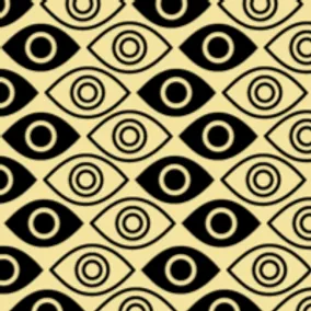
In any case, the small differences in recognition speed that I observed are not likely to cause any lasting fatigue for users. Research has shown that users begin to map the meaning of icons to their positions in the interface, so it’s not like users have to reinterpret each icon during every use. It is also important to consider that a two-style approach may have an accessibility benefit over using color alone to show an icon’s state, since it gives people with color blindness additional visual feedback. Of course, the first image in this article shows that Apple uses a combination of style, color, and labeling to reinforce usability.
My ultimate conclusion is one that most designers probably felt intuitively upon encountering the solid/hollow debate: designing icons to be both semantically clear and visually attractive is a complex exercise that doesn’t lend itself to simple binary rules. In fact, a closer look at Apple’s Human Interface Guidelines, which lay out its recommendations for solid/hollow icon design, acknowledge that some icons simply won’t work well in both styles.
Finally, I hope that this study highlights the importance of using real evidence to back up UI design decisions. Designers of all types need to think critically about best practices and back up their recommendations with solid (pun not intended, but embraced) research.
The full research paper is available here. Thanks again to Nate Hunzaker for his help in developing the testing app. Thanks also to Alla Kholmatova, who conducted an earlier informal study on this topic as part of a terrific article on icon design.