Close and Go BackBack to Viget

The Mysterious “Save For Web” Color Shift

Doug Avery
Doug Avery, ON THE TOPIC OF Tips and Tricks
Apr08 126

While working on the Odeo relaunch, we kept running into a frustrating problem: When we saved out the slices, the awesome Odeo pink flattened to a dreary "light coral". I'd seen the problem before, but never so pronounced: The color, through no fault of its own, was obviously changing, and we were at a loss for a way to prevent this.


Odeo Logo

Fig. 1 : Dastardly!


The usual suspects get knocked out pretty quickly in this issue: It isn't a Mac/PC thing, it isn't a monitor thing, it isn't because the color profile is somehow set "wrong". Fellow designers: Somewhere between PSD and JPG, Photoshop is draining our colors of their life, like some horrible, RGB-stealing vampire.

There's a lot of confusion on the web over why this is, and a lot of solutions being offered. Everything I found fails the acid test, though:

Testing for Perfect Color Translation

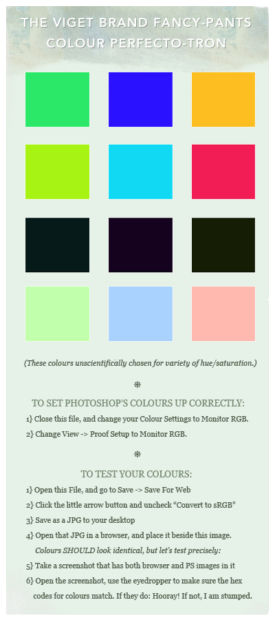
If I "Save For Web" an image from Photoshop, open that image up in a browser side-by-side with the original, I should see identical colors. I can then take a screenshot, open the screenshot in Photoshop, and test the color accuracy with our friend the color eyedropper, to show that nothing has shifted even slightly from the original image.


Color Testing

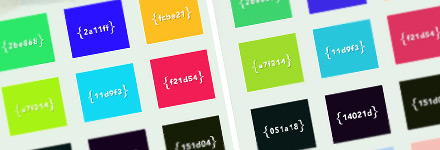
Fig. 2 : Checking for color shifts.


I've attached a JPG with some more indepth instructions at the end of the post. The testing process is a little painful, but the end result is worth it:

The ability to see, perfectly, how the colors in Photoshop are going to appear in your browser.

A Warning

What we're doing here won't make your colors look the same on all monitors or machines. Macs will display lighter (by default, at least), and monitors themselves will experience crazy color shifts based on age and settings. Reassure yourself: This is not your fault. The key is to calibrate your monitor as close to the center as possible, use Proof Colors (we'll get to that) to make sure details aren't getting blown out on other platforms, and be prepared to gently explain to clients why your green looks like aqua on their friend's 1992 Trinitron.

Okay, here we go: Three Steps to Color Perfection.

Step 1: Color Profiles

Color profiles define how Photoshop interprets the raw color data in your files. That's right: That means they change how you see the colors. This kind of precision is great for photography and print design, but it's got to go if we're making a website. With no images open, go to Edit / Color Settings.


Color Settings

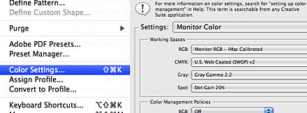
Fig. 3 : Changing to Monitor Color.


We're going to essentially turn off all this profile nonsense by changing the top drop-down to Monitor Color. Let's uncheck "Ask When Opening" while we're at it....from now on, when you open an image that has a color profile, Photoshop will give you a brief heads-up that we're tossing it out.

Step 2: Proof Setup

Now, let's go up to View / Proof Setup / Monitor RGB. This is to make sure Photoshop won't be showing you skewed colors on your nice new profile-less images. A note, though: If you're on a Mac/PC and want to see how an image is going to look on the other's default gamma setting, you can come back here and test using "Windows RGB" or "Macintosh RGB." Just remember to switch it back, or you could accidentally be designing in (shudder) PC mode.


Proof Settings

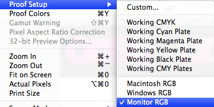
Fig. 4 : Make sure you're not viewing the wrong proof colors.


Step 3:

After all this hard work, Photoshop still wants to sneak color profiles into your images. Most web browsers ignore them, but new Safari and Firefox builds DON'T, and IE can be set to work with them too. This can result in the weirdest cross-browser headache yet, so we need to make sure the colors we save out are sans profile.


Convert to sRGB

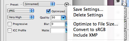
Fig. 5 : Convert to sRGB is an evil setting.


Thankfully, it's an easy fix: Open up any image on your machine and File / Save For Web. Next to the Preset option, there's a sneaky little arrow...click it and uncheck "Convert to sRGB." (Note: From what I can tell, this is only the default setting in CS3)

Congratulations

Your color woes are over! Or maybe not. If you followed these steps and your color accuracy test failed, leave a comment and we can try to figure this thing out using the awesome power of teamwork.

Download the color test jpg: ColorPerfectotron.jpg

International version: ColourPerfectotron.jpg

Update! Wednesday Afternoon, April 9th

For some more indepth schoolin' on the how and why of color profiles, check out the great discussion MacMojo started in the comments.

Dave Rutledge said on 04/08 at 10:16 AM

Thanks for the tips. I’ve spent a few days of my life, collectively, pulling my hair out over bizarre color changes that I was pretty sure I’d protected against. Here’s hoping these settings make those a thing of the past.

One question: Are there alternate/additional things to need to do in Illustrator? We save for web from there and have had issues with that as well. Knowing Adobe, the settings are named slightly differently and located in slightly varying places.

Doug Avery said on 04/08 at 10:22 AM

I don’t have experience with Saving for Web from Illustrator, BUT, I just checked and Illustrator has the same nefarious “Convert to sRGB” option checked by default...it’s just hidden under a weird list-arrow icon to the right of the Preset pulldown when you’re Saving for Web. If you haven’t tried turning this off, it might do the trick.

David said on 04/08 at 10:27 AM

Awesome writeup, Doug. I’ve also noticed some weirdness trying to save images as .png files (that disappear when I switch over to .gif).

Tom Finley said on 04/08 at 10:28 AM

Thanks for clearing that up — this has been one of the most vexing problems and at some point, sadly, I just gave up. I can’t wait to re-export all my site’s images so the color variation between browsers is kaput.

Keith Muth said on 04/08 at 10:43 AM

Great article, I was looking into this last week. I was trying to upload photos to Flickr and was frustrated because the colors were washed out. Turned out the photo’s color space was Adobe RGB and not sRGB. Still not perfect but it looks better.

Dave Rutledge said on 04/08 at 10:50 AM

Btw, I love the International version, but you didn’t do a full find/replace!

Doug Avery said on 04/08 at 11:03 AM

Good catch! Thanks, I’ve gone through and finished the internationalization.

Shiva said on 04/08 at 11:41 AM

Working really great, thanks !!

Ty said on 04/08 at 01:00 PM

I think you could call this post:
“Pimping your Photoshop Color Settings” :)
For me in PHotoshop v.7 it was only a two step process, I don’t see the setting in the third step, so I hope I’m good still.
thanks.

I was definitely aware of some of the color anomalies, but not a fix for them, bright colors are the worst, they get tamed down sometimes.

Doug Avery said on 04/08 at 01:04 PM

From what I’m reading, version before CS2 didn’t have the Convert To sRGB setting selected by default, but you should be okay. I’ll make a note about this in the post. Thanks!

Dave Morin said on 04/08 at 02:49 PM

Thank you for tackling this, it’s a problem that has bugged me for years without resolution, can’t wait to try this out myself.

Ian James Cox said on 04/08 at 03:51 PM

Nice write up, thanks for this.

I’ve done this once before but I forgot how after installing CS3 and the issue returning.

My colors are safe once again!

Doug Avery said on 04/08 at 04:37 PM

It’s good to hear that everyone was as frustrated by this problem as we were, it was making a few designers crazy here at Viget.

Michael said on 04/08 at 05:19 PM

That’s gonna be a life saver! Thanks!

Casey said on 04/08 at 05:22 PM

Good tips Doug, thank you very much! Just about every designer I know has run into this problem.

Have you also found that this doesn’t “correct” older files that were created without viewing in Monitor RGB proof? As in, you need to BEGIN your designs with the monitor proof mode active for accurate exporting. Opening older files and switching to that proof mode will simply result in an accurate preview of how they’ll look when exported (unfortunately lighter and de-saturated in most cases). This, at least, has been my experience… do you know of a method that will retain the initial intended values? Converting to a profile first perhaps?

Doug Avery said on 04/08 at 05:44 PM

I played around a little and might have an answer, Casey...to test, try “Edit -> Assigning” a crazy profile like one of the Fujifilm ones to a test image, something that makes an obvious difference in the color of the image.

The original colors are still there in the image, which you could see if you saved/closed/re-opened and “discarded” the profile. But what we want to do convert our weird preview version of the colors to the actual, un-calibrated color. Go to “Edit -> Convert to Profile.” Select the working Monitor profile and turn off “Flatten Image.”

You should now have weird-looking image that is (ta-da) basically profile-free. You can save it for web and the colors should be nearly identical....I tested mine with the eyedropper and only found slight disparities.

Note: I don’t know what horrible voodoo is actually happening behind the scenes here, so I wouldn’t recommend going through your archives and trying this on every image. But it seems like a viable fix for images made under bad profiles.

Josh Franco said on 04/08 at 07:52 PM

Wow I like this! I remember the color shift getting the best of my time, a day or two before a deadline… It took me a few hours to get back on track again, this would have quite come in handy.

Will keep this one in my tool box of solutions! Cheers!

Cody said on 04/08 at 09:37 PM

I’ve had a similar problem with my dark tones when using ‘Save for Web’ on my duotone photographs.  I observed in the ‘saved’ version a fairly consistent percentage of darkening in the detailed regions of shadows and wasn’t quite sure what was causing it.  I was able to ‘correct’ the issue by changing my overall black output in Levels to around 8-13 from 0 as the step just prior to using “Save for Web”.  I’ve tested and the problem seems to gone after applying your suggested changes.  As a photographer, I’ve always been bummed that my images would look differently on the same monitor that was used to produce them...let alone those throughout the rest of the world.  At least the first part of that equation has been remedied, not I just need to drop the coin on a nice calibration setup.  Anyway, great piece and thanks for the helpful tip...you’ve bettered my workflow.

chris said on 04/08 at 11:30 PM

wow thanks so much, I have been wondering how to fix this issue.

This tip is very much appreciated. :)

Fubiz™ said on 04/09 at 05:42 AM

Very beautiful template!

Jerome Gravel-Niquet said on 04/09 at 07:14 AM

I’ve recently encountered this problem when working collaboratively with my boss on a PSD.

I’ve read much and the procedure I went through is drastically different.

In Color Settings, I chose the sRGB setting. I also changed my mac gamma to 2.2 to fit “most” monitors (as more people are using a pc than a mac...). I then disabled the “Convert to sRGB” option in the Save for web window.

These were the recommended settings for designing for the web… well, according to what I read earlier, you’re making me doubt!

By default, it seems that Photoshop CS3 puts in the Adobe RGB settings, so when you save for the web, the color profile is embedded and the image’s color profile is changed to sRGB which gives you another result altogether from Adobe RGB. (to my understanding)

Basically CS3 converts to sRGB by default when it saves a file for the web because that’s a standard. But they just don’t use that profile in photoshop’s “editing” mode. This is non sense, but I guess they figure we’re not all web designers.

Hopefully, all this made sense!

Jerome.

Doug Avery said on 04/09 at 07:41 AM

Jerome, thanks for adding to this discussion. I had also read that sRGB -> Save For Web was the best workflow for web color We tried it, but we continued having the problem.

A quick test: Open the “Color Perfectotron” in Photoshop, and “Assign Profile” to sRGB. You should see a slight darkening.

Now, save it for web/JPG as “ColorPerfectotron2” without the “convert to sRGB Profile” option. A reminder: “Assign” simply changes how we see the image, “convert” actually changes the pixels in the document to match the profile.

If you open Perfectotron2 in a browser, and view it beside the sRGB version in photoshop, you should notice a slight difference. Take a screenshot and test a few of the colors with the eyedropper, and it becomes more apparent.

I’m suggesting that based on test cases we’ve seen, if you “view” in sRGB but save images out without profiles, you’re going to see color differences between the Photoshop and browser versions.

Confession: I sort of brushed past the “proof colors” in this entry, but in most cases, we found that setting them to Monitor RGB was enough to get an accurate color representation. However, if we’re going to proof without color profiles, and save without color profiles....why have color profiles assigned at all?

Jerome Gravel-Niquet said on 04/09 at 08:09 AM

Thanks, I understand much more of the mystic color profiles!

Rereading what I’ve written earlier… it didn’t make much sense hehe.

My old technique did everything to comply with the setting in the save for web mode “Convert to sRGB” when it could’ve be as simple as your way of doing it.

Even though we’re not yet at the point where everyone on every screen will see the same exact color, it’s better than nothing!

Jerome.

Doug Avery said on 04/09 at 08:15 AM

Jerome, you had a good point in that sRGB really is how we’re “supposed” to be doing our color work. I just can’t, for the life of me, get it to work correctly!

Based on what we’re saying, I think viewing in sRGB and then Save-For-Web converting to sRGB should produce visually identical results. One is viewing a skewed version of the colors, the other is saving the colors out through a skewed “filter,” so it should match up. But there’s still some mysterious X factor I’m not quite getting that prevents this from actually working correctly…

Jerome Gravel-Niquet said on 04/09 at 08:27 AM

(You must think I have a lot of time on my hands!)

Maybe your X factor is the browser. Every browser, except Safari, ignores an embedded color profile. From what I understand, the color profile forced on an image in a browser is “Monitor RGB"… being however the user’s monitor is calibrated.

So even if we work in sRGB, convert to sRGB and even embed the sRGB color profile, it still won’t feel right in every browser not Apple-made (hehe).

As hard as we try to design with nice colors, correct colo profiles and calibrated monitors, most people don’t know a monitor can even be calibrated. I come across this problem too often when presenting mock-ups to my superiors.

I think your technique is as close as it gets to having a farily good idea of how an image will look compressed and to others.

Jerome.

MacMojo said on 04/09 at 09:48 AM

Oh dear. Just read the topic and if you don’t mind me adding my 2 cents: Please do not turn off P’shop colorsync settings. There won’t be any color shift what so ever if you work in sRGB (sRGB IEC 61966-2.1 is recommended).
Open your own JPG and assign this profile. Save for web… and no color shift! (PS: Save without the ICC tag, ‘cause it’ll make the imagesize larger).

I wrote an article some time ago explaining exaclty what happens, unfortunantely it’s in Dutch…

http://www.macmojo.nl/nl/artikelen/photoshop-kwaliteit-behouden-bij-opslaan-voor-web-2.html

But here’s an English one:
http://www.gballard.net/psd/srgbforwww.html

Good luck!

Doug Avery said on 04/09 at 10:15 AM

I read Ballard’s article while researching this, but working in sRGB and saving for web without the ICC profile is resulting in color shifts in all my tests. Using Ballard’s sRGB settings, the exported image has lighter, less saturated midtones when viewed in a browser.

I don’t know too much about the color profiles, but it seems to me that if we’re setting up a color working space in Photoshop and then exporting images without this working space, there are going to be color discrepancies. If there weren’t what would be the point of using the color profile at all?

Ballard’s fixes include changes to the monitor settings, which I agree are important. But it’s not too much to ask that an image I “Save For Web” preserves the exact same colors I saw in Photoshop, without any profile or translation issues. As far as I can tell, the fix posted here can accomplish this...and unless I’m missing something, there’s no major downside for losing the sRGB setting in a web design environment.

Jerome Gravel-Niquet said on 04/09 at 10:37 AM

I think the only point about why we should use sRGB in his article (which I initially based everything on) is this:

“BECAUSE over 95% of web monitors are based on 2.2 gamma (and will display the least amount of shift in the sRGB rollover).”

Even if you don’t embed the profile, the colours are still converted (since the tutorial doesn’t say to uncheck this option in save for web), so I guess with the colors forced in sRGB, the hex values aren’t the same and therefore look better in most browsers.

MacMojo said on 04/09 at 11:33 AM

“ But it’s not too much to ask that an image I “Save For Web” preserves the exact same colors I saw in Photoshop, without any profile or translation issues.”

It is actually. (Unless you are saving with ICC-profile and only use Safari or Opera to browse).

One cannot expect all browsers to render color like the ‘mother of all color apps’ Photoshop… You can let P’shop behave like a browser using the sRGB profile. This way you’re not fooling youreselve with perfct colors ‘cause most people won’t have a very good or calibrated monitor. And mst of the time, you are designing for ‘most’ people’.

Bytheway, I do not get a color shift on my (Eye One calibrated) high end Eizo monitors if i assign sRGB to your JPEG and ‘ave for web’.

I realy enjoy discussions like this. Most of the time the “webguys” tell the “printguys” how stuff works ;-)

Jerome Gravel-Niquet said on 04/09 at 11:39 AM

So what should we do?

You’re telling me browsers “assign” by default the sRGB color profile? (except for Safari [and opera?])

If this is the case, I suppose it is better to put everything in sRGB and save without the ICC thingy checked.

Jerome.

MacMojo said on 04/09 at 12:30 PM

Yes and no. The nice colors you see in Photoshop are actually aRGB (Adobe RGB). This color range is much larger than sRGB (small RGB). Hence the shift in colors.

The browser is actually color-dumb. (well most are). So no need to save with the ICC-tag. You can create your own ‘dumb’ preview in P’shop if you work in the sRGB profile.

Oh and there is a difference between ‘assigning’ or converting to sRGB too. A huge one.

A bit off-topic but also a myth: What dpi should one use for images for web? 72? 92? 300? Answer: None....

Doug Avery said on 04/09 at 12:33 PM

I guess I’m saying that since I browse the internet all day on my monitor, that if I decide I want my green to be slightly darker than the green I see on another site, I should be able to a) make a slightly darker shade in Photoshop b) export it and see, in the browser, that it is slightly darker but in other ways identical. Working without color profiles makes this possible with any monitor, but working with them requires that my monitor be very precisely calibrated (something, I confess, it probably is not) to achieve this.

Since all of my browsing is relative to my personal monitor calibration, Photoshop is doing me a disservice by showing me a guess at what red looks like in other color spaces, when red looks different on my own. If I want to see my colors in other gammas/color spaces, I can use proofing, but until then I’d like Photoshop to show me colors as they’re actually going to display on my monitor, even if it’s not calibrated perfectly.

So it sounds like we have two answers to the frustrating problem of exported colors looking different from Photoshop colors:

1) Calibrate your monitor very well
2) Try working without color profiles

-----

MacMojo, unless I’m incorrect, “assigning” simply asks Photoshop and other non-dumb programs to shift colors based on the profile, right? And “converting” applies the profile to the actual color values of the image?

ty said on 04/09 at 12:46 PM

@MMjo
The comments about image dpi, could be off track to anyone concerned with ppi, which will directly effect the size of the image in your browser. Unless you use CSS or another means of telling the image to show at a certain size specification.

MacMojo said on 04/09 at 12:46 PM

Correct. Basically everything you view browsing is displayed using no ICC. Best way to recreate these colors is using the sRGB profile and a CSS viewer like Firefox’s extentions and tools.

You can create any color you wish as long as it’s in range. Always start with a sRGB P’shop file and the color shifts should be minimal.

‘Converting’ tells Photoshop to give the image the same color-feel as before only in a different profile. ‘Assinging’ keeps the same numeric values but alters the way the color feels. A very big deal especially for cmyk-artwork. The last thing I want is 100K to change to something like this: 22.3/55.4/55/7/96.

I write about this stuff a lot. There are 3 English articles here:
http://www.macmojo.nl/nl/englisch-articles-summary.html

Ty said on 04/09 at 12:50 PM

Ahh got ya macmojo, but the first thing when working on web files would be going to image | mode | and switching to RGB there. This feels like two different streams of comments those aimed at Print design and those at web. I think somebody already suggested that.

MacMojo said on 04/09 at 01:09 PM

Colormanagement is both RGB and CMYK. I run a RGB workflow for all my CMYK stuff as well.

I personally change my preferences when working for web to sRGB. When I’m done I switch back to aRGB. (And because I’m a purist I use a aRGB with adjusted white point. It’s set at 5000 Kelvin instead of the 6500 Kelvin aRGB uses ‘cause 5000 Kelvin is the temperature of ‘norml daylight’ and documented ISO conditions).

But that’s just us ISO freaks ;-)

Just found this site today. It’s in my bookmarks now!

Doug Avery said on 04/09 at 01:22 PM

MacMojo, thanks for stopping by and helping hash this out with us! I’ve updated the post to help readers find your comments and contributions to the article.

MacMojo said on 04/09 at 02:26 PM

You’re more than welcome. Love the articles and profesional attitude here.

@Ti: dpi, ppi, it doesn’t matter. The only thing that matters is the pixels size. Dpi or ppi information is egnored by the browser. Try it by making 2 150x150 pix images. One 72 dpi and the other 300. As long as the size remains 150x150 pixels both images are shown the same size in your browser… No css required…

essenmitsosse said on 04/10 at 03:30 AM

I don’t think it is a good idea to completely turn of color management. If only working for the web this might work, but you will run into some trouble if want to print your images, as already mentioned.

There are numerous reasons for color managing. In fact its there for avoiding these problems (change in color) but it must be set up correctly to work. But if everything is set up fine you will have no color problems anymore (even in printing).

The Save for Web Problem doesn’t occur because Photoshops changes your colors after saving for the web, but because it displays them differently than applications who can’t color manage while working on them.

I wrote an article on how to set up your color management and still see your images as you would in a browser to avoid the “Save for Web”-Problem:

http://essenmitsosse.de/how-to-set-up-color-management/

Doug Avery said on 04/10 at 08:08 AM

Thanks for adding to the post, Essen. I’ll have to test your method and see if the color shift is reduced...I understand the value of color management for printing, but I still spend 99% of my time saving out files to browsers, so I was looking for a flawless way to get those colors matching up.

Nick Whitmoyer said on 04/10 at 08:56 AM

Thanks for this helpful resource Doug!

essenmitsosse said on 04/10 at 10:12 AM

Doug: Yeah, I know it seems easier to just deactivate all the color management. But it is there for a reason.

If somebody sends you a file in Adobe RGB (which isn’t that unrealistic, I think) and you just drop the profile all colors will be interpreted as if they were sRGB. Which will lead to the thing you just wanted to avoid: wrong colors!

Same works the other way around. If you send somebody a file with no profile and he has to guess what profile you are using (because this person is color managing) well … you can guess what could happen.

If you set up everything right for one time, you just have to give attention to activate color proof. But you can be sure every image you create or open is just displayed exactly as it should.

Doug Avery said on 04/10 at 10:22 AM

Essen: but if we’re talking about the web here, that Adobe RGB file is already in the “wrong colors,” because that profile is going to be dropped when they Save For Web, and the flat, unmanaged colors are going to be outputted. I’m advocating that in this case, you can drop the color profile and get an immediate understanding of what this image will look like, in your browser, if you export it right now. Then, use proofing to check it on other color spaces.

You and MacMojo are saying that if I have my monitor calibrated well, the sRGB space should show me an accurate representation anyway, which I understand...but why would I want to keep an aRGB profile someone sends me, if I know the colors will shift when I Save For Web anyway? Seems like it might make more sense to “convert” to Monitor RGB in this case, so I’m keeping the colors the sender intended and translating them accurately through to the final exported images.

Thanks for following up on this, I’m getting a lot of stuff to try out from this conversation.

Tony Geer said on 04/10 at 11:00 AM

Thanks a lot for this article, I too spent many hours trying to fix this. I came across this article at one point: http://tancredi.co.uk/2007/5/13/photoshop-cs3-and-save-for-web-issues that seemed to solve it but I think I tinkered some more and I was back to square one.

Going to go back and re-save some images so they look like they’re supposed to.

Doug Avery said on 04/10 at 11:08 AM

Tony, the article you linked to is essentially the same method I’m advocating. I hadn’t seen it during my initial searches, which were a few months ago.  Thanks for posting!

(Also, your site looks great!)

essenmitsosse said on 04/10 at 11:16 AM

Well, that Adobe RGB file is in the wrong color if you drop the profile. Try saving a picture with Adobe RGB and than open it up again dropping the profile. This will cause the colors to change. Because they are as if they were Adobe RGB but are now interpreted in a different way.

But if you do color management they will be converted correctly. Thats why the “Convert to sRGB” should be checked. This only produces wrong colors if you have no profile for the image (because you dropped it or because you never used one). So Photoshop can only guess how to convert the picture.

But if you Photoshop knows, that the colors of the picture are in Adobe RGB they can be converted correctly.

The problem is, you have to activate the color proof for your monitor RGB or Photoshop will display them wrong (even if they are still right), so you get a difference between the way the colors look in Photoshop and the way they look after saving for the web.

Phil said on 04/10 at 04:55 PM

Thanks for a great explanation!
I am having a few problems though.  I’ve followed the settings, opened a previous design and discarded it’s color profile as stated.  The image darkens, is that normal?  Then when i select proof setup and select “windows” it brightens up.  I have a calibrated mac display, and when clicking the “windows” proof setup i need it to not change, so i know the images i see will look as close as possible to those on PC’s, if that makes any sense.  Any help would be appreciated

Doug Avery said on 04/10 at 05:07 PM

Phil, you should experience a color shift, in most cases, when you remove a profile....the profile was, in a sense, “tinting” the colors you saw. To preserve the color, you can try Converting it to Monitor RGB instead.

The Windows proofing setup is essentially your monitor profile, but in 2.2 Gamma. I’m testing with a mac-calibrated monitor as well, and find that if I go to Display settings and set my screen to 2.2 Gamma (the standard setting for windows machines), it darkens everything a little bit. Then, when I select Windows RGB in Proofing, there’s no change whatsoever. Hope this helps.

Michael Sigler said on 04/10 at 05:10 PM

Dude, thank you from the bottom of my heart. We, the designer at Jive Software, salute you. It has been plaguing the design of our new site. Adobe CS3 on our shiny iMacs has been a very painful process. We had narrowed everything down except for that evil, evil little fly out in step 3.

Thank you from the very depth of my anal-retentive, OCD, designer-soul.

essenmitsosse said on 04/10 at 05:17 PM

Phil: It depends on which gamma correction you calibrated your monitor. The normal Windows monitor is calibrated with a Gamma correction of 2.2. Macs are normally calibrated with a Gamma of 1.8 which is a bit lighter.

In every calibration application you should be able to define a Gamma to which you want to calibrate. Just set it to 2.2. This will make images on your display look like on a windows computer.

Michael Saganowski - sgnwsk said on 04/10 at 11:01 PM

Thanks so much for all your input. My photoshops are pimpn’

Tony Geer said on 04/11 at 12:54 PM

Hey Doug, thanks! I’m still trying to get over all the lovely details in the new sites that you guys have created, it’s really inspirational stuff!

Jeremiah said on 04/11 at 03:27 PM

This is excellent. I have implemented the fix, and even though it isn’t 100%, it is such a vast improvement over what I have been doing (saving for web as I go just to double check my colors). I have been searching for a very long time for an answer and now I have one! And it makes so much sense. No offense, but the advice from serious color management gurus has not been helpful. This is a real solution, as you aptly stated, only for web designers.

Doug Avery said on 04/11 at 03:35 PM

Jeremiah, glad to hear it’s working out for you. I’ve noticed some small imperfections on the process since I posted, which is aggravating, but like you said, it’s still an improvement on the old process. I’ll keep looking at ways to get a bulletproof method on this…

ty said on 04/11 at 03:36 PM

B.I.N.G.O., ‘nuff said.
I mean a web designer may just manage images for web period. If this works it’s one size fits all.
The other stuff was very enlightening, wow.

Phil said on 04/11 at 04:27 PM

Thanks for your help guys.  I’ve set my monitor to 2.2 and ignored my custom calibration i did.  This sorts out the problem of clicking “proof setup” for “windows RGB” and it getting brighter, although when i select monitor RGB it gets darker (slightly confused by that if my monitor is already selected in the color settings).  But anyway now when i click save for web, it gets slightly darker?  I’ve tried deselecting “convert to sRGB” in the drop down menu in save for web mode, but that hasn’t worked.  Any thoughts?  My brain hurts....

Thanks
Phil

Doug Avery said on 04/11 at 04:46 PM

Phil, are the saved-out images appearing slightly darker than your Photoshop comp when it’s in ‘no proofing’ mode, or when it’s in Windows proof? I’ve also noticed a slight shift between 2.2 Monitor RGB and Windows proofing colors, which seems to point to another factor besides Gamma that separates Mac and Windows setups (other comments seems to suggest it’s the sRGB color profile that Windows uses).

Phil said on 04/11 at 06:39 PM

Doug - Yeah they’re appearing darker when saved out.  I have my monitor set to 2.2, images in photoshop look fine, i then click “proof setup” for windows RGB, and the image stays the same, great! but it’s as soon as i hit save for web, it darkens up :( Very annoying though, i’m actually color blind, so i’m only going on contrast, but i can’t be designing things, which are dark in nature, for them to look even darker by others and for detail to be lost.

essenmitsosse said on 04/12 at 04:56 AM

How do you set your monitor to 2.2? Does this create a monitor profile? Is this profile selected in your system preferences?

Also, as a suggested in the article, that I postet above, you shouldn’t use your monitor profile as your RGB Profile.

I think this is a problem, coming from not color managing, because now you can’t tell what Photoshop is really doing.

Josh Pyles said on 04/12 at 11:55 PM

Wow, this really helps solve the mystery!

Thanks for writing this!

WEBARMY said on 04/14 at 12:54 AM

I have been just pressing Command/Control + y to get my colors the way I want using Curves and /Hue Saturation adjustment layers.

I will give this a try and see how it works for me. :)

Webdesign said on 04/14 at 10:24 AM

I use standard monitor colors, and use two monitors. Were buying a screen calibrator soon though. I want the best for my monitors, because I’m a designer.

MacMojo said on 04/14 at 11:37 AM

You could look at the Eye One Display:
http://www.computer-darkroom.com/i12/i12_page_1.htm

Mike D said on 04/14 at 04:14 PM

I think this is a good article to compress photography for the web and maintain color saturation, but the example you provided should have been compressed as a GIF.

General rule of thumb I’ve always followed is GIF for illustrations and logos, JPEGs for images.

JPEGs do a poor job compressing illustrations with solid colors and hard edges due to its agressive lossy compression resulting in a larger file size.

Of course I know common practice on the web is to use what does the job so to each his own…

sDF said on 04/14 at 08:43 PM

oh man.. no wonder some of my designs don’t turn up the way they’re supposed to, especially after I ‘save for web’ a piece of graphic. This sucks.

But thanks for the tips, gonna try them some time.

Andrew Rodney said on 04/15 at 04:12 PM

You can’t disable color management in Photoshop! And there’s no reason to try.

All you’ve accomplished is hosing the previews in Photoshop so they are just as wrong (only on this one machine) as the other dumb non ICC aware applications. And that did what to improve things?

Its akin to seeing an image that’s too dark in Photoshop and cranking up the brightness so it looks lighter. That’s a fix? Nope.

Worse, there’s a way to have Photoshop preview how images on YOUR machine would look on YOUR non ICC web browser that he shows in step 2 without hosing the rest of the application by doing something as dumb as setting the color settings as illustrated. Just setup a soft proof using Monitor RGB. But in the end, until more browsers are ICC aware, there’s nothing more you can do than leave Photoshop setup PROPERLY and convert files to sRGB for the web, then hope for the best.

Its pretty simple really. Unless you’re using Safari or the beta of FireFox, your browser isn’t color managed and even uploading a document in sRGB does NOT guarantee it will match Photoshop. The Photoshop preview is correct because it uses both the display profile and the embedded profile (in this case sRGB) to build a preview to screen. Non ICC aware applications simply send the RGB numbers to the display. They don’t know anything about the fact that you’ve got a display profile or that the data is in sRGB. So, the two don’t match.

When you set Photoshop’s color settings for Monitor RGB (which BAD idea) or use the Proof Setup and select Monitor RGB, Photoshop acts like a dumb web browser and the previews match. Don’t you feel better now that Photoshop is equally incorrectly previewing the numbers incorrectly (but using color management to do so)?

Short of using an ICC aware browser, there’s never a guarantee that Photoshop or any other ICC aware application will match.

Andrew Rodney
Author “Color Management for Photographers”
http://www.digitaldog.net/

Collin Allen said on 04/17 at 11:38 PM

Thank you SO much for posting this!  I’ve had this issue for months on end and thought I had tried everything.

Where’s the ‘Donate’ button?

Dave Rutledge said on 04/18 at 03:07 PM

Slight, confused update:

I am still having color shift when I’m working on my RAW .nef (Nikon) file in Photoshop. That is, after I open the file, makes some changes in Adobe’s Raw program, and then take it into Photoshop, saving for web shows me different colors than I had been seeing.

Additionally, if I copy the images out of the .nef and paste them into a new window I also get this color shift (darkening).

Doug Avery said on 04/18 at 03:09 PM

Dave, I haven’t worked with the RAW program, but it sounds like it’s not discarding the profile after your import. One thing to try might be “Conver to Profile > Monitor RGB,” which should take the colors you see and lock them down to the “actual” colors of the image.

DISSIT said on 04/18 at 03:21 PM

BAD IDEA TO USE “MONITOR COLOR” IN PS COLOR SETTING
BAD IDEA TO DISABLE DEFAULT “sRGB” IN SAVE FOR WEB

The fix is easy you already nailed it in Step 2.

ALL YOU NEED:
View / Proof Setup / Monitor RGB

Just do that once. EVEN if it is already set to it, do it again, to make fully sure it is set. This will show you what it will look like in your browser. You can even set this as a photoshop action to make it easier and faster. After you do this when you save for web there will be NO color shift even with the default “Convert to sRGB” is checked, for making “proper” web jpgs.

DO NOT set your PS Color Setting to “Monitor Color” BAD!

There will be a color shift “with” convert to sRGB “checked” in the save for web option, when you set PS color settings to “Monitor Color”. This is why you should NOT use “Monitor Color” as your Color Profile.

Andrew Rodney said on 04/18 at 03:34 PM

DISSIT is correct and most of what’s being discussed here, including the bulk of this article I’m sorry to say is not only technically incorrect but not helping the issues one bit!

Photoshop and all ICC aware applications ARE showing you the numbers correctly and anyone else who works with such an architecture. Trying to “break” Photoshop so it is just as wrong as most all web browsers is akin to driving along, getting a flat tire, getting out of the car and puncturing the other three so all four are now flat!

Users either care about the color they see or they don’t. IF they care, they need to use one of the two web browsers that support color management. Those that don’t care, no issue.

I’ve heard the argument “well most people don’t use Safari or FireFox” and then they go about, puncturing their tires, instead of doing something real simple (because they do care about the color) and telling themselves and others to use a browser that understands proper color management. You can and should educate users who care, and complain to anyone who builds a dumb web browser, but this article and the advise is totally counter productive. And in fact, you’re now potentially ruining images that may not go to the web with very bad, dangerous color settings. I understand that the author is trying to help, but I think he really needs to understand what effect these settings have, and how in no way do they help or accomplish anything useful.

And that an image is Raw or rendered is totally immaterial to this discussion (you’re not getting this to work because again, you’re not using Photoshop properly).

Dano said on 04/18 at 04:35 PM

THANK YOU SO MUCH!

For ever I have wondered why all my work looked so dull and dead, and why was my PSD files looking so awesome. Well now I know. You rock. Thank you.

Doug Avery said on 04/18 at 04:47 PM

@DISSIT - From what I’ve been checking, it looks like the Proof -> Monitor RGB is good enough when saving WITHOUT convert-to-sRGB. One issue is always remembering turn Proofing on (no way to keep it on at all times, which is frustrating).

Converting to sRGB, however, I’m not convinced on...been trying it out and there are slight color shifts in Mac Safari from Photoshop, although they’re still not much. Which is odd, because without an ICC profile attached, Safari shouldn’t re-interpreting colors, correct?

@Andrew Rodney - Only one person in this thread has offered an actual argument for why stripping out the color management is the kind of wrong that deserves all caps, and as a result, I’ve repeatedly amended that this method is suggested for web design only.

Of the major browsers, only Safari honors ICC profiles.  Even the new FF doesn’t honor them by default. You can test here, where you should see lines around the boxes in a browser that correctly renders images with the attached profile. This is an example of what goes wrong when exported images go through color shifts or have ICC profiles: Images that are supposed to blend nicely into hex-color backgrounds show hard edges instead.

So, with your ICC profile method, I’d need to manually find a new hex value that matches my image when its color gets interpreted for Safari, which seems like a difficult process to go through for a single browser.

You can and should educate users who care…

Since only one browser honors ICC profiles by default, you’re saying web designers, who build sites for clients and thousands of users with different capabilities, computer ages, and levels of technical proficiency, should suggest that all 96% of non-Safari users switch over so they can see our colors as we intend them? I appreciate promoting browser standards, but I couldn’t agree with that less.

A note to other readers: Color profiles CAN be assigned, proofed, and viewed on for-print images, very simply. What I’m suggesting is that web designers set their Photoshop up to work best, by default, for what they spend most of their time doing. No one is puncturing Photoshop’s tires or choosing to ruin all print images here, just trying to get a little more control over what we see in our browsers.

Andrew Rodney said on 04/18 at 05:57 PM

Safari isn’t the only web browser that honors profiles.

You do NOT need to embed the profile! As long as the document is in sRGB, Safari will still provide a far closer color match because its using the display profile and an assumption about the color space of the document.

The settings you propose, for web users only or not doesn’t provide anything at all useful. All you’re doing is forcing Photoshop to preview the numbers and the color appearance incorrectly and os ONLY legit on YOUR machine(because you’re using your display profile). Say this to yourself 50 times “you can’t turn off color management in Photoshop, you can’t turn off color management in Photoshop.

If you want to see what the image looks like incorrectly displayed, open it in your browser. Why first hose the proper color settings in Photoshop to soft proof the image to show you an incorrect preview? Just open the image in any non ICC aware application or upload the image and look at it? Again, you seem to misunderstand that you’ve done absolutely nothing useful in how you are suggesting Photoshop users set their preferences. If you leave Photoshop alone, yes, the previews don’t match but then, unless you use the two (current) ICC aware web browsers, its not going to match anyway, its incorrectly being previewed and setting Photoshop the wrong way doesn’t change this fact one bit. So why do it? Its a feel good button or just a sugar pill placebo.

>Since only one browser honors ICC profiles by default, you’re saying web designers, who build sites for clients and thousands of users with different capabilities, computer ages, and levels of technical proficiency, should suggest that all 96% of non-Safari users switch over so they can see our colors as we intend them?

I told you that you have two users; those who care about the correct color appearance and those that don’t. IF THEY CARE, the ONLY way all users can see the same RGB values identically and correctly is to use an ICC aware browser. I don’t know how I can dumb this down for you any more. ICC aware browser equals correct color appearance for all users. Non ICC aware browser, anything is possible. If you care, you use one of the browsers. There’s nothing more you can do. So yes, you find out if anyone really cares about proper color and you tell them how to do it. Or you can ignore what are facts, and deceive yourself into thinking everyone is seeing your site identically and correctly. That’s not happening but if that makes you feel better, go for it.

And yes, you are puncturing Photoshop’s tires in that what you’re currently viewing is simply science fiction, its not something anyone else will necessarily see, and in fact for those smart people using an ICC aware browser, you’re going out of your way to ensure that what is being shown (correctly) will not match what you’re viewing in Photoshop. How is that at all useful?

If only 5% of users work with such browsers, you’ve now guaranteed that when you work in Photoshop, the images you view will not match those 5%. Does this fact make you feel better? If you use your recommendations for Photoshop, you’ve now made it such that 100% of users are not seeing the image as it should appear and neither are you. If that’s not puncturing Photoshop, I don’t know what is.

Jason Pontius said on 04/18 at 09:29 PM

Did any of you use ImageReady?  Omigod, it was awesome:  basically Photoshop with absolutely everything that wasn’t related to creating Web graphics removed.  No CMYK, no image resolution, no TIFF, no nothing.  It was the greatest Web graphic tool ever, and the Adobe/Macromedia merger killed it in favor of Fireworks.  I upgraded from CS2 to CS3, and all of a sudden color became this weirdly relative concept.  Thanks so much for these great tips— the sRGB one is what I was missing.

Ty said on 04/19 at 07:30 AM

I had already turned on sRGB, going with the suggestion here for monitor, still turns on sRGB as a profile, so this article really made no changes for me in PS7 on Win.
Can the posts be paginated, this sucker’s getting long and long winded, lol. All good though!

Anne Helmond said on 04/22 at 04:36 AM

Thank you so much for this explanatory post. The fading save-for-web colors and the inexplicable cross-browser color shifts were causing unbearable headaches.

Peter Figen said on 04/23 at 06:23 PM

“Based on what we’re saying, I think viewing in sRGB and then Save-For-Web converting to sRGB should produce visually identical results. One is viewing a skewed version of the colors, the other is saving the colors out through a skewed “filter,” so it should match up. But there’s still some mysterious X factor I’m not quite getting that prevents this from actually working correctly…”

The mysterious “X” factor is that your monitor is NOT sRGB, but viewing untagged images in a browser that in non color managed or has it turned off assumes that the file is in Monitor RGB. The further your particular monitor is from sRGB, the larger the difference you’re going to see between Photoshop and your browser. The “problem”, as it were, is not a problem at all, but more a misunderstanding or lack of understanding of how color spaces and device gamuts interact. The visual color shift is more noticeable on the newer wide gamut monitors. The only real fix is for everyone to use both sRGB (great for older monitors), embed profiles and start insisting that every web application become profile aware, both in honoring embedded profiles and being able to set an assumed profile for untagged images.

Louis said on 04/25 at 03:44 PM

Thank you for the great reading. It saved my life !

Studio7 said on 04/25 at 05:23 PM

Thank you so much for this advise.

I just forwarded this article to about 40 designer friends I know, most of which have had issues with this, and have not found such a beautiful and simple solution.

Thank you so much for the help with this!

Cheers
A

Peter Figen said on 04/26 at 01:57 AM

Surely you all are kidding about taking the advice given at the top of this blog. If you’ve read everything here including my comments and Andrew Rodney’s and still want to set your working space to Monitor RGB, just realize it’s akin to going back the the color management characteristics of Ps 4 and below, where the working space was your monitor space. If you decide to do that, be aware of all the ramifications and how it might affect your other work. But hey, it’s not my head being buried in the sand.

phalkunz said on 04/26 at 03:31 AM

Color shift has been a problem for me ages ago. Now the hassle is over. Thanks alot.

marian said on 04/26 at 06:11 AM

Thank you very much, I’ve had this problem recently and i know i know that i wasn’t crazy or something :)

Steve Tapping said on 04/27 at 05:37 AM

I’m a photographer that uses alot of images for web. The problem with this tutorial is that your images are going to look different on different browsers ie firefox vs safari. Color profiles are important and color lcd profile is a quick easy fix which I used to use but its not appropriate for web. If you want your images consistent over more screens/browsers your going to have to resort to sRGB.

There is a simple rule I work by after much research:

1.) All apple uses convert your gamma to 2.2

2.) Change Photoshops color settings to adobe RGB 1998 space. (Thats if your a photographer if your solely web based choose sRGB.)

3.) ALWAYS turn proof colors on under the View menu in Photoshop EDIT/DESIGN WITH THIS SETTING ON. I wish you could have this as a default instead of having to keep turning it on after opening each image.

4.) If its going on the web convert to sRGB as early on in the process as you can, make sure color proof is on after conversion.

5.) Check convert to sRGB at save for web screen.

The only issue I have is I often export images from aperture to Photoshop. The images are shot digital in the Adobe RGB color space, when first imported into photoshop they look exactly like they do in aperture however as soon as you turn proofing on which is how they will end up looking the color is just sucked out. Anyone know a way around this? The proofing in aperture doesnt seem to match the photoshop one.

K A L E said on 04/28 at 05:00 AM

very nice article..it mostly solve my queries..Thank you very much..

Alexandra said on 04/28 at 08:11 AM

Very helpful. Thank you very much :o*

Nina Richards said on 04/29 at 05:34 AM

I did quite a bit of research into the topic of colour reproduction on the web very recently and produced a couple of articles to try and explain the issues involved.

The “Save for the Web” colour shift described in the article is directly related to this.

http://www.nicedream.co.uk/articles/best_practice_colour_setup_for_web_designers/

There are lots of factors that come together in order to understand the correct colour settings to use. Reading the comments above, I agree with settings that Steve Tapping provides.

Regarding Aperture, your might find this helpful:
http://docs.info.apple.com/article.html?artnum=302827

Doug Avery said on 04/29 at 07:30 AM

Thanks for the links, Nina. When your article explains that color should look like it does “when editing,” do you mean with Windows proofing on or off?

Nina Richards said on 04/29 at 08:41 AM

When editing, if the sRGB colour space is used and the monitor is recently calibrated, there should be little or no difference between Windows proofing and proofing being turned off. In a perfect world they would be identical.

Andrew Rodney said on 04/29 at 08:54 AM

>When editing, if the sRGB colour space is used and the monitor is recently calibrated, there should be little or no difference between Windows proofing and proofing being turned off. In a perfect world they would be identical.<

There hasn’t been an sRGB display since circa 1993, it was a big CRT with P22 phosphors! If what you say is true, we’d never need to calibrate and profile our displays, they would behave as sRGB devices, which they don’t. The sRGB color space is a synthetic color space, based on three simple mathematical target values. In fact, this theoretical CRT display spec has definitions for the ambient light conditions surrounding the theoretical display!

Its amazing how so few here get the actual facts that, without color management, profiles for documents and devices, and software that understand them, the same set of RGB values will appear differently on all the devices. The ONLY way to get the RGB values to appear correctly is to handle them using color management, the advise way, way at the top (the article) totally fails to recognize this fact.

Photoshop (and all other ICC aware applications) ARE CORRECT in previewing the values (unless as suggested, you try to set them to do the opposite). No matter what you do, if you’re not working with an ICC aware browser, it is simply not speaking or understanding the language of RGB numbers correctly, repeatedly and thus, anyone viewing the numbers in this way probably see them differently.

Bottom line, IF you want the web images to match Photoshop and thus be previewing correctly and across platforms and the same for all users, you need an ICC aware web browser. And you need to profile your display. We’ve been doing all this since at least 1997! That so many browsers don’t operate correctly doesn’t change the facts one bit.

Nina Richards said on 04/29 at 09:06 AM

>There hasn’t been an sRGB display since circa 1993, it was a big CRT with P22 phosphors! If what you say is true, we’d never need to calibrate and profile our displays, they would behave as sRGB devices, which they don’t. The sRGB color space is a synthetic color space, based on three simple mathematical target values. In fact, this theoretical CRT display spec has definitions for the ambient light conditions surrounding the theoretical display!<

Sorry, maybe I wasn’t clear (see comment and links). I personally am not advocating turning off colour management - quite the opposite. From my article:

“Make sure your monitor is properly calibrated, using a screen gamma setting of 2.2 and a colour temperature of 6500K (white point of D65). The colour temperature may be a setting on the monitor itself, accessible via an onscreen menu.”

“Images for the web should always be prepared using the sRGB IEC61966-2.1 colour space. In Photoshop CS3, you can use the “North America Web/Internet” colour management preset. With this setting in place, your default working colour space is sRGB IEC61966-2.1 and any new documents are assigned the sRGB IEC61966-2.1 colour profile.”

“In addition, if you have Proof Colors activated, make sure that Proof Setup is set to Windows RGB. If you are curious to see what it will look like on a Mac with the legacy 1.8 gamma setting then set this to Macintosh RGB - just remember to change it back afterwards or you may get some unexpected results later.”

“Make sure your image mode is RGB. If you have source imagery that isn’t RGB then make sure it is properly converted to RGB. Also, if you get a profile mismatch you will need to convert the source image to the sRGB IEC61966-2.1 working space.”

Doug Avery said on 04/29 at 09:10 AM

Andrew, I’ve said this before, but we’re talking from the standpoint of wanting to work with the best, most consistent, and most widespread applications of color on the web. For the same reason designers use IE6-specific stylesheets and hacks to create the best browser experience for as many users as possible, we’re interested in giving the most users the best color we can, instead of ignoring them in favor of a choice few power users.

Everyone’s had great feedback and linked to excellent information in this post, and I plan on posting a follow-up with the info you guys provided. That said, I’m never going to be convinced of the idea that the onus for best-case color is entirely on the user. Until a decent share of the market is using ICC-enabled browsers, embedding profiles isn’t a reasonable way to work with web color, just like ignoring IE7 and IE6 as browsers isn’t a reasonable way to work with web layout.

Andrew Rodney said on 04/29 at 09:16 AM

“In addition, if you have Proof Colors activated, make sure that Proof Setup is set to Windows RGB. If you are curious to see what it will look like on a Mac with the legacy 1.8 gamma setting then set this to Macintosh RGB - just remember to change it back afterwards or you may get some unexpected results later.”

But all this is doing is showing you how wrong the images will appear outside an ICC aware application (simulating no color management). There’s nothing to soft proof IF you’ve got an ICC aware browser, the images will match Photoshop as is, showing you the RGB values correctly. And anyone else, on any OS using the same sound approach to viewing what is nothing more than a big pile of numbers.

What some are getting confused about here is this idea of soft proofing in Photoshop. Its a “feature” that does NOTHING MORE than show you what that image would look like on your very own machine, in a non ICC aware application. Not anyone else’s system! Its not useful. It doesn’t tell you what the image will appear like anywhere else. However, if you simply stop fooling yourself with the soft proof, view the image as is in Photoshop and an ICC aware browser, the two match. For you and anyone else (who’s smart enough to use said browser and profile their display).

The soft proof process discussed isn’t useful once you understand what it is simulating and for whom (only you).

“I personally am not advocating turning off colour management - quite the opposite. “

That’s exactly what is happening when you invoke the soft proof: You are simulating what that image would look like without color management (using of course, the color management in Photoshop to do so). Its not at all useful.

Nina Richards said on 04/29 at 09:18 AM

>Bottom line, IF you want the web images to match Photoshop and thus be previewing correctly and across platforms and the same for all users, you need an ICC aware web browser.<

In the real world of website design we have to exercise a degree of pragmatism. 94% of all browsers out there will ignore ICC profiles and assume sRGB - not to mention colours specified in the CSS.

In fact, the settings I personally recommend are the same as those recommended by Apple:

http://docs.info.apple.com/article.html?artnum=302827

Which are also demonstrated here:

http://www.gballard.net/psd/srgbforwww.html

Hope that helps.

Andrew Rodney said on 04/29 at 09:25 AM

“In the real world of website design we have to exercise a degree of pragmatism. 94% of all browsers out there will ignore ICC profiles and assume sRGB - not to mention colours specified in the CSS.”

Then 94% of those users will see widely different color appearance from the same numbers. It doesn’t matter a lick that these browsers “assume sRGB”. That’s what this so called web community doesn’t seem to “get”. An assumption of the color space isn’t color management. I’ve explained till I’m blue in the face what is necessary to make the same RGB numbers appear the same way to all users. An assumption? You know the old saying about that right?

Its as simple as that! You either convince those who want proper color appearance to use the right browser, or you tell people how to continue to fool themselves into thinking what they see is not only correct, but what their friends are seeing, neither of which is true. Assuming sRGB is nothing to do with getting correct and matching color appearance.

If this is the real world of web design, then they get what the deserve if they continue to advise users, at least users who care about proper color appearance to fix the problem. It ain’t that hard!

All this of course is easily demonstrated to anyone who wishes to do so.

Nina Richards said on 04/29 at 09:58 AM

>That’s exactly what is happening when you invoke the soft proof: You are simulating what that image would look like without color management (using of course, the color management in Photoshop to do so). Its not at all useful.<

We are simulating what the image would look like using the operating system’s colour management and not “without color management. This is an important difference when considering the context and the target of a non-colour managed application.

If the operating system’s colour management is set up correctly for the web design as I suggest (calibrated screen, gamma: 2.2, white point D65 - sRGB stipulates these settings) then switching between Windows proofing and no proofing has little or no effect on the colour reproduction. This is because the Windows proof setting in photoshop simulates sRGB with gamma 2.2 and a white point of D65.

>Its as simple as that! You either convince those who want proper color appearance to use the right browser, or you tell people how to continue to fool themselves into thinking what they see is not only correct, but what their friends are seeing, neither of which is true. Assuming sRGB is nothing to do with getting correct and matching color appearance.<

In a few years when most people are using a browser that can interpret embedded profiles, then yes, I absolutely agree. Until then, we make do with what we have to produce a result that will work for the most people.

Andrew Rodney said on 04/29 at 10:51 AM

“We are simulating what the image would look like using the operating system’s colour management and not “without color management.”

You better define what you mean by the OS’s color management. There is nothing like this happening on Windows. On the Mac, as well, all you’re getting is the RGB numbers being sent directly to the display. IF indeed there were OS level color management, the numbers would appear correct.

But even if we take your premise, its absolutely easy to prove that the same RGB values will appear differently on another users system, even of the same OS! How can you call that color management? Color management by its simplest definition is the ability to provide correct and consistent color appearance for all users who implement it. That’s clearly NOT happening in what you describe. 

“In a few years when most people are using a browser that can interpret embedded profiles, then yes, I absolutely agree. Until then, we make do with what we have to produce a result that will work for the most people.”

An embedded profile in the document is no more necessary in a browser than in Photoshop. Photoshop either looks for an embedded profile, or it guesses, based on the color settings what the color space of untagged documents are. You do NOT need to embed a profile for this to work in a browser, you simply need to tell the browser “when examining an untagged image, assume sRGB (or what will be likely in the future, Adobe RGB (1998)).

There is a problem in that Safari assumes untagged data is in the display profile color space which is BAD. Prior to Tiger, we could setup the ColorSync level system to assume whatever we wished for untagged data, just as we can today in Photoshop. That feature was unfortunately removed from the OS. Its far better to allow users to tell even a color managed app what to assume for untagged data, or at least force that assumption to be sRGB (which works if indeed the data IS in sRGB).

I’m not sure what FireFox uses for the assumption, I’d hope its sRGB. But the point is, you do not have to embed a profile unless you so desire, you simply need the color managed application to guess what an untagged doc is and nearly all do so (they have to). Then, with a display profile, the RGB numbers can be properly previewed.

For any color management process, we must have two profiles. In the case of displaying data, we need the document profile (or an assumption for untagged docs) and the display profile. Anything but such a system simply take the RGB numbers, and send them directly to the display. Calibrating isn’t enough. You must have an architecture whereby the display profile compensates for previews based on the embedded or assumed color space and that display profile.

“In a few years when most people are using a browser that can interpret embedded profiles, then yes, I absolutely agree. Until then, we make do with what we have to produce a result that will work for the most people.”

Fine, but doesn’t anyone else here see that soft proofing based on not using color management in Photoshop, based on solely your system does nothing useful but make Photoshop match YOUR browser and not anyone else’s? How on earth is that at all useful to anyone but you? How is that even useful to you? Just explain that to me please. Its a delusional setting, nothing more.

Jeremiah said on 04/29 at 10:59 AM

I would like to stress a point that seems to be getting lost through this whole discussion. The article is not about making sure that your intended color is the same from machine to machine. Everyone knows that goal is impossible, or at least for what this article is addressing, irrelevant.

What Doug was addressing in this article is the color shift that is happening ON OUR OWN MACHINES, not from machine to machine. It seems like web designers whose background is in technology (people like me), not in graphic design have the most trouble understanding why, when they look in their “save for web” view, or in their browser after saving for web, the color already seems messed up. How can we expect anything for our audience if we can’t even get our own color to be consistent ON OUR OWN MACHINE.

If we can get the color to be consistent for ourselves then we can feel much better about throwing our design into a world of screwed up color, but without that consistency, we live in fear every time we put one pixel of color into our designs.

That being said, I appreciate Doug’s feedback and willingness to ‘put up’ with belligerence of the so-called color experts that have posted to this article.

Based on my experimentation, it appears that the best scenario to solve this problem comes down two things; 1) making sure that every design is created using sRGB and; 2) viewing the site using the various Proof Setup options, specifically Mac RGB, Windows RGB and Monitor RGB.

I think that if you notice that there is a huge shift when you switch from the default proof view to the Monitor RGB view, you probably need to start over with your calibration process. This is where color management folks can really be of service.

Andrew Rodney said on 04/29 at 11:14 AM

“I think that if you notice that there is a huge shift when you switch from the default proof view to the Monitor RGB view, you probably need to start over with your calibration process. This is where color management folks can really be of service.”

Nope, that’s not so. And I think I’m beating a dead horse here and think I’ll quit and then read stuff like this.

The so called huge shift isn’t a result of the image. It is the result of viewing the numbers incorrectly, just as you could do by altering the brightness and color controls on your display. You could in fact muck up the controls, profile your display and the color appearance in a color managed application would be correct due to the use of color management, the profile and the embedded profile. Calibration is only used on a display such that you can keep this non stable device in a set condition and ideally in a behavior that provides the best data (least amount of banding). The profile is far, far more important than the calibration! The profile reflects this state, good or bad (and ugly outside an ICC aware application) and compensates on the fly to produce the CORRECT color appearance.

But lets say again, we take your idea here as correct. You illustrate that in Photoshop, the one application you’re using to alter the values to produce a desired color appearance, you like what you see, but when you soft proof, by actually previewing the image outside this state, you see a “huge and ugly” color shift. OK, does that mean that’s what the image will look like to anyone else? No. Does that mean the image appears incorrectly in any ICC aware application on your machine or anyone else’s? No. Does it mean that maybe the raw behavior of your display outside an ICC aware application sucks? Yes. Is this a problem? Yes, outside ICC aware applications. Again, how is this at all useful in prep’ing an image for the web? It looked fine in an ICC aware application. It looks poor only on your machine outside an ICC aware application. As yet, what’s the value? Does anyone else have a display behaving as yours does or worse? Maybe, maybe not.

When you load this soft proof in Photoshop, does it help that you now see the color appearance incorrectly and only based on your one computer? And what do you do now, go back into Photoshop and edit the image based on a display that’s pure science fiction and has no relationship to anyone else’s? How is that useful?

Until someone explains the logic of providing an incorrect preview based on a single display, I don’t see why there’s a reason for me to continue here. Forget that 95% of web browsers are not color managed. Assuming you’re viewing an image incorrectly, based on your one system, how is this helpful? You’re going to now edit the image based on this science fiction? Makes no sense to me. Its like the analogy I suggest weeks ago: Image looks too dark in Photoshop, don’t change the numbers, increase the brightness on your display.

MacMojo said on 04/29 at 11:42 AM

By the way: Of course everyone realises we’ll have discussions like this AGAIN even if all bowsers are capable of reading ICC tags, right?
‘Cause we’ll be complaining the aRGB / sRGB images won’t match the web safe hexadecimal HTML color codes. ;-)

Doug Avery said on 04/29 at 11:44 AM

MacMojo, CONGRATS ON BEING COMMENT 100! Also, I think this is all the more reason to just leave the profiles out of exported images, no matter how we do color before Saving For Web. Safari’s current system of applying color profiles but leaving hex colors flat is going to look dreadful on a lot of sites.

MacMojo said on 04/29 at 11:58 AM

Ha ha, cool, #100 ;-)

I agree. The internet was created to transfer knowledge. This entire ICC thing is a “graphic design thing” that sort of sneeked in the browser. Actual readers of websites won’t care. Cause they’re *reading* text mostly…

Anyay, the color shift you see on on your own system when saving for web has been explained very well.

Nina Richards said on 04/30 at 05:10 AM

I think this discussion, while great, has gotten a little confused with comments perhaps being misread or misinterpreted in some cases. Not really surprising given the number of posts.

Specifically, I think that there is some confusion over what the Windows RGB soft-proof setting actually does in Photoshop. I’ve cited the Adobe help file below, maybe this will help to clear it up.

From the Adobe Photoshop help file, talking about Soft-proof presets:
“Macintosh RGB or Windows RGB (Photoshop and Illustrator) Creates a soft proof of colors in an image using either a standard Mac OS or Windows monitor as the proof profile space to simulate. Both options assume that the simulated device will display your document without using color management. Neither option is available for Lab or CMYK documents.”

So, in the case of Windows RGB, we are seeing how it would look on a ‘simulated Windows RGB monitor that doesn’t use colour management’. This doesn’t turn off the colour management in Photoshop. It is still using it’s colour management to produce an accurate image on your calibrated, profiled monitor.

In the case of Windows RGB, unmanaged colour means sRGB. When also working in sRGB IEC61966-2.1, which is recommended for web work, this setting should have the same effect as turning soft proofing off if your monitor is calibrated using gamma 2.2, white point D65.

The full help article can be found here (under Soft-proof presets):
http://livedocs.adobe.com/en_US/Photoshop/10.0/help.html?content=WS151986BD-6D68-4880-9123-CC0D8B7033F5.html

Adobe’s recommended web publishing RGB workflow can be found here:
http://www.adobe.com/designcenter/creativesuite/articles/cs3ap_colorworkflows_06.html

Hope that is useful.

Andrew Rodney said on 04/30 at 10:36 AM

“So, in the case of Windows RGB, we are seeing how it would look on a ‘simulated Windows RGB monitor that doesn’t use colour management’. This doesn’t turn off the colour management in Photoshop. It is still using it’s colour management to produce an accurate image on your calibrated, profiled monitor.’

Spot on correct! But we have no idea what the definition of a “windows RGB monitor” is. That very fact that every display out of the box, even from the same make and model is different and thus why we spend money on an instrument to calibrate to a target proves the point.

“In the case of Windows RGB, unmanaged colour means sRGB. When also working in sRGB IEC61966-2.1, which is recommended for web work, this setting should have the same effect as turning soft proofing off if your monitor is calibrated using gamma 2.2, white point D65.’

In this case, the assumption (which isn’t correct) is that simply hooking up any display to a Windows OS produces sRGB. That simply is not the case. Nor is calibrating the display to a D65 white point (which isn’t actually possible unless you heat that puppy to the point it would be puddle of plastic**) or a TRC gamma of 2.2 is really producing sRGB as specified. If you look at the original spec for sRGB, it defines the chromaticity using very exacting and specific values based on a phosphor set that no LED (and not all CRT’s) can produce. You might get close however, but the point is, D65/2.2 is not in of itself making this an sRGB device.

** note that there’s only one real item that can produce D65, which is a standard illuminate of an exact spectrum, that object is 93 million miles from your display. What we attempt to do is produce a correlated color temperature of D65. And we need instruments to do this!

Nina Richards said on 04/30 at 04:59 PM

“Spot on correct! But we have no idea what the definition of a “windows RGB monitor” is. That very fact that every display out of the box, even from the same make and model is different and thus why we spend money on an instrument to calibrate to a target proves the point.”

Yes, but in the commercial arena of website design the destination of our work is largely unpredictable. We don’t have control over the destination colour environment. We make the most appropriate choice to keep the majority of people happy.

We’re not trying to achieve photographic proof level colour correction. We understand that it is an unrealistic proposition on the web at this point in time.

The reality is that most people will never calibrate their monitors or even know what monitor calibration is for that matter. We are not talking about specialists viewing our websites. We are talking about the general public with their computers, monitors or even mobile devices.

sRGB is the default color space in Windows. Non-colour-managed applications and devices are taken to be using the sRGB colour space. If you calibrate your monitor on a Windows computer then the Windows Image Color Management (ICM) converts the default sRGB colour space to the monitor’s profile, producing a representation of sRGB. If you don’t calibrate your monitor on Windows then Windows assumes the monitor will reproduce a representation of sRGB.

It turns out then we do actually have a practical (note: not perfect) guide to what the average “Windows RGB monitor” is: sRGB.

http://www.microsoft.com/whdc/device/display/color/default.mspx

From the above Microsoft article…
“sRGB Color Space Profile. sRGB is the default color space in Windows, based on the IEC 61966-2-1 standard. An sRGB-compliant device does not have to provide a profile or other support for color management to work well.”

It’s perhaps summed up a little better here:
http://www.microsoft.com/whdc/device/display/color/wincolormgmt.mspx

From the above Microsoft article:
“Hewlett-Packard and Microsoft helped to develop and drive the sRGB color space as a published international standard (IEC 61966-2-1). In the most basic sense, when the operating system, devices, and applications support sRGB, the result is a simple, easy-to-use solution that works for many kinds of hardware and software that historically have been unable to represent color in a consistent manner without direct user intervention.”

The sRGB standard was adopted for the web precisely because of its simplicity:
http://www.w3.org/Graphics/Color/sRGB.html

From the W3C article above:
“Currently, the ICC has one means of tracking and ensuring that a color is correctly mapped from the input to the output color space. This is done by attaching a profile for the input color space to the image in question. This is appropriate for high end users. However, there are a broad range of users that do not require this level of flexibility and control.”

The above paragraph is particularly appropriate to this discussion. The key point here is that us web designers are dealing with a broad range of users, not specialists.

And finally, please, there’s no need to be pedantic. It’s not conducive to a helpful, constructive discussion about the topic. When mentioning D65 in the context of monitor calibration, this was in relation to the monitor settings: the target white point, not the actual definition. We know that D65 is our very definition of white light, the standard illuminant, our Sun.

Taken to its logical conclusion, we could go on about the nuclear fusion of hydrogen into helium, the electromagnetic radiation this produces, the solar constant, emission spectra, the Raleigh scattering effect etc. etc. - none of which is really relevant to this particular discussion.

Andrew Rodney said on 05/01 at 08:07 AM

“Yes, but in the commercial arena of website design the destination of our work is largely unpredictable. We don’t have control over the destination colour environment. We make the most appropriate choice to keep the majority of people happy.”

OK, that’s understood.

So can you explain how using the soft proof setup recommended, one that only shows you how something will appear (and incorrectly I’ll add)) ONLY on your machine in any way is helpful? That’s the $64,000 question no one here appears to wish to answer.

“sRGB is the default color space in Windows. Non-colour-managed applications and devices are taken to be using the sRGB colour space.”

No, it is not! They might be close to sRGB, they may not. So you’re saying ever CRT and LCD display, of any make is sRGB out of the box, no matter what controls or settings the end user might make as means this is sRGB? That’s simply not so. And I’m not suggesting people NOT upload sRGB data. Because while all those displays are all over the place in terms of providing similar color appearance from the same set of RGB numbers, its the closest barn of which we are throwing a dart to hit in the middle.

But what does undoing proper color previewing in Photoshop do to help? Nada, zip, nothing. If 6% of users DO calibrate and profile their displays, they at least all see the same color appearance from your RGB document as you do. If they use the article as a guide, now that small group do not see the same RGB numbers the same way. How on earth was that helpful?

This long debate is so simple. There’s only one way multiple users on multiple systems can view the same RGB numbers the same way. The article advises a system that ensures that this isn’t the case, at least in Photoshop and the two web browsers that operate like Photoshop. This is useful how? Anyone?

“If you calibrate your monitor on a Windows computer then the Windows Image Color Management (ICM) converts the default sRGB colour space to the monitor’s profile, producing a representation of sRGB.”

ONLY in ICM aware applications. And lets say you’re correct, once again, it (sRGB documents) would match Photoshop without the incorrect soft proof setup suggestions here. If it doesn’t, then it will also not match anyone else’s previews either. Non ICM aware applications don’t know the profile exists. It does nothing but send the raw RGB values to the display.

Once again, hopefully for the last time! If the previews in Photoshop (of sRGB documents for the web) are desired, those are the previews all other users will see both in Photoshop and any other ICC/ICM aware application. If you use the soft proof setup suggested, if its close, great (for just your machine). If NOT, there’s absolutely no guarantee anyone else will see what you see with this soft proof on, because its only showing you a preview based on your one, single device. Using this soft proof shows you NOTHING about what anyone else will see of said RGB numbers. Not useful!

IF doing nothing with an sRGB document in terms of color management is always right, how come it doesn’t match Photoshop without this silly soft proof? How come so many users are seeing the same RGB numbers differently? The idea that somehow, sRGB is the solution for color matching is pie in the sky. It might be close, it might be way off, it might be anywhere in the middle. And this is only on your one machine. Anyone else’s machine, their mileage may vary.

Nina Richards said on 05/01 at 09:14 AM

Andrew, you do realise that I’m not talking about the article at the of this page?

I’m talking about my article, as referenced in my first comment:
http://www.nicedream.co.uk/articles/best_practice_colour_setup_for_web_designers/

Andrew Rodney said on 05/01 at 10:12 AM

Nina, there’s nothing in this article that changes my opinions above. It still states “set the soft proof to Windows RGB”. As I’ve said, that doesn’t do anything at all helpful in showing you want others will see (on Windows or otherwise). It only shows you what the current doc would look like using this assumption on YOUR system. Not useful. Not accurate or correct preview of the numbers.

The color settings suggested are also not all that great, you’ll notice that the warning check box for Missing Profiles is off, its real, real useful to know when anyone supplies an untagged document. And the Convert Policy is dangerous because it forces a conversion on any document that isn’t in sRGB (in this case), which I would submit is a potentially big hurt me button, especially since you recommend doing this using Save for Web later. Its often useful to view an image in the supplied color space provided (to see what it is and how it appears), then convert later.

Further:

“Don’t be tempted to manually embed an ICC profile at this point - most browsers will ignore it anyway. If anything, it will do more harm than good as you could find Safari rendering an image in a profile other than sRGB IEC61966-2.1 which will be at odds with other browsers.”

There’s only one rational reason NOT to embed an ICC profile here, that it will add an additional 4K of space to each image. Doing so in Safari WOULD make it match Photoshop but I can recognize that with enough images per site, 4K could add up in storage and bandwidth issues. But that’s it.

“If the above settings are followed you should find yourself with the perfect colour environment for website design.”

Perfect? Far from it. Perfect would be a situation where every users sees the same previews from the same numbers, this clearly isn’t the case.

Nina Richards said on 05/01 at 10:23 AM

“So can you explain how using the soft proof setup recommended, one that only shows you how something will appear (and incorrectly I’ll add)) ONLY on your machine in any way is helpful? That’s the $64,000 question no one here appears to wish to answer.”

OK, I think things are getting lost in translation. Personally I don’t work with proof colours turned on, I use it every now and again to check that things are going to look roughly ok on the Mac with it’s default gamma.

I was asked this question, in the context of my Article (not the article at the top of this page):

“Thanks for the links, Nina. When your article explains that color should look like it does “when editing,” do you mean with Windows proofing on or off?”

I was trying to explain that activating the soft proof setting “Windows RGB” does nothing more than to convert what we are seeing to sRGB, simulating a gamma of 2.2.

Since (taking the settings in my article) we have a working space of sRGB, with a display calibrated to use a gamma setting of 2.2, it shouldn’t drastically change the colours. That is all.

“No, it is not! They might be close to sRGB, they may not. So you’re saying ever CRT and LCD display, of any make is sRGB out of the box, no matter what controls or settings the end user might make as means this is sRGB?”

I completely agree with that, of course all displays are different. The point I was trying to make was that there are some useful defaults as long are we’re working in sRGB or converting to sRGB. Again this is useful given the target audience of out work.

“ONLY in ICM aware applications.”

That’s not strictly true, it depends on the version of windows you are using. Have a look at the table at the bottom of this MSDN article:

http://msdn.microsoft.com/en-us/library/ms536809(VS.85).aspx

Andrew Rodney said on 05/01 at 10:46 AM

““ONLY in ICM aware applications.””

That’s not strictly true, it depends on the version of windows you are using. Have a look at the table at the bottom of this MSDN article:”

There’s nothing there that indicates that a transform is used to convert using the display profile (and then the question would be, is this display profile accurately defining the display or some generic profile that shipped with the unit 3 years earlier?).

For a preview to be color managed, you need TWO profiles. One is for the document (or in the case above, assumed to be sRGB). Fine. The 2nd has to be the display profile. Did this profile just land on the users system, or did they actually use hardware and useful target calibration values (TRC gamma, white point, luminance) and if so, was it done recently (within say the last month or so considering displays are unstable devices).

Even a Photoshop user, working with a fully ICC aware application can have a profile for the display that does not define the current behavior of said display. If so, the previews are naturally not correct.

Cisco said on 05/01 at 10:46 AM

Here’s the simple solution: FIREWORKS. I never have to mess with all those settings. Photoshop is a great app, but is not focused on doing one thing great like Fireworks does for web/interactive work. There’s a reason Adobe kept this program around, and there’s more to come from it (http://tinyurl.com/yqfwh6). Do yourself a favor and try it on your next website design.

Nina Richards said on 05/01 at 10:53 AM

Andrew Wrote:
“Nina, there’s nothing in this article that changes my opinions above. It still states “set the soft proof to Windows RGB”.”

Andrew, you might want to read/quote that full sentence in context, I’ve highlighted the important point:

“In addition, *if* you have Proof Colors activated, make sure that Proof Setup is set to Windows RGB.”

Gary Ballard agrees with what I was trying to get across:
http://www.gballard.net/psd/saveforwebshift.html

From Gary Ballards article:
“Photoshop’s Soft Proof screen preview here simulates how unmanaged applications, web browsers, will display the file on 2.2 gamma monitors, based on the sRGB profile. If the file is based on sRGB and our monitor gamma is 2.2 and D/65 6500 degrees Kelvin, we should see very little shift here, which is the goal.”

Andrew Wrote:
“There’s only one rational reason NOT to embed an ICC profile here, that it will add an additional 4K of space to each image. Doing so in Safari WOULD make it match Photoshop but I can recognize that with enough images per site, 4K could add up in storage and bandwidth issues. But that’s it.”

There are other reasons: Getting CSS and Flash colour to match (hex values).

For example, if you have a background colour specified in CSS and you need an image on top to match or to blend in. Or if you need the colours in a Flash movie to match - this is very important in website design.

Here is a post on the Webkit (the Safari rendering engine) blog that explains this:

http://webkit.org/blog/73/color-spaces/

Andrew Rodney said on 05/01 at 11:02 AM

I know of Gary. His text is incomplete:

From Gary Ballards article:
“Photoshop’s Soft Proof screen preview here simulates how unmanaged applications, web browsers, will display the file on 2.2 gamma monitors, based on the sRGB profile (ON YOUR MACHINE is missing). If the file is based on sRGB and our monitor gamma is 2.2 and D/65 6500 degrees Kelvin, we should see very little shift here, which is the goal.”

OK, so lets assume you did the right thing recommended here, you did use an instrument to calibrate the display as Gary suggests. And lets assume that indeed, you should and do see very little shift here. Then I assume the three of us agree (based on your post above) that the recommendations of this site, to use the Soft Proof is of no use yes? That’s been my argument from day one. Well OK, Gary suggests it, still makes no sense to me despite the calibration recommendations as again, the soft proof never tells you what any other user would see, only you.

Lastly, all users should calibrate to a TRC gamma of either 2.2 or, if the software allows it, native gamma (which is pretty darn close to this). Mac users should NOT calibrate to 1.8.

“There are other reasons: Getting CSS and Flash colour to match (hex values).”

Flash will be color managed. My NDA doesn’t allow me to go further. We can thank Adobe for finally seeing the light here.

Further, I’m referring more to images (Photoshop’s meat and potatoes).

Jeremiah said on 05/01 at 11:29 AM

So, if we take Nina’s (and Gary’s) advice, as web designers we will be happy about our own color setup, but our color settings and proof views will have little relevance in the broad scope of user variables. And if we take Andrew’s advice, as web designers we will be unhappy about our own color setup (the ‘shift’) but our color settings and proof views will STILL have little relevance in the broad scope of user variables. Is this correct?

Andrew Rodney said on 05/01 at 11:42 AM

“So, if we take Nina’s (and Gary’s) advice, as web designers we will be happy about our own color setup, but our color settings and proof views will have little relevance in the broad scope of user variables.”

Yes. Especially the last part of the sentence.

“And if we take Andrew’s advice, as web designers we will be unhappy about our own color setup (the ‘shift’) but our color settings and proof views will STILL have little relevance in the broad scope of user variables. Is this correct?”

Yes except you need to understand that all you’re working with are big piles of RGB numbers, numbers alone don’t provide enough information about color appearance. IF you do what I propose, the color numbers in ICC aware applications ARE showing you a correct preview. At least you can work to that goal. And anyone else using the same system will see what you see.

Once you move outside that system, all bets are off. And, as I’ve tried to point out, using the soft proof advise presented here, you’re not only seeing the colors incorrectly on your system now, you’re not seeing them correctly based on any other system, so the idea presented isn’t useful. It gives you the false impression that now that Photoshop and your non color managed browser match, you’re somehow seeing things correctly when in fact, all you did was make Photoshop as incorrect as your browser. That’s not at all useful is it?

Nina Richards said on 05/01 at 12:14 PM

“Flash will be color managed. My NDA doesn’t allow me to go further. We can thank Adobe for finally seeing the light here.”

That’s good to hear, some progress at least. It will be a while before the use of ICC in the CSS is in widespread use though, I feel that’s going to be a stumbling block while most of the world uses Internet Explorer.

(Incidentally for anyone interested, Adobe has just launched the “Open Screen Project”. The future of Flash could be very interesting: http://www.adobe.com/openscreenproject/)

Andrew wrote:
“Further, I’m referring more to images (Photoshop’s meat and potatoes).”

Well that’s fine and certainly does explain some of the tangents in the comments. In the context of website design, as this discussion is about, here are some of the things we need to consider from the point of view of colour:

- Cross-browser compatibility
- Images
- SVG
- Flash movies
- CSS
- Mobile device rendering
- Rendering performance

Getting everything fully ICC compatible, or at least to the point where ICC used in some content types it isn’t at odds with other content types, this is when website designers can perhaps start embedding ICC profiles.

I’m looking forward to that day when us web designers can use ICC profiles. I picture a future in which consumer monitors and other devices can self-calibrate themselves. It’s probably just a matter of time until that type of technology is widely available or even standard.

It’s a slow process, and to be honest, I look forward even more to the day when I don’t have to support IE6 with my CSS-based designs ;)

Nina Richards said on 05/01 at 12:30 PM

Andrew wrote:
“There’s nothing there that indicates that a transform is used to convert using the display profile”

The information is there, just have to follow the definition links:

“When no input color space is specified, by default WCS 1.0 uses the sRGB color space as the input color space for color mapping (<- link).”

“color mapping: See color matching (<- link).”

“color matching: Matching a converted color to its visually closest color in the destination color space.”

Here is the link again for reference:
http://msdn.microsoft.com/en-us/library/ms536809(VS.85).aspx

Andrew wrote:
“(and then the question would be, is this display profile accurately defining the display or some generic profile that shipped with the unit 3 years earlier?)”

Absolutely, I think we all agree on this, however it is ground we have already covered many times in this discussion.

Ognjen Knaus said on 05/01 at 02:48 PM

I came across this problem a couple of time, specially with some blue colors.

The one solution always working is to make a screenshot of your open photoshop document than open a new file and paste it on canvas.
You’re gonna see colors are all messed up but when you “Save for web” colors are perfect.

The only problem is taht you can’t use it if u need transparent gif or ong file but good all jpg or non transaprent stuff is all fine.

Onajídé Shabaka said on 05/02 at 08:39 AM

I knew you had to work with your color profiles to fix this but, in my late comment I would also say that it’s a lot to do changing the profile such as you have when a person also has a profile set for photographic work (or print work). Is there an easy way to save ones different profiles and change then quickly based on the work one needs them for?

Mani Sheriar said on 05/04 at 11:53 AM

Wow - thank you so much for this article!  I have a bottomless well of gratitude to you for solving the most confusing, frustrating, distressing, and persistent problem I have encountered since switching to Mac/PS3. 

In response to the magnitude of comments above, I have a few thoughts.  Please forgive in advance the fact that, try as I might, I cannot for the life of me begin to grasp all this color management stuff, and so I’m sure that the language I use will blatantly betray that fact ...

First - As a web designer, I could care less about whether I have an embedded color profile that will open up and render mathematically correctly for other people on other browsers in other applications or what have you. 

What I care about is that I don’t spend hours or days lovingly tweaking every nuance of the color of a design, only to find that it looks absolutely horrible and not at all as I intended when I save for web.  And, this is not only on my own machine with my own browser, this is on any of the three machines (both mac and windows) and the six various browsers installed on them that I test on.  The same horrible dulling and darkening of colors appeared across the board. 

I have searched high and low, tried myriad solutions, only to keep banging my head against the same problem.  I would sometimes even revert to the screenshot method mentioned above.  This is the first solution which has really worked for me.  And, while of course there are still minor differences between various machines and browsers, I can live with those!  They are what I expect.

Secondly - it seems clear to me that even the most educated among us on this subject clearly cannot agree on what is best.  Just spend the time to read the comments here, or spend a few hours researching this topic on the web, and you will see that the advice of ‘experts’ varies dramatically - often resulting in heated debates.  How then, are we who don’t understand this stuff possibly supposed to make choices?

I’ll tell you - the way we make a choice is to find something that actually works and then go with that.  Thank you again for offering a solution that actually works!

Jean P said on 05/04 at 02:09 PM

Just because not so many color professionals are posting here does not mean that you web designers who don’t want to bother with learning color management are doing the right thing.

Giving up on color management because a lot of your viewers have poorly controlled monitors is sort of like posting the time on your web site but not bothering to be sure it is right, because most people’s watches are wrong.

There are standards, and if you follow those standards you will be doing the right thing, even though not everyone will see the right thing. The important reason to do the right thing is that your work will be repeatable, and still look good in the future, when you yourself have a new monitor with different capabilities… and so that it will look good to the folks who do bother to set the right time on their watches. <