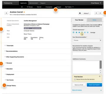
ApplyYourself Application Review Tool

Hobsons came to us with an interesting observation. Their flagship software, ApplyYourself, enables universities to process applications from prospective students. Over time, they noticed that admissions officers were quietly granting faculty members access to the software to streamline the review process. This unanticipated use was identified as an opportunity to build an application review tool explicitly for faculty members.
What we did
Strategy & Architecture
Based on what they heard from their clients, we knew the need existed. What Hobsons didn’t have was a clear vision for the product. So we started with a quick, intense research phase. We first spoke with customer service, training, and sales employees to understand the review process at a high level.
Then we dove deep, interviewing their clients and observing how they conducted their reviews. This helped us understand how each review was conducted and who was involved. Looking across clients, we spotted patterns in their processes as well as nuances that must be accommodated.
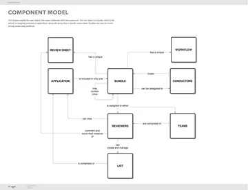
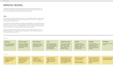
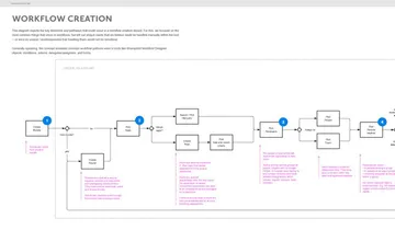
The result of this review was a mental model identifying the needs of the users, a conceptual model of the architecture, a prioritized list of features, and a clear estimate of effort.
Working Collaboratively
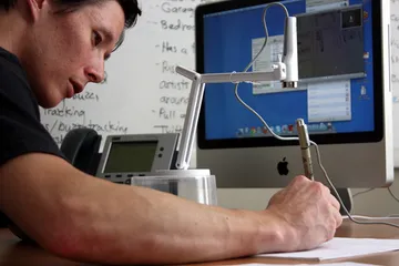
As Hobsons was both the subject matter expert and the implementor, it was crucial that we worked together closely. A standard waterfall process would not work. Though our teams were geographically separated, we kept the experience fluid with remote brainstorming sessions, often using sketch cams to convey ideas and work through questions efficiently. Once the design stabilized, we provided thoroughly annotated wireframes that recorded the design decisions we made.
We also established weekly design reviews with their product, development, and QA teams. This made it easy to maintain a tempo, stay informed, and course-correct when needed. It also allowed their development teams to work in parallel, setting up infrastructure and logic in advance of final buildout.
Designing for Perpetual Novices
Because admissions processes are usually seasonal, reviewers use the tool intensely for a few weeks, then forget about it until the next review. They never become very familiar, so we needed to ensure that our designs could be grasped with little to no training.
To do this, we relied on vocabulary, metaphors, and interface patterns that were familiar. Email, in particular, became a reference point because of its ubiquity. Within the application, wizards and contextual help provided additional guidance around concepts that could be unfamiliar.
Inspired by Paper
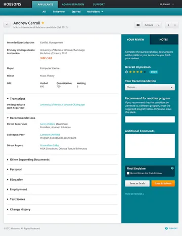
In our research we discovered that there was still a strong bias towards paper, even at schools whose processes were largely digital. Reviewers would print applications out, make personal notes, and dog-ear the pages. They would divide applications into piles in order to compare similar applicants -- or simply to have a small set they could review in between appointments.
These behaviors and actions supported their highly personal review strategies. We realized that the application needed to accommodate these in order to be useful to reviewers. Features like tagging, starring, and recording private notes were designed to discourage reviewers from printing applications out.
Controlled Flexibility
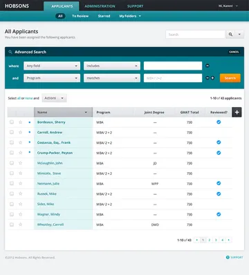
One of the most important research findings was that universities, schools, and departments each had unique, unwavering review processes. A one-size-fits-all review process would not work. We needed to allow flexibility while also defending simplicity and clarity.
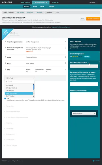
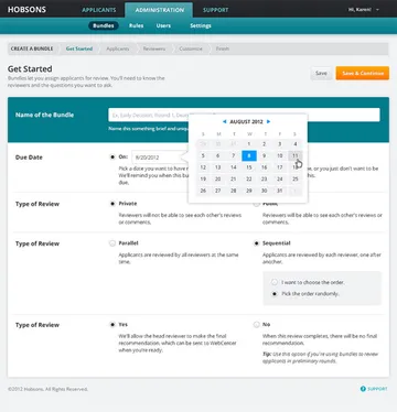
We built the architecture around the commonalities: bundles of applications, sets of reviewers, types of review questions, methods of review. With this stable foundation, we were able to allow controlled flexibility where it mattered most. Reviews can be run sequentially or parallel, in single or multiple rounds, and with tiers of reviewers if necessary. Admissions officers can customize what applications look like to reviewers as well as the questions posed to them.
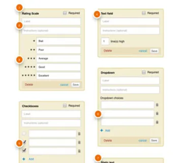
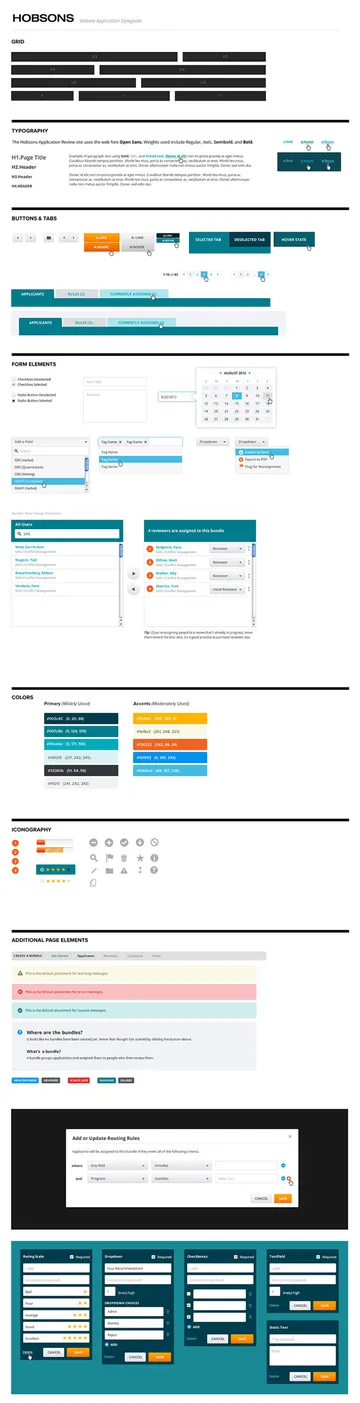
Designing a Design System
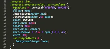
Developing a thoughtful, intentional design language is critical to application design. At the functional level, we developed reusable patterns that allowed us to componentize the visual design. This was enhanced and codified in an styleguide -- which acts as library of reusable elements that can be drawn upon as the tool evolves.
Rapid Front-end Development
We chose to use Twitter Bootstrap as a starting point for UI development, and to highly streamline and customize it specific to the application's design and functionality requirements. This allowed us to rapidly start building out application screens and see progress early in the buildout process.
Additionally, application screens were released incrementally using Github, in order to stay in sync with Hobsons's development team's user story based development.