What UX Designers Can Learn From IKEA

Katherine Olvera, Former Senior User Experience Designer
Article Categories:
Posted on
How putting together furniture can help you think about user onboarding.
I recently moved and ended up buying a lot of IKEA furniture. While assembling the different pieces, I began to notice how IKEA devises their instructions to gently lead builders through complex tasks.
One of the customer's first interactions with an IKEA product will be to build it, and this experience will likely shape the customer’s lasting impression of both that piece of furniture and IKEA as a brand. This is a high-stakes interaction, and there are so many places where it could go so wrong. Poorly-written instructions may very well end with the customer either throwing up their hands or throwing a hammer at the piece in frustration.
IKEA understands this and carefully crafts their instructions to guard against rage-fueled furniture destruction. They are written (or drawn really) to guide a novice through the complex process of creating functional furniture out of a pile of otherwise inscrutable panels and hardware. But they don't just instruct. They are devised to positively shape the assembly experience, hopefully culminating in a feeling of success or accomplishment. This is very similar to an onboarding process, and we, as UX designers, can borrow some of the strategies that IKEA models in their instructions to guide our approach to onboarding design.
Set an Expectation
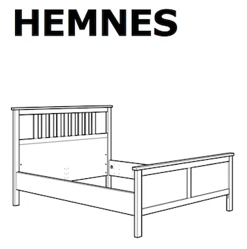
Every set of instructions starts with a bold picture of the finished product. Here they are making a promise and keeping the customer aware of the end goal: if you follow these instructions, this will be the result.
When you are onboarding a new customer, concisely restate the purpose of the product. Demonstrate what a customer can expect to gain by setting out on the sometimes frustrating journey of learning a new app. That promise will help keep your new users motivated.
Prepare Your Users
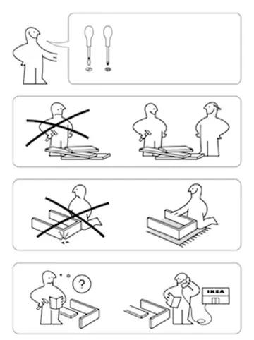
Preparatory notes offer reassurance. They are also intended to prevent some of the interruptions or frustrations that could slow a customer’s momentum or sour the entire experience. If you know up-front that you will need two types of screwdrivers, you won’t need to break away to dig up those tools later. Proper priming keeps the customer’s attention focused.
In an onboarding process, there are similar considerations. Is there 2-step authentication where a user will need to have their phone handy? Or, will a user need content to test an email-building application? First, consider whether these preparatory steps are really necessary. (Sometimes you can redesign the onboarding process to smooth potential impediments, like providing dummy content to play around with.) Then, give your users a heads up. This will help ensure that they continue to progress through the onboarding flow.
Connect All the Dots
In the past, I've encountered instructions that felt either incomplete or overly complex. Multiple steps were combined into one, or transitional steps were missing. This seemed to be in an effort to keep the instruction pamphlet brief. When I began to doubt my understanding of the instructions though, I would hesitate. Why? Because I would hate to realize 15 steps later that I had put a piece together backwards and now have to backtrack to fix it. If a user grows unsure or confused about too many steps, they too will be hesitant to proceed, hindering progress.
IKEA, on the other hand, doesn't shy from length. They favor clarity over brevity. While the overall task of putting together a piece of IKEA furniture can be complicated, each step is broken down into a discrete action and clearly and simply articulated. I felt confident after each step that I was putting the pieces together properly.
Break down your tasks into discrete actions, make fluid connections between these actions, and reveal the appropriate amount of detail to assure your users that they are making progress. Giving too much detail can be overwhelming, while a lack of detail can be confusing.
Anticipate Problems
I also noticed how often IKEA anticipated my questions. They anticipated confusion and provided the appropriate guidance. They knew their product through the lens of the uninitiated.
While this may seem obvious, it is often hard to do. Features and terminology can seem self-evident to the designers who are working on a project day in and day out. But, they may be rather opaque for a new user. Test the onboarding process with new users to ensure your language and guidance makes sense and that there is appropriate explanation for more complex features or actions.
Acknowledge Incremental Success
IKEA purposely designs their instructions to make progress apparent to the customer. While putting together some drawers, I realized it would probably be faster to screw in all the screws to all the fronts at once, instead of creating a full drawer, and then another. However, this isn’t how the instructions are written. IKEA would prefer the customer proceed a little slower and use clear visual progress to prod them forward. Recognizable pieces (like a drawer or a headboard) materialize and, then those pieces are assembled into the whole. Each large task is broken down into smaller accomplishments.
IKEA also front-loads the assembly of larger pieces, leaving smaller, fussier pieces for the end. For example, the frame of the dresser will come together rather quickly before starting on the more labor-intensive and monotonous task of putting together all the drawers that go inside. This allows the customer to feel satisfied almost immediately with their progress.
How might this apply to onboarding strategy? First, encourage your user forward by giving them a sense of their progress. For example, a progress bar or explicit steps orient a user as they work through a task.
Second, front-load your “aha moment.” We recently tested an email builder with users. As users discovered the drag-and-drop feature towards the beginning of their interaction with the builder, they often commented how intuitive and easy that seemed. The perception of that early interaction seemed to shape their impression of the entire app experience, even if they struggled with some of the more complex tasks we asked them to try. Try to position a big accomplishment towards the beginning of an onboarding experience. It will keep your users more engaged and motivated. That initial success will build up your users’ confidence, so that they feel more capable of tackling challenging tasks.
Give Your Users Some Space
Instructions aren’t for everyone. Some users like to just hop in and get started. The nice thing about a book of instructions is that they are available for you when you get stuck, but you aren’t required to use them. An ideal onboarding process is available and accessible when you need it for support, but it isn’t obtrusive. You can skip it, if you just want to jump in and get going, but you can refer back later if you need help.
Making connections between real life experiences and digital experiences can strengthen our thinking about design. Putting together furniture renewed my empathy for new users, and it also gave me a deeper appreciation for a good onboarding process. For me, discovering these analogies gives me a more concrete understanding of the problem, fresh perspective, and a starting point to begin developing solutions.