What I Love & Hate About Tailwind CSS

Trevor Davis, Former Front-End Development Technical Director
Article Categories:
Posted on
As a long time skeptic of Tailwind CSS, I’ve finally given it a try and discovered some things I love and hate.
I’ve been building websites for a long time professionally now. Since tables were still used for layout, through the web standards movement, testing sites on IE 5.5 Mac, when Position is Everything was my go to resource instead of Stack Overflow, CSS Zen Garden, and when we actually looked at the our rendered source and cared about the indentation. So yeah, it's been a while.
I’ve seen CSS frameworks come and go and always favored a bespoke CSS approach for every site. I was reluctant to dive into yet another CSS framework, but after continued internal discussion within the front-end development team, I finally built a site (or two) with Tailwind CSS. At first, I didn’t go all in and only exposed a couple of variants for spacing, but now I’m all in.
So as a reluctant grump old web developer who has finally given Tailwind a chance, here are a few thoughts on what I love and hate about it.
What I Love
Enforced Adherence to Design System
It is too easy to write regular CSS and not adhere to an existing design system. Does this styling exist in a component elsewhere? Which component? Is the existing component exactly the same as this new component I’m building? Are there slight differences?
Tailwind’s configuration forces you to standardize on colors/units/etc. Certainly you can create a bad configuration, but it makes it a lot easier to standardize on a system and not deviate from it.
theme: {
    screens: {
        xs: em(450),
        sm: em(640),
        md: em(768),
        lg: em(1024),
        xl: em(1280),
        'xs-d': { max: em(449) },
        'sm-d': { max: em(639) },
        'md-d': { max: em(767) },
        'lg-d': { max: em(1023) },
        'xl-d': { max: em(1279) },
    },
    colors: {
        yellow: {
            100: '#fffbd4',
            200: '#f0ff08',
            500: '#ffe614',
        },
        magenta: {
            400: '#f20374',
            500: '#d80367',
        },
    },
    spacing: {
        '0': '0',
        ...rem(2),
        ...rem(4),
        ...rem(8),
        ...rem(12),
        ...rem(16),
        ...rem(20),
        ...rem(24),
        ...rem(32),
        ...rem(48),
    },
    width: () => ({
        '1/4': '25%',
        '1/3': '33.333333%',
        '1/2': '50%',
        '2/3': '66.666667%',
        '3/4': '75%',
        full: '100%',
    }),
}
Another huge benefit to pretty strictly enforcing a design system, is that it’s trivial for multiple developers to jump into a project and easily adapt to the design system. Since these systems end up having the same foundation between projects, it makes these transitions between projects very smooth.
Limited Custom CSS
If you go all in on adding classes to elements, you rarely find yourself having to write actual CSS. The HRC website that we just launched had 10kb of CSS, which includes all of the Tailwind CSS as well as some custom CSS when we needed to reach for it.
This also limits the amount of naming you have to do, which we know is one of the hardest things in Computer Science.
Intellisense & Developer Experience
Modern code editors include a Tailwind extension to help with autocompleting classes.

You can also hover over a class and see what CSS is being added.
You also get linting, which will highlight any errors in the classes being added. When you separate your CSS from the HTML, you can’t really get this sort of in context intellisense.
Responsiveness
This was the initial reason I wanted to pull in some of the Tailwind variants the first time I used it. I wanted to easily setup a “grid” system in which I could responsively apply widths.
You can define your screen sizes, and then add the responsive variant to the properties I wanted to generate classes for. So if we take a simple configuration example and look at the CSS that get’s generated.
theme: {
    screens: {
        sm: em(640),
        lg: em(1024),
        'sm-d': { max: em(639) },
        'lg-d': { max: em(1023) },
    },
    width: () => ({
        '1/2': '50%',
        full: '100%',
    }),
},
variants: {
    width: ["responsive"],
},.w-1\/2 {
width: 50%;
}
.w-full {
width: 100%;
}
@media (min-width: 40em) {
.sm\:w-1\/2 {
width: 50%;
}
.sm\:w-full {
width: 100%;
}
}
@media (min-width: 64em) {
.lg\:w-1\/2 {
width: 50%;
}
.lg\:w-full {
width: 100%;
}
}
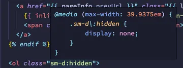
@media (max-width: 39.9375em) {
.sm-d\:w-1\/2 {
width: 50%;
}
.sm-d\:w-full {
width: 100%;
}
}
@media (max-width: 63.9375em) {
.lg-d\:w-1\/2 {
width: 50%;
}
.lg-d\:w-full {
width: 100%;
}
}That means when you want to create an element that is full width until the screen is 1024px, and then it becomes 50% width; it would look like this:
<div class="w-full lg:w-1/2">
    This element is 100% wide until 1024px and then it becomes 50% wide
</div>
You are not only limited to responsive variants either. Tailwind comes with a number of additional variants built in, and more can be added with plugins.
Naturally Forces You to Componentize
It’s a pain in the butt to add so many utility classes to every element (I’ll get to that later), and because of this it’s sort of natural to create HTML components (utilizing whatever templating language you are using). Once you do componentize, it's advantageous because the styling and markup for the component then lives in one place, instead of having to bounce over to the CSS to see how the component is being styled.
Avoids the Abstraction of CSS
As a team, we recently watched a great video where Dan Abramov presented about the danger of abstractions. As we were watching the video I had a light bulb moment where I recognized that writing normal CSS is a complex abstraction that’s hard to maintain. Tailwind helps you to inline that abstraction in a really slick and maintainable way.
The most important benefit here is maintainability. With other sites that do not use Tailwind, the CSS will continue to grow over time and without limit because it becomes a challenge to make changes to existing code. With Tailwind, you can handle most future variations with utility classes and without having to write custom CSS.
What I Hate
Tons of Classes in HTML
This is just awful; there’s no other way to put it.
<div
    class="flex flex-col max-w-max mx-auto
           lg-d:bg-white lg-d:ease-out lg-d:fixed lg-d:h-full lg-d:invisible lg-d:left-0 lg-d:opacity-0 lg-d:overflow-auto lg-d:top-0 lg-d:w-full lg-d:z-10
           lg:flex-row lg:items-center lg:justify-between
    "
>
    …
</div>
This is certainly an extreme example, but looking at all those classes and trying to determine what is happening can be a challenge.
Blurry Line Separating Content & Appearance
I’ve spent my entire career writing clean and semantic HTML and CSS with a clear separation of concerns, and Tailwind made me completely rework my thinking. Before diving in, it just looked like writing "inline styles" to me, but really it’s a subset of "inline styles" (in the form of class names) specifically scoped to your design system.
More Empty Elements
Wanna style a pseudo element? You could add a Tailwind plugin thats add all the utility styles for the pseudo element variants. Or just throw an empty div in there. Or bail out to writing custom CSS. Typically we end up going the extra empty element route.
Have to Build or Add Plugins Frequently
When you need to do something that Tailwind doesn’t provide, you either need to write your own plugin or find an existing one. It’s good that there is a thriving plugin ecosystem and the flexibility to add it yourself, but introducing additional technical debt or third party libraries is something to be wary of.
Tailwind has also continued to add new features which remove the necessity to include plugins. That’s also good and bad. They are increasing the complexity of the core but also reducing reliance on third party packages.
We have started to mitigate this a bit by having our own collection of plugins that we can easily pull into projects.
Another Damn Config
While this isn’t necessarily a tailwind specific problem, Tailwind (and PostCSS) require a config file, so now you have all the configs. Remember the olden days when things used to be simple? 👴
Inconsistent Class Naming
This is probably the most annoying thing to me. Tailwind’s classes don’t have a consistent naming pattern. For example, the display property has a class for each value.
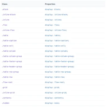
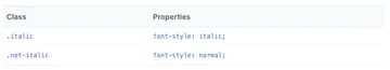
These all make sense, except for hidden. But you can understand why the naming in that instance needs to be customized since so many properties have a none value. So fine, I can deal with that one. But for reference, when you want to apply box-shadow: none, you use the class shadow-none.
In another example, why are the font-weight classes prefixed with font?
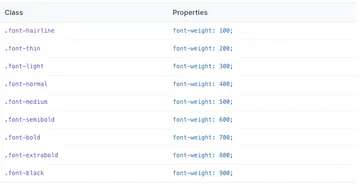
But font-style and font-size are not?
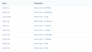
I just wish there were some more consistency in these.
Emphasis on Extending
We’ve touched on this a few times, but the Tailwind docs emphasize extending instead of replacing the default configuration. This certainly can make sense when you are using Tailwind as more of a Bootstrap or theming tool. But when you are using it to build a custom designed site, a lot of the default values are not terribly useful.
So to remove that layer of abstraction, we prefer to generate the full configuration and customize for each site.
Give it a Shot
Even if you are an old school web developer who names your classes semantically, I’d recommend giving Tailwind a shot. I held out from the pressure from the rest of the Front-End Development team as long as I could, but I finally gave in and see the value in using it.