Web Brutalism, Seamfulness, and Notion
Brandon Dorn, Former Senior Product Designer
Article Categories:
Posted on
How a tool for sensemaking reconciles two distinct software design ideologies.
Taking a dig at Jakob Nielsen’s po-faced disapproval of Flash, Joel Spolsky wrote a post that has been echoing around the internet for the last 20 years. It’s short and funny, so I’ll quote it all here:
“Jakob Nielsen says that Flash is ‘99% bad.’ I have to agree. Flash always reduces usability. On the other hand, every time I read Jakob Nielsen, I get this feeling that he really doesn’t appreciate that usability is not the most important thing on earth. Sure, usability is important (I wrote a whole book about it). But it is simply not everyone’s number one priority, nor should it be. You get the feeling that if Mr Nielsen designed a singles bar, it would be well lit, clean, with giant menus printed in Arial 14 point, and you’d never have to wait to get a drink. But nobody would go there, they would all be at Coyote Ugly Saloon pouring beer on each other.”
Spolsky’s post reads differently today than it did in 2000, a few years before web accessibility regulations were legislated into federal law. Usability now has to be everyone’s priority. WCAG standards are our rules of the road, preventing needless ambiguity, error, and exclusion. Yet the standardization of web patterns and general obsession with optimization have prompted calls for a return to the “weird web” (calls which notably reminisce about Flash development in the early aughts). We got too serious, too mainstream, as the web grew.
The web is fundamental to modern life, but modern life is also weird and bizarre and our commitment to usability needn’t hinder the expression of that strangeness. Thankfully, you can spend Bill Gates’ money using just keyboard navigation. There’s more strange out there.
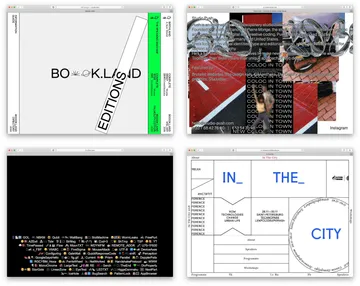
We see a little of this weirdness in the sites cataloged on Brutalist Websites. Web Brutalism has become a catchall term for websites that flout the conventions of modern web design with a kind of droll, utilitarian nostalgia for the early web. Think JNCO jeans in a sea of khaki Wordpress chino sameness. Things animate that shouldn’t, things don’t animate that should, things animate in ways that they shouldn’t. Navigation elements are either in your face or purposefully obscured. 3D art, italics, plain, neo grotesk fonts, monstrous hover states, jewel tones, thick dividing lines, harsh contrasts are some of the hallmarks. The trend is decidedly hip, and popular enough to show up in The New York Times articles and Bloomberg design conference sites. You know it when you see it.
There’s some debate about what constitutes Web Brutalism. In “The Split Personality of Web Brutalism,” Frederick O’Brien quotes Pascal Deville, curator of the Brutalist Websites archive, on the different types of practitioners:
”The purists reference strongly to the architectural characteristics of Web Brutalism, such as the concept of ‘truth to materials’ and the use of the purest markup elements available. The UX minimalists, in contrast, see efficiency and performance as the main driver of Web Brutalism and even believe that the radical limitation of possibilities can boost conversions. The ‘anti-ists’ or artists see web design as an (still) undervalued form of art and don’t show much respect [to] the status quo and mostly get bad press.“
Most of what’s labeled Web Brutalism is a normcore visual aesthetic — the web version of anti-art, a rejection of refinement and sophistication — rather than a meaningful digital analogue to architectural Brutalism. Coined by Swedish architect Hans Asplund, “Brutalism” described a style of architecture that intentionally revealed the underlying structural materials, derived from the French béton brut, “raw concrete”. Though it has since been associated with monolithic, domineering concrete government buildings aptly described as brutal, Brutalism is in fact an ethos of truth to materials, emerging from postwar ideals of transparency, economy, and stability.
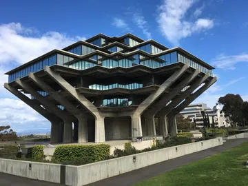

People have recently come to the defense of these maligned buildings as they fall into disrepair and become targets for demolition. Brutalist buildings weren’t primarily avant garde artistic statements — although some are remarkably forward-thinking and provocative — nor were they designed to intimidate inhabitants with monolithic walls and cantilevers. Rather, the style was an attempt to create architecture that honestly reflected purpose and form. Architecture critic Reyner Banham wrote in 1955 that brutalist buildings exhibit three qualities:
- formal legibility of plan,
- clear exhibition of structure, and
- valuation of materials for their inherent qualities ‘as found.’
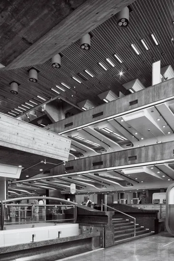
Banham formed his definition in part by reflecting on the work of British architects Alison and Peter Smithson whose mid-century buildings anticipated the early phases of Brutalism. Describing a Soho project in 1953, the Smithsons described what would come to be called “the warehouse aesthetic:” “It is our intention in this building to have the structure exposed entirely, without interior finishes wherever practicable. The contractor should aim at a high standard of basic construction, as in a small warehouse.”
Brutalist buildings are notable for their use of unadorned materials — “raw” concrete and wood. Yet at the core of the Brutalist ethos is a tension between two philosophies that have been the topic of a longstanding debate in information design: the merits of “seamless” and “seamful” design, “seams” in this context taken to mean revelations of an object’s inner workings.
It is our intention in this building to have the structure exposed entirely, without interior finishes wherever practicable. The contractor should aim at a high standard of basic construction, as in a small warehouse.
The debate asks the question, To what extent should an object reveal its structure and operation to the user? Seamless proponents argue that tools should be invisible, disappearing into the task at hand. Mark Weiser, writing about Ubiquitous Computing in 1991, summarizes seamlessness well: “By invisible, I mean that the tool does not intrude on your consciousness; you focus on the task, not the tool.” Designers typically take seamlessness as the de facto standard for our work, emphasizing clarity, consistency, simplicity, efficiency, reducing cognitive load. We seek to minimize distractions.
Yet what if we can achieve a clearer understanding by intentionally revealing how a system works? Proponents of seamfulness argue that revealing an object’s complexity and operation can aid usability. Chalmers and Galani point out that seamful design allows users to “to selectively focus on or reveal [seams] when the task is to understand or even change the infrastructure.” Interactive explorable explanations are some of the best examples of information design that facilitate understanding. They don’t banish complexity, but rather progressively-disclose it to the user as they reveal the system. The concept of meta-moments is another example of seamful design, in which moments of reflection are prompted by thoughtful use of friction in UI design.
Seamlessness emphasizes concealment; seamfulness emphasizes transparency. In architecture, Brutalism’s ethos of transparency was partly a response to the buttoned-up modernist International Style. And on the web, Brutalist websites can be seen as a response to the polished visual style of Material Design and Apple’s Human Interface guidelines.
The anti-art aesthetic has become the face of Web Brutalism because it's fun and edgy and all the cool kids are doing it. Yet Deville’s purists, minimalists, and anti-ists are all asking, in their own way, what it means to make something on the web that is true to the web. Where is authenticity to be found? In adherence to traditional web markup, or in efficient minimalism, or maybe in the goofy spontaneity of the early web? Are David Copeland’s principles a truer representation of “fidelity to materials” of the web than Google’s Material philosophy? What is the true material of the web? Is it markup, or is it microchips and physical telecommunication networks? Or is it motion, like Frank Chimero argues in “What Screens Want?” When the Smithsons placed the water heater for the Hunstanton Secondary School prominently above the school’s roofline, they weren’t just revealing the building’s infrastructure, they were reveling in it. What does it look like to do this on the web?

Of course there’s no single answer, because the web is simultaneously a physical and digital medium. It is material and it isn’t. It depends on how literally you interpret the question. But taking it somewhere in-between, seeing the web as primarily an information medium, we can ask the question a little differently: what does it look like to design something that is true to the material of digital information?
I’ve been thinking about this as I spend more time using Notion, an application designed for organizing and sharing information. At first glance, it doesn’t seem all that different from the Evernotes and Google Keeps of the world. It allows you to create pages which include calendars, to do lists, image galleries, tables, and the like. What makes it different than other note-taking tools is its flexibility: a page can contain just a calendar, or it can contain text, images, video embeds, all of which are treated as defined, linkable content blocks.
Notion’s flexibility is too unrestricted and ambiguous for some. The app doesn’t prescribe an organizing structure to information, allowing you to nest and combine pages and content in whatever way makes sense for you and your work. Yet it has very clear structures for the types of content blocks that can be created: something is either a video, or a heading, or quote, and is styled and formatted accordingly.
This, I think, is the brilliance of Notion, and what makes it one of the best examples of “fidelity to digital information” that I’ve come across. The structure of the app reflects the structure of the web itself: digital content is purposefully formatted, like semantic HTML elements, and exists in a hierarchical structure (directories on the web, nested pages in Notion), yet can be linked and referenced to create a complex network of information. And pages in Notion reveal the structure of the information: when nesting a page within a page, the child page always displays on the parent page. There’s no way to create a child page that doesn’t display on a parent page, no way to obscure the structure of the information. The semantic structure of Notion reflects the semantic structure of the web itself.
Which brings us back to seams, and web brutalism. By the looks of it, Notion isn’t an exemplar of web brutalism. It’s a highly-polished consumer app, technically complex, and goes far beyond the strictures of vanilla HTML markup. Yet it thoughtfully balances the tension between seamfulness and seamlessness, revelation and disclosure at the heart of the Brutalist ethos. The app reflects ideas of information design that inspired the web itself, which makes sense given their admiration of early web pioneers.
The concept of seamfulness prompts designers to ask how an object can aid understanding and usage by showing its users what’s going on inside. How can we create what Mark Wiser called “beautiful seams” — thoughtfully-crafted moments of revelation? Notion doesn’t show us how it’s literally working — the background processes constantly running to enable editing, collaboration, and the like. We don’t need to see our car’s engine to know it’s running. But it shows users how their understanding is working, how our ideas are structured, connected, and evolving. The app is reminiscent of Kedit, a program essayist John McPhee asked a friend to develop for him:
“Kedit did not paginate, italicize, approve of spelling, or screw around with headers, wysiwygs, thesauruses, dictionaries, footnotes, or Sanskrit fonts. Instead, [Howard J. Strauss, then-head of Princeton’s Office of Information Technology] wrote programs to run with Kedit in imitation of the way I had gone about things for two and a half decades...Howard thought the computer should be adapted to the individual and not the other way around. One size fits one. The programs he wrote for me were molded like clay to my requirements—an appealing approach to anything called an editor.”
Prior to using Kedit, McPhee would document notes on individual notecards, then arrange and rearrange them on his kitchen table or living room floor as he organized the structure of his essays. What he lost visually in using Kedit, no longer seeing groups of notecards on the floor, he gained in a searchable, flexible database of information that gave him an effective way to shape knowledge in idiosyncratic ways.
This is the essence and opportunity of Web Brutalism: more than a utilitarian aesthetic, it’s a way of creating spaces for thought and expression on the web that reflect the nature of thought and the web. The best tools — digital or otherwise — give enough structure and flexibility for the task at hand. When that task is thinking, the best tools reflect the way that thinking happens, a meandering, back-and-forth process of exploring and refining our hunches and questions and notions.