Signal vs. Noise: Color as a Wayfinding Tool

Tom Osborne, Former VP, Design
Article Categories:
Posted on
Used carefully, color can become a helpful wayfinding tool to better help a user know where she is and where to go next. When it comes to user interface design, you may want to limit your use of color. Instead, use it cautiously in very intentional and meaningful ways.
When color is used in excess, it’s not clear what needs your attention most. Think of it like a crowd full of talkers. If everyone is speaking at the same time you won’t hear when someone says something important unless that person is shouting louder than everyone else. On the contrary, if one person in the crowd is the only one speaking, you’ll likely hear what that person has to say.
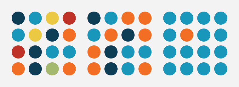
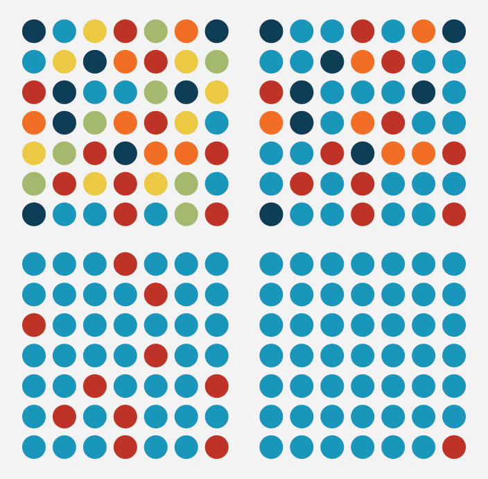
As an example, look at the dot patterns below. As the colors are reduced, it becomes easier to notice any one dot. Imagine that these dots represent links. In the bottom right set, which is the important link?
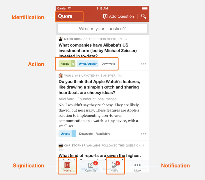
Wayfinding Guideposts
When it comes to wayfinding, I believe color can be used in at least four significant ways:
- Identification: as a brand identifier often in harmony with a logo
- Action: for links, buttons, and other actions like voting and rating
- Signification: to let you know where you are as in “you are here”
- Notification: to let you know there is something new
It's worth noting that often color simply comes naturally through media content (like photos and videos). Let’s take a look at examples from a few popular apps made by Facebook, Quora, Pandora, and Netflix.
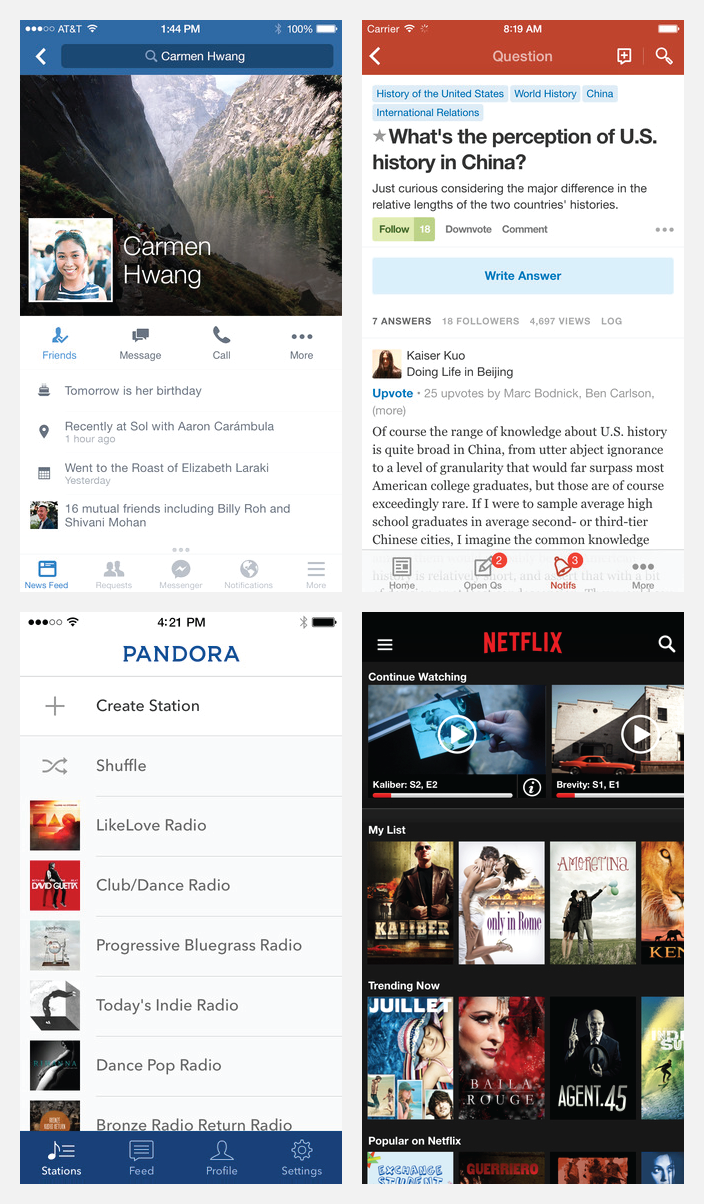
(Clockwise from top-left: Facebook, Quora, Netflix, and Pandora)
When you see these examples, where do you see color? What do you think the colors are trying to tell you?
You might have said the Netflix app is full of color (because it is). But what happens when we remove the media assets and replace the vivid imagery with lower-fidelity shapes and colors?
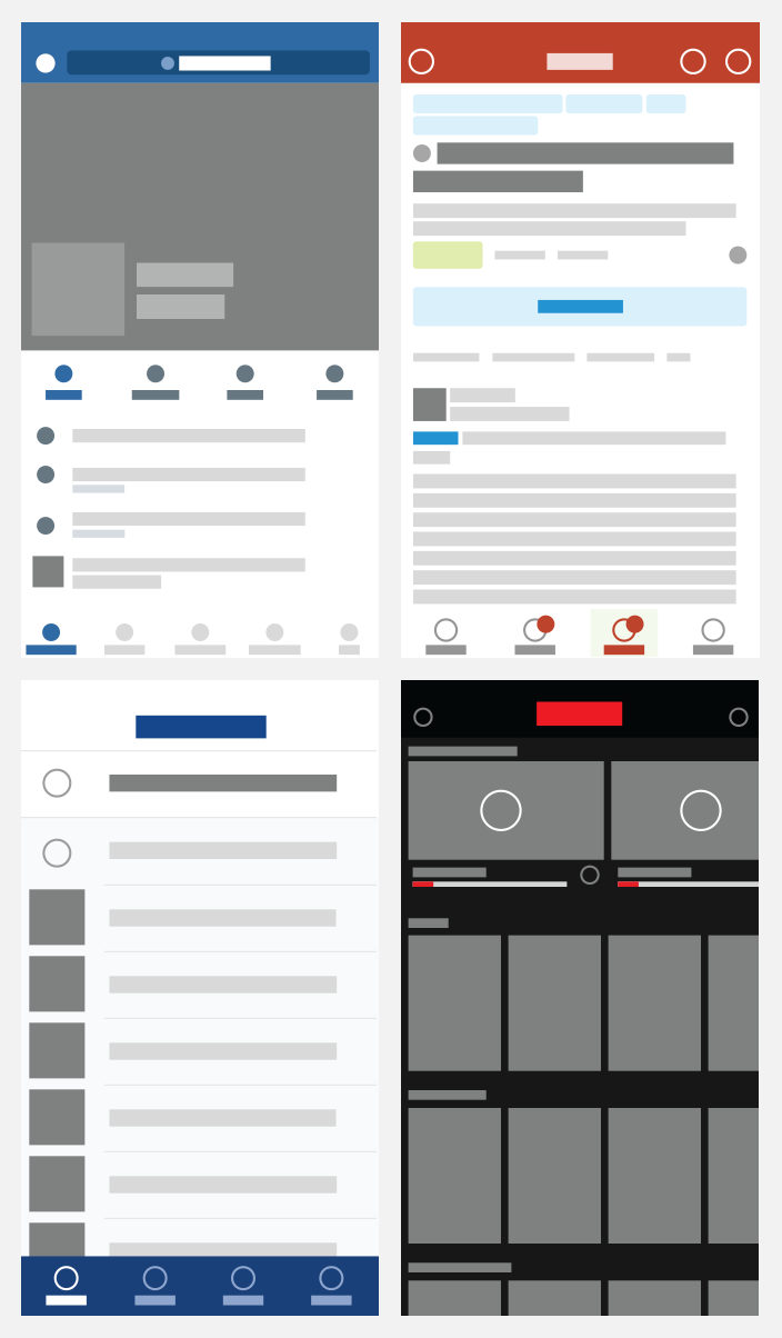
Can you see how these apps allow for much of the color and interest to come from the media art within? After the content is replaced with gray boxes it’s more obvious where the added color can be found. Image-heavy Netflix uses very little color, whereas text-heavy Quora differentiates brand and action colors.
It’s also worth noting that because of it’s added visual interest and contrast, the iconography can also serve as a guidepost (this is why the icons have been replaced with circles in my examples). The icons (and circles) serve as contrasting beacons alongside the text.
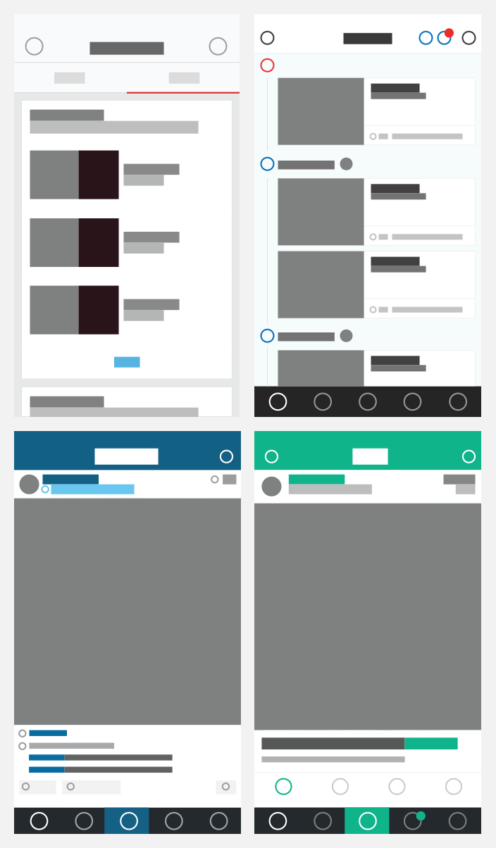
Now look at these patterns in YouTube, Behance, Instagram, and Vine.
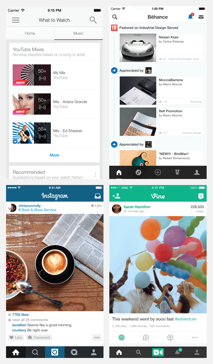
(Clockwise from top-left: YouTube, Behance, Vine, and Instagram)
Do you know where you are? Do you know what to do? Do you know where to go next? Can you see how color is used thoughtfully?
A little color can go a long way as a wayfinding device.
In Summary
When you bring color into user interface design try to make careful and meaningful choices to help optimize your application’s wayfinding and usability. Your users will be less confused and you will likely have more success getting them to do what you would like them to.
See also:
Note: This article is part of a series on color as it relates to designing for the web. For more in the series, check out these articles: