Using Visual Loudness for Better Wayfinding
Tom Osborne, Former VP, Design
Article Categories:
Posted on

“It needs more ‘pop’.” Can I tell you how many times I’ve heard that phrase? It’s the sad reaction to a design that could lack proper emphasis. My reaction is usually something like, “if everything pops, nothing pops.” Does this sound familiar?
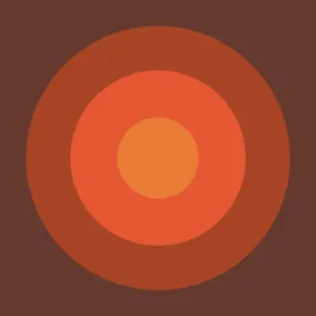
Over time I’ve learned this can be a symptom of not better understanding hierarchy and priority as it relates to visual loudness. Well-designed interactive experiences use loudness to help identify and amplify wayfinding systems. Because, if everything screams all you will hear is noise. Emphasis used properly—like a loudspeaker in a crowded room—can help guide attention more effectively. Careful use of visual loudness helps illuminate priority.
Suffice to say, it’s worth taking time earlier in your process to better understand and think about what elements need to speak louder than others.
Loudness scale
With sound, a loudness scale measures varying decibel levels. Good ones illustrate different degrees of loudness that we make. From a 12-gauge shotgun to a pin falling, there can be many levels in between.
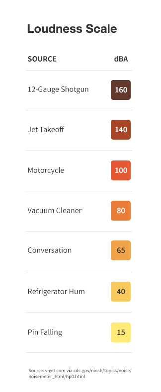
I’ve found this to be a useful tool to better identify, illustrate, and convey which elements of a design need more ‘pop’ than others. First, what is it that needs to be louder? How loud does it need to be? A whisper? A shout? With two or more adjacent elements, which is louder? How loud in comparison?
Visual Loudness
These techniques can be built into wayfinding systems through the use of links, buttons, and promotional call-outs. Here’s an example of a guide I’ve created in the past:
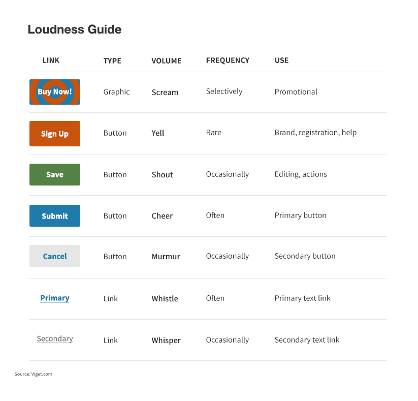
The key in the above example is that different kinds of promotions, buttons, and links each have a different volume to their use. Thoughtful and selective use of color, size, and format will net better results as wayfinding guideposts than using the similar elements everywhere.
For example, a blue ‘submit’ button next to a gray ‘cancel’ button should clearly put more visual importance on the ‘submit’ button. Also, a single instance of a green ‘save’ button should stand out among several instances of blue buttons (see previous article: Signal vs. Noise: Color as a Wayfinding Tool). A larger, orange button should stand out from others because it’s a warm color used infrequently when cooler blues and greens are used more frequently. Turn the volume up further with illustrative promotional call-outs—the megaphones on busy street corners.
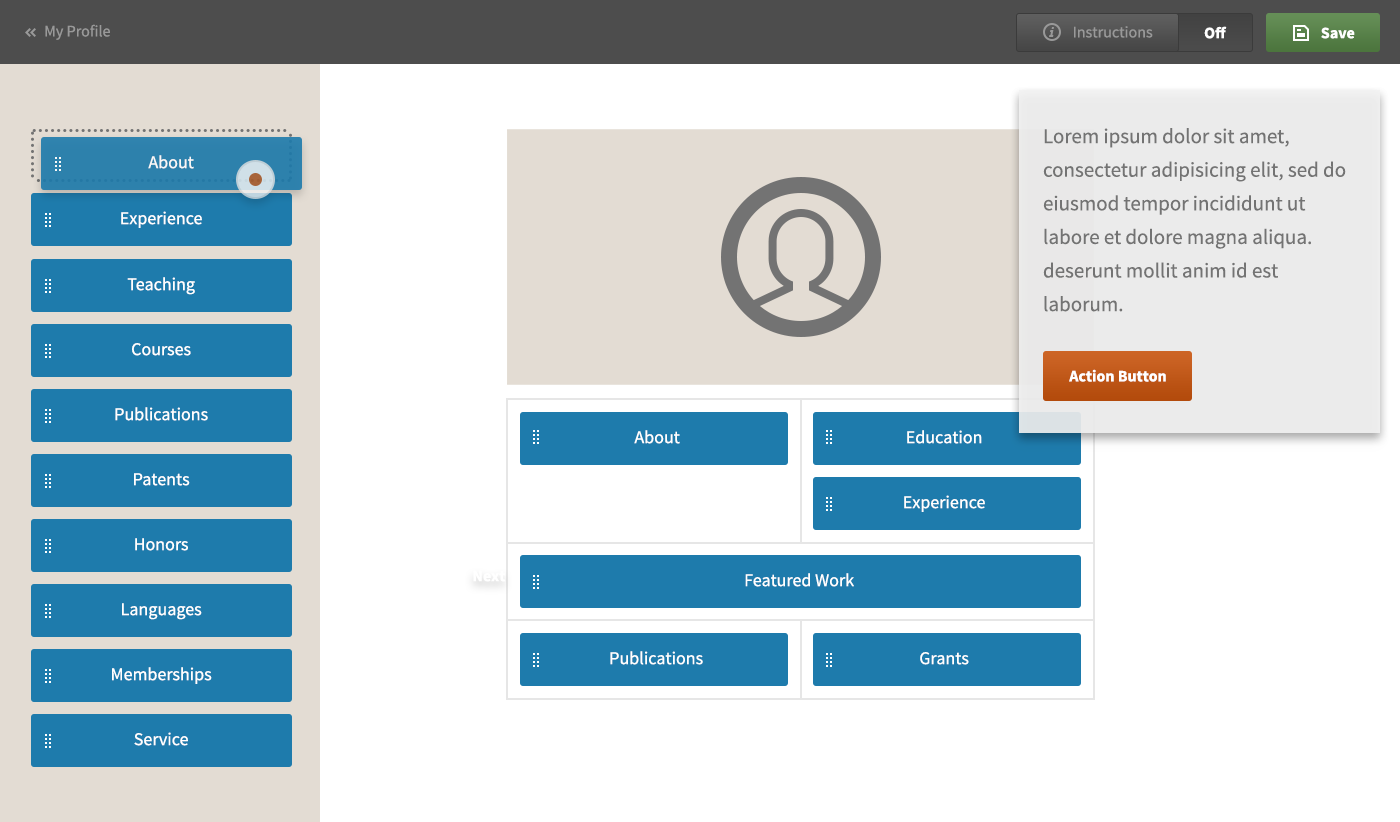
In the example shown above, note that the blue buttons are drag and drop elements, whereas the tutorial action button is orange and the save functionality is green. By color coding them differently and selectively we are giving them more meaningful attention.
In Summary
So, the next time someone tells you your design needs more ‘pop’, try using visual loudness and sound metaphors to help guide the conversation and prevent too many things from competing for attention.