VigePops : Making Them Look As Good As They Taste

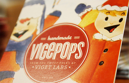
Recently, Owen Shifflett and I combined forces (not unlike the Wonder Twins) to work on the design for Viget's annual holiday gift (it's still January, it's not too late to write about holiday things yet, right? Right?) This year it was VigePops, yummy handmade lollipops (read all about them and maybe even snag some VigePops for yourself here). The project included branding, packaging, web design, and illustration. Lots of illustration.
Our design director Tom, Owen, and I brainstormed the concept and style of Vigepops. The words "candyland" and "winter wonderland" came up more than once. From there I quickly threw together a style board. I drew mainly from the classic, bright look of the 50s and early 60s, with excited, wide-eyed kids, and a few touches of sophisticated illustration.
Illustration
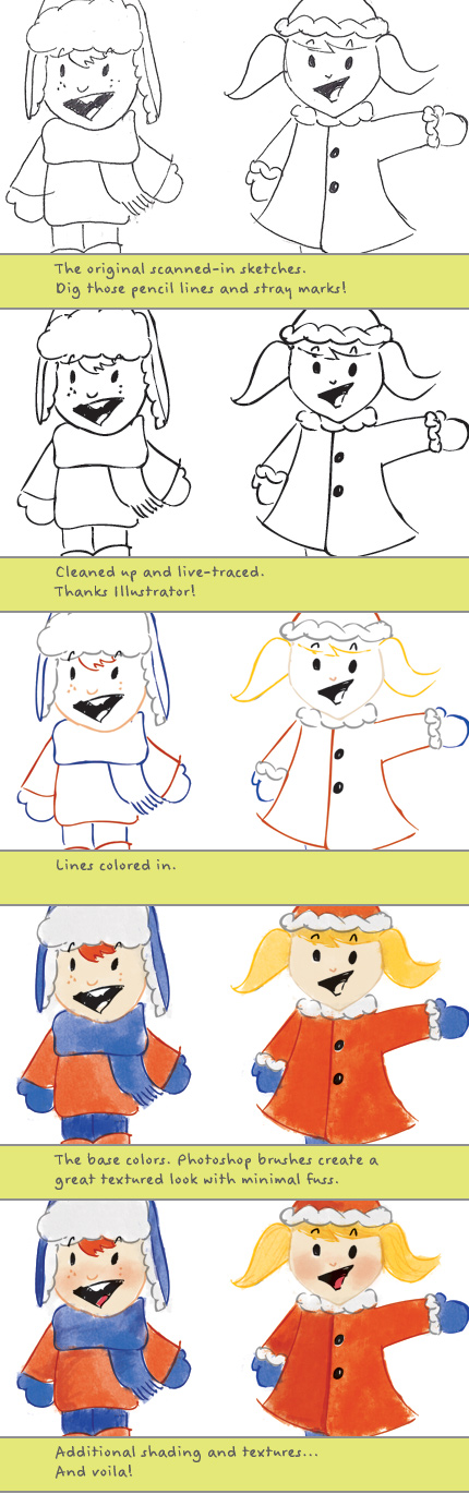
The illustration style was meant to be inspired by that fun, 50s look with casual lines and roughly textured blocks of color. The kids used in the packaging and website were first hand sketched, then inked in. After I scanned them in, I brought them into Illustrator, live traced them, and gave the strokes a little more style. I wouldn't always recommend live tracing, but in this case, the results using it were great.
From there the newly-vectorized VigeKids went into Photoshop to get painted and shaded in Viget orange and blue.
The Dry Media brushes that come with Photoshop were used for coloring and drawing. Lots. Tons. A mega ton. Serendipidously, Onextrapixel had recently published this post listing some great Photoshop brushes that were also used gratuitously.
For the winter wonder-candy-land, I hand drew the most basic shapes, trees, lollipops, candy canes, etc. to use as a stencil in Photoshop and roughly painted over them with my trusty Wacom tablet.
Branding
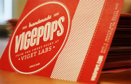
The logo and packaging are meant to keep in that same line of fun and bouncy, like a candy wrapper that would put Willy Wonka to shame. Owen designed the logo in Illustrator. The label wraps around the box and holds the whole package together, while showing off the logo in style.
web design
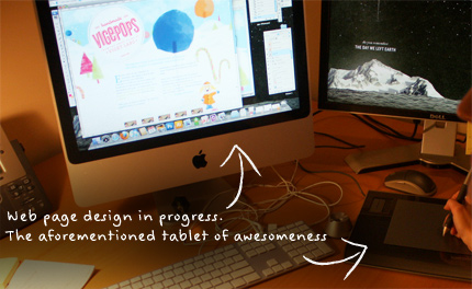
The web site is only one page, so it didn't need to be too complex; just get in, show our message, our photos, and get out. (And throw in a wallpaper version of the illustrations as a little bonus, so you can enjoy VigePops on your desktop year-round, with no threat of cavities or sticky-sugar fingers.) The same style from the packaging is used on the webpage, surrounded by winter wonderland illustrations to give it a fun, storybook aesthetic.
Then, like the code ninja he is, Trevor Davis built out the design in a matter of hours, so that VigePops were ready and on their way in time for the holidays (unlike this blog post).
Sweet Links
Viget.com Blog post about VigePops and the Viget holiday gift tradition