Using HSB Inputs in Photoshop’s Color Picker
Steve Schoeffel, Former Designer
Article Category:
Posted on
Quick tip, here. Perhaps you already know about and use these. If not, read on!
I've recently started changing color values using the HSB inputs in Photoshop's color picker. If you don't know, HSB stands for hue, saturation, and brightness. One of the things I like about using the HSB inputs is that it feels intuitive (especially compared to RGB or hex values). It corresponds pretty closely with how I already use the color picker when I'm choosing new colors or slightly modifying an existing color I'm working with. In short, the saturation input moves left and right within the color box. Brightness moves up and down. Hue moves the color bar to the right of the box. Pretty simple.
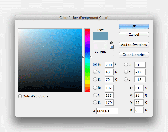
Now, you can of course do this manually with your mouse within the color box and sometimes that's easier. The reason I've been liking the inputs lately is for their precision. For instance, say you've locked in on a hue that you're liking. But you need it a little less saturated. And 10% lighter. Using the HSB inputs, you can easily reduce the saturation number and increase the brightness number. The numbers for Saturation and Brightness are in percentage points (0-100%), so that makes things really straightforward.
Practically speaking, here are a few quick examples.
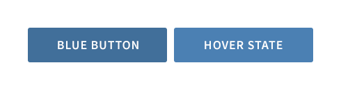
Button Hover
Say I need to figure out a hover state for my blue button. In the past, I may have approximated this by just moving the dot up in the color box. Using the HSB inputs, however, I can just punch up the brightness 10%. Now I have a color that's the same hue and saturation, just brighter. It's a small thing but the precision is helpful.
Social Icons
In this example, maybe I'm working on the footer of a site that uses a dark, desaturated blue for the background color. I'm adding in some social icons and I want them to be subtle but also feel like they fit within the existing color scheme. Using the background color as a starting point, I can then drop the brightness a few percentage points and already, things are looking pretty good. For my hover state, I'll go lighter and maybe a little less saturated. You can do the same thing manually but I've found it's nice to be able to fine tune things using the number values.

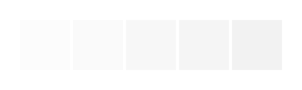
Light Gray
Sometimes when picking a light gray, it can be hard to know what you actually ended up with. Could you have gone a little lighter? Is there a tiny bit of saturation in there? For me, it's a lot easier to just start with white and drop the brightness down a few percentage points. You can easily reference the HSB numbers to know for sure.
Those are just a few examples of the HSB inputs coming in handy. Pretty simple tip but hopefully one that will prove useful for you going forward.