Use Ecosystem Maps to Show, Not Tell
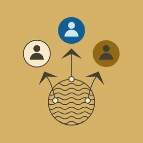

"Show, don’t tell" isn't only for your content. Using diagrams like ecosystem maps to visualize information is usually the best way to make sense of complex problems.
What properties and third-party systems are part of your digital ecosystem? Who writes, edits, and posts the content that’s on your website? And most importantly, who is responsible for making all of those things work together seamlessly?
If your brain started melting just reading those questions and your first thought was, “I have no idea,” you’re not alone. Extensive work might be needed to uncover those answers because digital ecosystems tend to involve way more people and tools than you think. Maybe your community engagement team actually posts their events on the website themselves, or perhaps you use a Salesforce integration to personalize your content – and that data is managed by the sales team. So, the most straightforward answer to who is involved? Everyone.
It can be hard to explain that your digital ecosystem goes beyond your web team and involves more than your website because that doesn't usually show up in org charts, job descriptions, or other formal planning processes. So how do you explain that to your executive team — who might not know a CMS from a CRM — in a way that everyone understands? Try using a diagram like an ecosystem map.
An ecosystem map is a visual representation of your digital ecosystem. It provides a comprehensive overview of the digital assets, components, technologies, data flows, and stakeholders that make up your digital environment.
Benefits of diagrams
A diagram like an ecosystem map can break down complicated concepts into easy-to-understand components that provide clarity that text alone cannot achieve. They can serve as a common language, especially for executive teams who might only be involved in a final presentation but still need to understand what went into its conclusions and recommendations. Finally, executives are more likely to remember and recall the information presented in a visual format, so they can explain your digital ecosystem to others when needed.
Benefits of ecosystem maps
In your org chart, the web team appears to have oversight of your content and they are responsible for writing, editing, and posting it on your website. Seems straightforward, right? Not so fast.
We have worked with enough clients to know it’s never quite that simple. That’s where an ecosystem map can highlight what is hiding under the surface. It can show how different teams, not just your web team, have de facto oversight of some content. The process of creating an ecosystem map can also uncover third-party software that is used on your website.
Let's look at a few examples of ecosystem maps we have created for past clients and how those diagrams helped everyone get a better understanding of their digital ecosystems.
Example 1: National Trade Association
We worked with a national trade association in the healthcare insurance space to redesign their website. We developed an ecosystem map that highlighted all the people who were responsible for the content on their site and what third-party systems were used with that content.
In the example below, we used solid lines to connect individual people and entire departments to the content they are responsible for adding to their website and dotted lines for people who provide oversight of that content. We included gray circles for third-party systems — like their webinar provider, course providers, events tracker, and job-tracking software — and mapped them to the relevant people and departments. We also used a tag icon to represent that tags were the way they tied different types of content together.
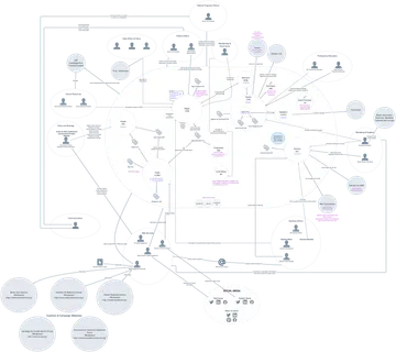
Seeing how complex your website is can be an eye-opening “aha” moment for your executive team. In this case, it showed just how disjointed the pieces of the website were and allowed our client to make some internal changes that provided the web team with more oversight of the entire website to ensure consistent branding, management, and quality.
If I had tried explaining this with just words in one conversation, we would probably have all gotten confused and might have missed that key opportunity for improvement.
Example 2: Professional Services Firm
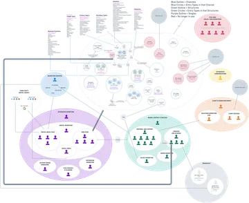
We worked with a multi-billion dollar professional services firm to redesign their website. One of the most meaningful deliverables that came out of our discovery work was an ecosystem map that highlighted the complicated process they used to produce and post content on their website, including third-party software.
In the example, we used different colors to group 42 of their employees in six of their departments. We used gray circles to show their four microsites — events, media, client stories, and non-gated Brandcast content. We also used dotted gray circles to show third-party integrations like Contently and Taleo.
With a few lines and circles on this map, we showed how the Solutions Marketing GTM group (within their Client and Marketing Impact team) and the GTM Campaigns team (within Marketing Services) both sent information to the Editorial and Content group, who were part of the Brand, Content, and Creative team.
The Editorial and Content group then used Contently, a third-party solution, to direct their marketing content to the Web group in the Integrated Marketing team, which published it on the website.
That same Editorial and Content group used Contently again to direct their “Insights” articles to the Creative group that published that content on the website.
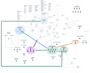
Using this ecosystem map, we were able to easily show just how many people were involved in getting content on the website. The Web group was actually only responsible for the final step in the process, and sometimes not even involved at all.
We found that most of the decisions about website content were actually being made by the Editorial and Content group and they just sent those decisions to the Web group through Contently. That revelation made including the Editorial and Content group in our discussions key to a successful website redesign.
After all that, aren’t you glad we made a diagram?
Worth more than a thousand words
If a picture is worth a thousand words, an ecosystem map is surely worth more. That’s why diagrams are one of the go-to tools in our toolbox. The process of discovery — and the diagramming that comes out of that work — is a great way to help you and your executive teams see what’s really involved in overhauling your digital ecosystem. That way, you can all work together to streamline operations, saving you time and money.
A well-designed diagram like an ecosystem map can help you quickly absorb key points, even with just a glance. They leverage our natural visual processing abilities to enhance understanding, retention, and problem-solving. A more complex map helps you easily follow the lines to understand where content is coming from and who or what it passes through when you need to dive into the specifics. It really can serve a lot of purposes.
So, when you need to explain complicated concepts like roles, responsibilities, processes, oversight, and integrations that need to be understood and remembered, ecosystem maps are a powerful tool for simplifying, clarifying, and communicating that information.