From Darkness to Light: Color Versatility Using Tints, Tones, and Shades
Tom Osborne, Former VP, Design
Article Categories:
Posted on

In my last article, I wrote about how using more specific names can be useful when referencing colors. Several people shared how this is doubly useful when mapping to SASS variables—and I agree. This time around I want to share how to use more specific color names when applying lighter and darker values through tints, tones, and shades and how this can be further helpful for color reference.
Tints, Tones, and Shades
First, a little background about tints, tones, and shades. Stated simply, these color variations are created by adding white, gray, or black to a hue (or pure color) to alter its lightness. More specifically:
- Tint: is the mixture of a color with white, which increases lightness
- Tone: is produced either by the mixture of a color with gray, or by both tinting and shading
- Shade: is the mixture of a color with black, which reduces lightness

In Fives
I like to apply tints, tones, and shades to hues in sets of five. I start with the hue as a middle value and then go lighter and darker in two steps. This way you create a range that looks like this:
Darkest > Darker > Hue < Lighter < Lightest
Here’s why I like this method: when you create tints, tones, and shades, and then apply the More Colorful Naming concept, you avoid naming colors “darker dark blue” or “lightest light orange.” Instead, you get something like this:
Darkest Coral > Darker Coral > Coral < Lighter Coral < Lightest Coral

Note: in this example the gray tone is defined as 50% of black (or middle gray) set to 20% opacity to create the "darker" effect.
In establishing a range of five values from lightest to darkest, you also allow for contrast flexibility and soft background coloring as needed.
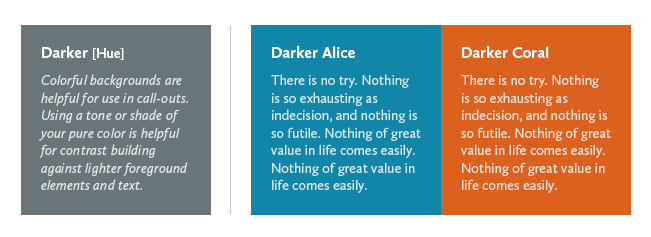
Contrast Options
I find that in order to use white text on a background color I need to increase the contrast between the two colors for better legibility. Having pre-established values for darkening a color makes it easier to quickly test that contrast.
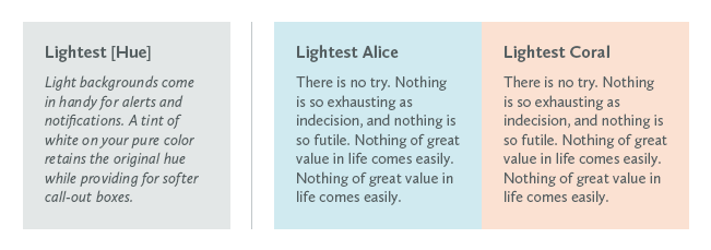
Alert Notifications
Similarly, light values of colors are often used as backgrounds for alerts and notifications, and having a lighter option at the ready makes creating those alerts easier.
Button Gradients
Lastly, gradient fills from “lighter” to “darker” help create tactile button effects while retaining a pure hue in the middle of the gradient.

In Summary
Tints, tones, and shades can help you create varying levels of color brightness without altering hue. I hope this method is as useful for you as it has been for me.
For a CSS friendly approach, I highly recommend Chris Coyier's Yay for HSLa article and HSLa Explorer tool as well as Kyle Fiedler's Controlling color with Sass color functions.