Testing Accordion Menu Designs & Iconography
Lance Gutin, Former User Experience Designer
Article Category:
Posted on

Figure 1 - Animated gif of 7 landing page designs. Each frame represents a separate test conducted with 20 participants.
Among UI patterns, the accordion menu is a workhorse. Its ability to collapse long lists into manageable groups is really useful for navigation menus and particularly for search filters. Beyond the decision to use an accordion menu, I often find the specifics of actually designing one to be a little murky. What icon should I use? Should the icon go on the left or right of the menu item? In terms of usability, is an icon really necessary at all?
Seeking some certainty on these questions, I decided to do some testing.
Methodology
In my experience, accordion menus most commonly use either a chevron, a plus (and minus), or a triangle. In addition, the icons are either located to the left or the right. So, with 3 icon choices at 2 locations and a control with no icon at all, I identified 7 total designs to investigate.
I was most interested in how users interacted with each accordion menu design and what they might expect to happen after making a selection. I also was hoping to recruit enough participants to analyze the results quantitatively.
Along with two multiple choice questions, I chose to create a first-click study via Optimal Sort's Chalkmark. To ensure context, I sketched a simple grocery story landing page and separately included each accordion menu design as primary navigation (Figure 1). To recruit, I hired 20 unique participants per design via Mechanical Turk.
Results
After accepting the study, each participant was first asked via multiple choice question what operating system they were using.
124 of all 140 participants reported they were running the Windows operating system.
Next, participants were shown 1 of the 7 landing page designs (Figure 1) and asked where they would click to find chicken.
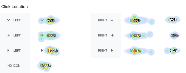
Figure 2 - Heatmap summary of click locations per test. In the Chevron Left test, 10% of clicks were not near the correct label.
A summary of click locations (Figure 2) reveals the vast majority of participants clicked the meat label in the menu. When the accordion menu icon was split out to the right, about 25-30% of participants clicked the icon rather than the label.
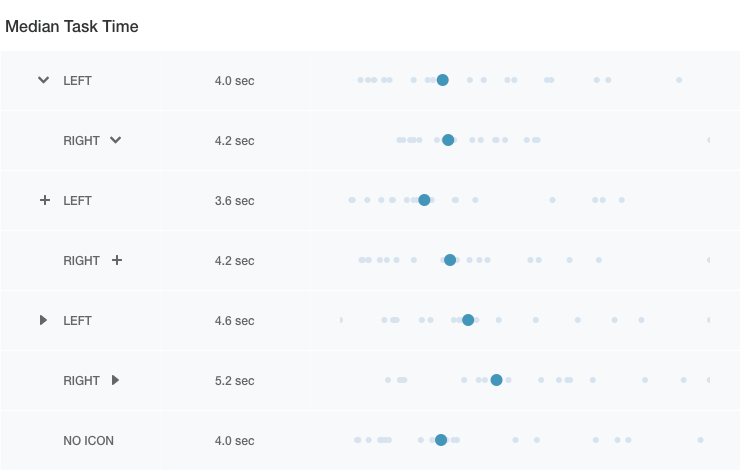
Figure 3 - Median task times per test with relative plots of individual results.
The median time it took participants to click on the design (Figure 3) varied from 3.6 seconds to 5.2 seconds.
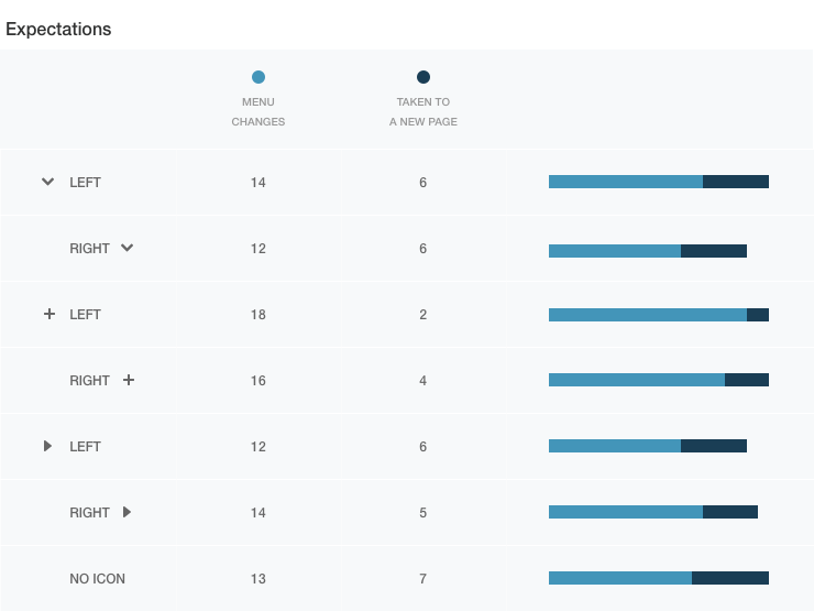
Figure 4 - Survey results to question on user expectations. Not shown are a small number of participants that chose “The item I clicked is added to my shopping list” or “Something else”.
Finally, participants were asked via multiple choice question what they thought would happen after they clicked. The majority of participants believed the menu would change (Figure 4), while a small number believed they would be taken to a new page, the item would be added to a shopping list, or something else would happen.
Conclusions
Analyzing the results, the most convincing data involved icon location. Presented with an icon to the right of the menu item, many participants preferred to click the icon rather than the text label (Figure 2). In addition, in every case, designs with icons to the right resulted in slower task times (Figure 3).
Considered together, it's very possible some participants believed the icon and the label functioned differently. For these participants who were presented icons to the right, it's also possible the icon's small size and distance from its label increased the recorded task times (see Fitt's Law).
In terms of icon choice, results were more difficult to decipher. At face value, the accordion menu with a plus placed on the left measured fastest (Figure 3) with 90% of participants predicting the menu would change (Figure 4). However, most of the task times did not differ statistically and none of them differed practically.
It should also be noted that operating system may have influenced these results. Early versions of Windows use the plus and minus combination to navigate files while later versions along with the Mac OS use triangles. As stated above, the vast majority of participants were using Windows, but the exact operating system was not recorded.
Recommendations
Despite my quest for certainty, I admit these tests can only go so far in answering once and for all how to design an accordion menu. Accordion menu icon choice and location are but two designs decisions among many that are made in context and at the discretion of the designer. Personally, the results encourage me to provide users affordance and to use any of the tested icons on the left side of the accordion menu. But, if I decide a right icon is best for a certain situation, I will accept potentially slower response times and ensure the entire menu row (menu label, icon, and surrounding space) is linked as one with an appropriate hover state.
Many thanks to Curt Arledge for his collaboration on this research project. His Refreshing Search: Testing Search Box Variations post enumerates many of the inherent limitations of first-click testing that also apply here.