Ten Data Visualizations that Tell the Story of 2020

Liz Roknich, Former Digital Analyst
Article Categories:
Posted on
A roundup of our favorite visualizations of the year.
In an unprecedented and unpredictable 2020, we relied on rapidly evolving information to guide our actions. More than ever, we saw a need to communicate relevant data in an accessible way. Data visualizations helped us understand and navigate a year marked by the pandemic, the Black Lives Matter Movement, and a turbulent presidential election season. Collectively, data visualizations from 2020 tell the story one of the most pivotal years in history. We’ve compiled a list of our ten favorites below:
#1: Sizing up Australia’s Bushfires by Reuters Graphics
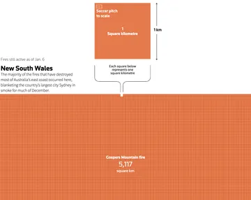
The year began with devastating wildfires across Australia. It was one of the worst wildfire seasons Australia has seen, resulting in over 17 million hectares of burned land. This visualization from Reuters Graphics in January helped contextualize the amount of space that had burned.
Our take: This visualization uses a “scrollytelling” format to lend perspective to the massive area of land burned. Scrolling through the article helps readers understand the scale of devastation, along with spatial comparison points from other countries.
#2: Live Climate Scoreboard by Bloomberg
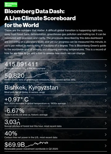
2020 was the second-hottest year on record, and we saw the impact of climate change through fires and a record-breaking hurricane season. In January, Bloomberg created a live climate scoreboard for the world, which tracks environmental indicators such as parts per million CO2 in the atmosphere, increases in global temperature, and deforestation.
Our take: Because of its real-time nature, Bloomberg’s dashboard provides a visceral experience. Each indicator in the dashboard has its own visualization and includes context behind the numbers, including what progress looks like for each metric.
#3: How to Flatten the Curve by The Washington Post
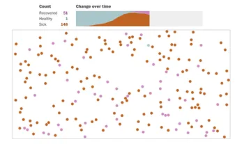
This widely circulated article was an early illustration of the power of social distancing. It came at a time in March when many businesses began to shut down, and the media was saturated with news about the novel coronavirus — a confusing and overwhelming time for many.
Our take: While we knew relatively little about COVID-19 at that point, the simulations showed us the weight our individual actions could carry. The visual simplicity of the simulations make them easily digestible and shareable. They also depicted best- and worst-case scenarios, making the appeal to social distance even stronger.
#4: How the Virus Got Out by The New York Times
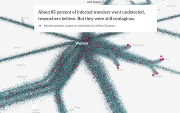
As we found ourselves in the midst of mass shutdowns in late March, The New York Times released this interactive visualization that depicted the spread of the virus from Wuhan to the rest of the world.
Our take: Especially early on in the pandemic, visualizations such as this one helped us understand the mechanics of how the invisible coronavirus travelled, despite mass-transit closures. The use of colored dots, similar to How to Flatten the Curve, clearly communicated virus concentrations and movement.
#5: The Mapping Police Violence Project
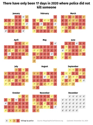
In 2020, we saw waves of protests against police brutality, and the visualizations from the Mapping Police Violence project showcase how these patterns have evolved over time. Their comprehensive database includes police reports, crowdsourced data, and social media.
Our take: Data on police violence can be difficult to find, and the Mapping Police Violence project stands out in terms of the breadth of data collection. Their continually updated visualizations enrich general statistics by examining race, zip codes, and incident context. They add transparency to the reality of policing in the U.S.
#6: Stolen by Adrian Brandon
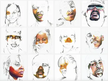
Adrian Brandon’s series, Stolen, blurs the line between data visualization and art. Adrian created portraits of Black people who police killed, using pencils and markers to create their outlines and time as a medium to define how long he spent coloring each portrait in; he spent a minute for each year of life lived.
Our take: Adrian’s portraits convey the tragedy of police brutality while highlighting the beauty and unreached potential of its victims. They convey a sense of time and context without losing humanity to numbers or statistics.
#7: Why Time Feels so Weird in 2020 by Reuters Graphics

One topic that seemed to surface again and again throughout 2020 was the concept of time; March seemed to drag on forever, we skipped straight to Fall and somehow landed in 2021. This article from Reuters Graphics helped explain our distorted perception of time through visual tests.
Our take: Visual illusions, such as the one used in the article, can help us understand how we process abstract concepts like time. Seeing quick representations of patterns we observed this year — paired with an explanation of why it occurs — helps to define and deconstruct the phenomenon. Pretty neat!
#8: Generational Gaps in Music by The Pudding
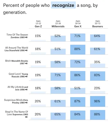
If anything rose out of the ashes of 2020, it was TikTok. When the pandemic hit, it became the most-downloaded app in the world, bringing quarantine trends to life. One such trend was Gen Z’ers filming themselves listening to prior generations’ music for the first time. Based on this phenomenon, The Pudding put together an interactive project that tests a user’s knowledge of a decade of music and benchmarks them against peers.
Our take: The Pudding’s project allows users to engage in the data collection process and see how their music knowledge compares to trends across generations. It’s an enjoyable process from start to finish and a clever way to collect information on how music and culture can be lost over time.
#9: The Election Forecast by FiveThirtyEight
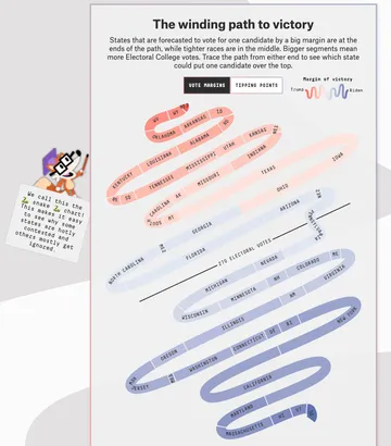
We couldn’t write an article about 2020 without mentioning the presidential election. FiveThirtyEight put together an election forecast to show which candidate had the better odds of winning the race as it unfolded.
Our take: The charts FiveThirtyEight included in their forecast were visually approachable and easy to digest, thanks to helper text that explained how to analyze them. The charts also broke the mold of the choropleth maps we often see around elections creatively displaying swing states and each state’s number of electoral votes.
#10: Happy Data by Pentagram
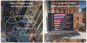
2020 had us in a cycle of grim news and data at many points. Happy Data, a project created by Pentagram, showcased encouraging statistics that came on the tailwinds of the events that unfolded throughout the year. Many of the statistics highlight positive changes in society and culture, such progress toward racial equality or U.S. workers’ increased benefits from working from home.
Our take: We love Pentagram’s approach to finding small glimmers of hope to help us imagine a better future for 2021 and beyond. Their visualizations are aesthetically uplifting and approachable, adding to their humanistic data.
That’s a wrap on our 2020 roundup of visualizations! Though most would never want to relive 2020, we hope you've found these data visualizations helpful for reflecting on and processing the year behind us. Happy new year!