Sure, Those Colors Look Nice - But Can You Prove They’ll Work?
April Mohr Harding, Former Viget
Article Category:
Posted on
For the past several months, I've been working with a client who is based in North America but who operates regional offices in various parts of the world where their (tourism industry) product is offered. Over the past year, we've collaborated with this client one country at a time, through their North American central office, updating some of their country-specific web properties. It's been a cool opportunity for the team to experiment with tweaking web designs to work in cultures that we haven't designed for in the past. One of the best lessons learned (well, more confirmed than learned), is that good web design (as any other form of art) transcends regional boundaries. A good web design in America is also a good web design in Norway, France, or Australia because, at the end of the day, the best web design gets out of the way and lets the content and features pull users in and through the conversion process. So far, we've found that user intuition about how to get from Point A to Point B in the purchase process doesn't vary by location - everybody is looking for the same information.
However, we also found that aesthetic preferences, as you might suspect, vary a great deal between nations. The preference in one country might be for ultra-sleek, clean design with little imagery and a neutral color palette. In other places, users seem to prefer a richer, bolder palette full of evocative imagery and depth. Given those widely varied and utterly subjective preferences, we faced a new challenge with our current design project in this space: How do we define a design that not only works but also looks "good" in Germany, in Australia, in France, in the UK, and many other distinctly different parts of the world?
Our first attempt was to employ our standard process of presenting three mood board options and finding the most preferred of the three. In this case, we had the opportunity to ask our users (during usability testing for the same product) what they thought about the mood boards. For this exercise, we came up with three distinct directions. One that was sort of business-y, one that was fun and lively, and one that was neutral. We asked users how they would describe them and which they preferred. After weeks of interviews, we were able to finally discover that the mood board results were totally inconclusive. Each country had a preference, but with 4 countries responding to 3 mood boards, we couldn't possibly have come up with a less definitive answer. Germany preferred one, France preferred another, the UK preferred the third, and in Australia there was no clear winner. Obviously, none of these design concepts was the "right" answer.
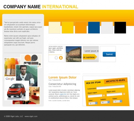
Beyond that, even within the countries that preferred a particular design direction, the feedback was contradictory. For example, we presented a mood board similar to the one below.
And, in response to this design concept, we heard the following descriptions:
France: punch, dynamic, warm, friendly, current, pretty, leisure, approachable, summer, modern, nice, ugly, usual, lively, airy, joyful, attractive, organized, hard hitting, welcoming, 1970s, cheap, old
Germany: loud, amateur, warm, white, leisure, friendly, sunny, nice, neutral
UK: bright, golden, distracting, holidays, warm, sun, summery, fun, light, breezy, sunny, inviting, touristy, interesting, striking
Australia: nice, bright, simple, stands out, eye-catching, inviting, warm, summery, fresh, eco-friendly, holiday, beach, mid-range
Our next step was to pull the best elements of each concept while attempting to steer clear of the potential negatives. People everywhere thought the yellow design above was friendly and fun, so we tried to keep that element without making it "distracting" or "amateur" or "1970s." For our other two mood boards, we did the same. The end product is still in development (I'll update with a link here when it goes live), but the key point is that our applied design employs blue, yellow, gray and generous use of white space. We really like it.
Normally, that's where the story would end. But, in this case, our client is responsible for presenting this design to a multitude of stakeholders in all these countries and to help smooth the approval process, they wanted more than a recommendation from our designers. They needed "proof" that this design was the best possible design for our purposes. More specifically, we needed to be able to prove that the color selection of blue, yellow, and gray was the best choice for every country we're working with.
Yes, that's right. My marching orders from the client were "Prove to us that these are the right colors."
It was a fair question given the circumstances; but, on its face, this seemed impossible to answer. What kind of research could I find to prove something so subjective? Skeptical that such an answer existed, I turned to Google Scholar to start digging. I expected to find some general studies that described the emotional impact of certain colors on the subconscious, or maybe a study of the use of colors for branding in certain industries. But. lo and behold, there on the very first page of results was the holy grail of documents: a legimate study about my exact topic with the exact answer to my question. That *never* happens! It was one of the best work days of my life.
Conducted by Irina Kondratova and Ilia Goldfarb of the National Research Council Canada Institute for Information technology, a paper called "Color Your Website: Use of Colors on the Web" had carefully, thoughtfully, and thoroughly analyzed the use of color on web sites across the globe and found some very significant patterns. I recommend you read the published paper yourself to learn about methods and other conclusions, but here's the punchline:
"Results of our color usage analysis for the fifteen countries showed that some colors are commonly and preferentially used across all countries studied. These colors include white, black, all shades of gray, all shades of blue and a light yellow color."
Sweet! What are the odds of that? It turns out the blue, gray and yellow palette we had arrived at was, coincidentally, the only single color palette that the (fairly limited, but perfectly valid) research on the subject has proved acceptable. Going one step further, I also discovered an article from the Proceedings of the 7th International Conference on Electronic Commerce which concluded that among the four most trust-inducing features of interface design is the use of "moderate pastel color with low brightness and cool tone." Even better - our palette was exactly that!
Armed with these facts, I was able to quickly sum up the key points and reiterate with more confidence to the client that not only was our design beautiful, but we could also prove it was the right choice. Of course, the ultimate proof will be in the conversion rates once we launch; but, at this stage of the project, I think the matter has been settled as conclusively as possible.
I didn't write this post just to tell you my fairy tale story of proving the unproveable - I'm curious what other web design professionals think of this whole exchange. Was there a different direction I could have pursued to arrive at an equally presentable conclusion about color? Even if the study I referenced was conducted perfectly, is there any *real* merit to an analysis like this? Or, in the end, is there just nothing more certain than good design intuition?