Shame the Confirmshamers
Brandon Dorn, Former Senior Product Designer
Article Categories:
Posted on
#Confirmshaming: one more dark pattern the web doesn't need.
When you deactivate your Facebook account, you aren’t politely bid adieu. Instead, you’re shown pictures of yourself with all of the people who will “miss” you now that you’re no longer sharing your life with them on Facebook.
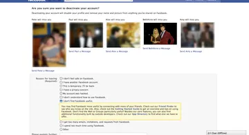
Putting aside the plain presumption of this tactic (BethAnne, shown in the fourth image, then my girlfriend and now my wife, most certainly saw more of me after I deactivated my account), what fascinates me about this screen is the same thing that prompted me to leave Facebook in the first place: the system understands “friendship” only in terms of the digital information provided to it. If I am no longer an entity in the system, my “friends” in the system will no longer be connected to me. I’ll no longer be able “send BethAnne a message.”
This is a screenshot of Facebook’s account deactivation screen in 2011 (a friend who recently deactivated his account told me that the screen is essentially the same). At the time, I didn’t have a term for what I encountered. I just thought of it as petty, self-defeating, and not a little desperate. Yet it turns out there is a term, and that this is a thing: confirmshaming.
Anatomy of a Confirmshame
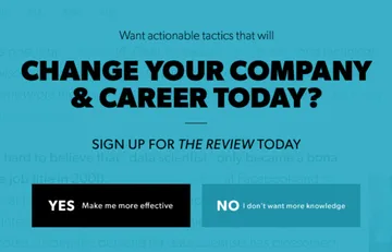
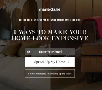
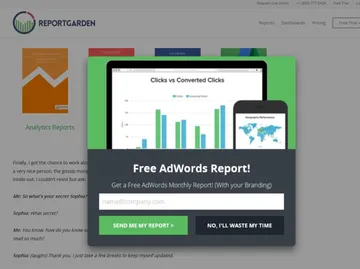
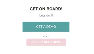
Confirmshaming is a strategy of using visitors’ guilt as leverage for heeding a call to action, usually manifesting as snarky microcopy in exit-intent modals. It's as straightforward a dark pattern as you’re apt to find. Confirmshaming is the web equivalent of the retail store worker that not only doesn’t leave you alone when you say you’re “just browsing,” but says the clothes you’re wearing are ugly. It’s like getting a Dick’s Last Resort waiter when you show up to an Applebee's.
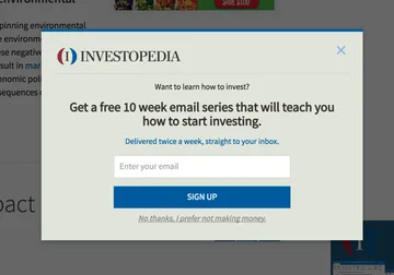
It goes something like this: you’re reading, say, a recipe for lasagna on Food & Wine. Halfway down the page, as you’re making a list of what to buy at the grocery store (maybe you’re in the grocery store reading this), the page is suddenly hidden by a fullscreen modal that looks like this:
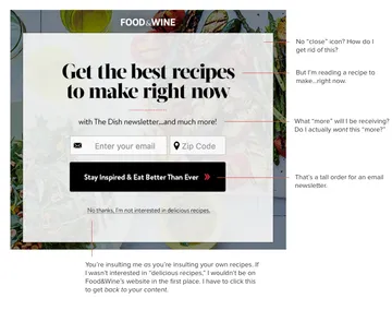
You didn’t click anything, maybe your cursor hovered above a browser tab (which triggers these modals in some instances); either way, you weren’t expecting this overlay but here it is, asking you to subscribe to an email newsletter. You aren’t interested – you just want to get back to the lasagna recipe – but the only way to hide this overlay is to click a link that says, “No thanks, I’m not interested in delicious recipes.”
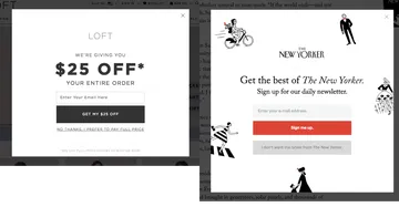
Confirmshaming is a more common, mainstream customer acquisition approach than one would hope. (There's even a blog devoted to cataloging these misdemeanor abuses.) Here are some examples:
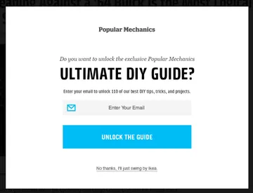
Ironically, at least 3 of Popular Mechanics’ DIY articles require a trip to IKEA: “Build This Glorious DIY Arcade Out of IKEA Parts,” “7 Tips for Assembling IKEA Furniture,” “10 Ways to Make Cheap IKEA Stuff Look Luxurious."
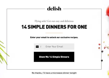
But…what about these articles on delish… “The 25 Most Delish Frozen Dinners," “13 Microwave Cooking Recipes," “19 Quick and Easy No-Cook Recipes."
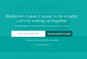
Esquire is the most prolific, with at least three distinct confirmshame modals. One could argue that, like theSkimm, teasing is part of their “brand voice,” that we shouldn’t be surprised by this kind of jest. But a pushy exit-intent modal is a pushy exit-intent modal.
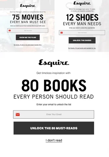
The examples are consistent in their tactic: “If you aren’t interested in being marketed to about [x], then clearly you are not interested in [x].” In each instance, the alternative to sharing your email address is to click on the company’s glib, sometimes cynical insinuation about yourself. Marketers take advantage of the fact that a click is a digital gesture of agreement. Clicking “I don’t read” makes you wince a little bit.
Popup ads on the Internet are as old as the Internet, yet this kind of ad is particularly abrasive for the way in which it attempts to coerce visitors into sharing personal information. As Julianne Tveten points out, they reveal businesses’ desperation for user data, usually their email addresses:
“On the commercial Web, data is a form of currency and often considered a portal into profitability, and, as rampant blog posts and case studies have demonstrated, aggressive, shame-inducing exit pop-ups are the en vogue strategy for pressuring people into providing it.”
Marketers try to make it “difficult for people to say no” in a moment of indecision, and are willing to bet that for every nine people who are offended, one might be willing to sign up.
A word for email marketers
Exit-intent modals must be working for you, otherwise you wouldn’t be using them (exitintent.org, the foil to confirmshaming, catalogs these “success stories”). Yet, from an experience design standpoint, you’re playing with fire. For one, these modals are presumptive: they disrupt visitors’ normal browsing behavior online, and often can't tell the difference between a new or already-subscribed visitor, so you risk doubly-offending patrons.
More to the point, this approach is likely a temporary fix for a bigger problem. Marketers who advocate exit-intent modals argue that they can be used to address common reasons for visitor abandonment, like these, from Gleam:
Users finished reading your article and they were ready to leave
Your content was irrelevant in the first place
They couldn’t find the product they were looking for
Customer is price sensitive and wants to wait for a discount or coupon
User got distracted and forgot what they were doing
Customer was just in research phase and wasn’t ready to make the purchase
Your product was unaffordable
Your product doesn’t do what the customer needs
More often than not, these are business and design problems, not marketing problems – especially for companies selling products, content, or services. If your content is irrelevant, if visitors can’t find what they’re looking for, if they get distracted, if a product is unaffordable or not appropriate – these are deeper issues that can only be dealt with through thoughtful consideration of your website architecture, content, maybe even your business strategy. The seeming success you’ve had with exit-intent modals will only distract from underlying problems.
Before resorting to exit-intent modals, work to make the content and design of your website so compelling that you don’t have to grab people’s sleeve before they leave, digitally speaking. Yet if you decide to try interruption marketing, soften the disruption with tact. Split test desperate, emotionally-manipulative messaging against modest, neutral language and non-interruptive patterns and see which works better. Your idea for a snappy escape link might sound clever to you, but would you actually say it to a stranger in your store, face-to-face? Is it worth charging your visitors an emotional toll, however minor, for choosing not to hand over their personal information to subscribe? Are these people unsubscribing a few weeks later? Take the concept of permission marketing seriously enough to see if courtesy is a legitimate growth strategy.
For one of our clients' marketing campaigns, we tested urgent language ("Last chance to get 15% off") with more neutral language ("Sign up to get 15% off"), assuming the former would prompt more subscriptions. Yet, the neutral approach won out, indicating to us that any sign of desperation is a deterrent.
A word for website visitors
My advice for the next time you encounter a shameful exit-intent modal is to simply close the browser tab. Don’t close the modal, don’t even press the “Escape” key. When you close the browser tab, you end the visitor session being recorded by the website’s analytics, which means that you’re doubly frustrating their efforts to cajole you: you aren’t subscribing, and you’re decreasing their average visit length. It might be annoying to search for another lasagna recipe, but you’ll find one.
If you already subscribe to the company’s newsletter and feel so moved, unsubscribe from their list. Tell them why you’re unsubscribing when they ask you why. Shame the confirmshamers.
At some point, these marketers will begin correlating dropoffs with their modals and realize that tact is a better business strategy. Courtesy will gain ground on the web, where it’s absent more often than not.
Seen examples of confirmshaming? Share links here, and post them to confirmshaming. Here are two more I came across since writing this: