Drawing Font Inspiration from Vintage Artifacts

While remodeling our home, I found several cool old items left behind in walls and crevices. They all have unique mid-century designs. As a creative exercise, I decided to try to recreate these designs digitally.
In 2015, my wife, daughter, and I moved into our current house. It's a mid-century home in the Washington DC suburbs that was architected by the owner and custom-built in 1958. We bought it directly from the original family who had kept the house in great shape. And to our delight, they hadn't done any major renovations throughout its history.
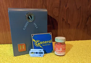
Over the past eight years, we've been renovating and modernizing the entire house while attempting to keep true to its original vibe. In doing this work, I stumbled into a bit of accidental archaeology. Behind walls, under vanities, and in other places, I've come across small, lost artifacts from decades ago. My favorites amongst these discoveries are an electric box, a dried-up bottle of ink, a logo plate for a switch company, and a disposable razor. In particular, I love the fonts used in the designs of these items.
For the exercise of recreating these digitally, I wanted to make it a bit of a challenge, so I'm going to stick with Google Fonts. To be clear, I’m not a font historian or typeface scholar, so this post isn’t about trying to find the exact fonts used during that era. This is just for fun.
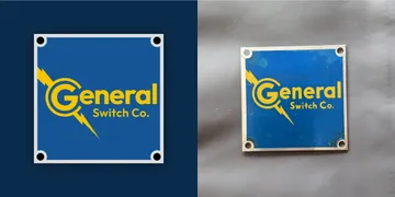
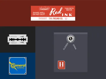
General Switch Co. Plate
This looked like the easiest of the bunch to do, so I started here. I initially chose Poppins, but after a bit more investigation, I ended up with Outfit. The most noticeable deviations are the top of the G, which isn't quite perfectly circular, and the angle on the right of the lowercase r. Overall, it's a pretty close match.

Honeywell Control Unit
This was originally hooked up to a thermostat in our attic that would control a whole house exhaust fan. When we modernized the central A/C and HVAC in the house, we ripped out the fan, but I kept this box. The logo here was in use by Honeywell from 1958 to 1965, so this unit was likely original to the house. For the Honeywell part of the logo, I used Barlow Condensed. For the “open” and “closed” labels, I used Nunito. The uppercase H was the toughest decision. I was split between Abril Fatface (too tall) and Gravitas One (too short). I could have easily modified either font to get the correct proportion, but I chose to go with Abril Fatface unmodified.

Gillette Razor
Ok, now things are getting more difficult. This tiny razor required five different fonts. The back of the razor (not shown) has the original Gillette logo that was in use until 1964. They used a simpler sans-serif logo for the font, so I went with Outfit again. For the all caps "Stainless Steel" and "Blade" I used Barlow Condensed and Barlow respectively. The hardest part of this one was figuring out "Super." I couldn't find a single font that had the correct style of the uppercase S paired with the rest of the letters. Ultimately, using a combination of Rouge Script and Dynalight worked well.
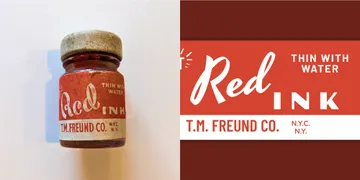
Ink Bottle
I found this little bottle of dried-up ink behind a wall when renovating a guest bedroom. My guess is that the original construction crew used it to mark the walls and studs, but who knows? It could have been an art supply that somehow got lost after the house was built. I tried looking up the company T.M. Freund Co. in NYC, but I couldn't find any info.
In addition to using Nunito, Barlow, and Barlow Condensed again, I had to find good matches for three more unique fonts. For RADIANT (shown below), I found a pretty good match in Stick No Bills. Poller One was a really close match for INK. I knew right away that finding a close match for "Red" would be near impossible, so I set out to find a suitable replacement. I settled on Yesteryear, which seemed appropriate.
While this was only intended as a fun exercise, I discovered several fonts I hadn't used before and it inspired me to generally explore display fonts more. While I don't typically use them day-to-day in my interface designs, I'll be on the lookout for opportunities to use them on future projects.
If you're interested in retro fonts from this era, I recommend checking out the 1950s tag on fontsinuse.com and the vintage fonts section on Creative Market.