Rethinking On-Site Notifications
Lance Gutin, Former User Experience Designer
Article Category:
Posted on
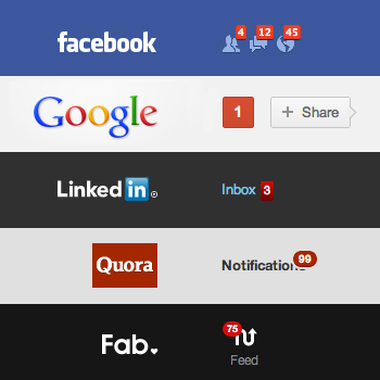 You've seen these before, right? Notifications, or, more correctly on-site notifications. Typically red and badge-like, they are designed to alert you to content on a website that has changed or that may require your attention. Well-intentioned and, as you can see, adopted by industry heavyweights. That's nice. But is this design pattern actually good user experience?
Implementation
As the examples above imply, on-site notifications appear and act pretty uniformly. In general, they are jarringly red and, to my knowledge, can't be completely disabled. Functionally, they operate on a basic set of rules, ticking up when some event occurs and clearing only after user interaction. Some implementations are less frustrating (LinkedIn) than others (Fab). All seem to be designed to draw the user's immediate attention.
Assumptions
More importantly, these notifications are also built on some rather large assumptions. By deciding what events are associated with a notification, the website implicitly assigns prominence to some content and use cases over others. For users with differing priorities, notifications can be quite distracting and intrusive. The pattern also brazenly assumes that the user regularly view and interact with the website. Notification counts above a handful are unmanageable and plainly disrespectful.
Now, rather than be overdramatic and belabor the point further, let's explore how we might improve on-site notifications. With minimal effort, on-site notifications can get better and be relevant to both occasional visitors and ideal users.
Granular Settings
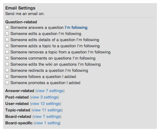
One approach is to give users more control. Allowing users the granular choice as to what, when, and how frequent they want to be notified is powerful. Quora, shown below, provides a long list of specific email settings, but curiously offers no similar control for on-site notifications.
Strategic Defaults
Taking this idea further, auto-selecting settings based on a hierarchy of engagement will allow users to choose the kind of notification activity they want. While power users may want to be notified for every event, a default grouping of a few pre-selected on-site notifications is probably most appropriate for casual users. Offering but not activating super sensitive notifications by default can show an uncommon level of user respect.
Better Rules
Aside from user customization, there is also room for software to act more intelligently. For example, say my notifications are about to reach double digits or are getting weeks old. Advanced notification rules could clear the out-dated or less important items automatically. If I haven't signed in for months, small, very detailed events have probably lost their relevance and displaying these notifications becomes unnecessary.
Kill Switch
And, of course, the easy solution is to give users the option to disable the feature altogether. Much like unsubscribing from an email newsletter or switching off mobile app notifications, opting out is simple. Updates could still accumulate in an inbox-type space, but this content no longer has the potential to divide the user's attention.
All in all, if on-site notifications are to exist, they need to be more thoughtful and recognize all users are not the same. No longer should we be forced to reflexively clear on-site notifications just to remove that glaring red flag on a website.
What do you think? Do on-site notifications have real value or are they just plain annoying?