Refreshing Search: Testing Search Box Variations

Curt Arledge, Former Director of UX Strategy
Article Categories:
Posted on
The most universally recognized icon for search isn’t a magnifying glass, it’s a wide rectangular box.
One of the most interesting research studies I’ve had the chance to work on during my time at Viget was an experiment to optimize the design of a keyword search box. Our team ran this experiment to help inform Viget’s redesign of WRAL.com, a trusted regional news source that pulls in a staggering 100 million pageviews a month.
One of the most heavily used features of the website is its keyword search, so we wanted to make absolutely certain that our redesigned search box didn’t make search harder for users to find and use.
We were also eager to test our design because it was somewhat unconventional: instead of showing a search input field by default, the field had to be revealed with a click. We considered this a clean, stylish solution, but we were curious about what effect it might have on users, many of whom are older folks who might be less receptive to a novel approach.

The experiment was one of several tests we ran for the project, but I find these results particularly interesting for UI designers, both in the way we were able to quantify the costs of a novel UI element and in what we learned about the iconography of keyword search.
Methodology
We wanted to know if users would locate the new search design with reasonable accuracy and speed. To test this, we designed a first-click test using Chalkmark.
The idea was simple: visitors to WRAL.com were shown a pop-up that asked if they would be willing to participate in a short test to help with the redesign. Those who participated were shown one of four variations of the WRAL.com homepage and given a single task prompt: “Where would you click to perform a keyword search of the site?” We then recorded where and how fast they clicked.
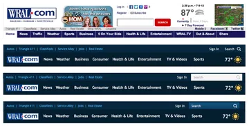
The four variations are shown above. The first was a screenshot of the current homepage to be used as a baseline. The other three variations consisted of our proposed redesign plus two slightly more conservative variations with the search field shown by default.
About 1,400 people accepted our pop-up invitation and took the test. For many of the projects we work on, it might take weeks to recruit that many test participants, but thanks to WRAL.com’s massive amount of traffic, we reached that number in less than four hours.
Results
You can see how each variation performed below. The first thing to notice is the remarkable consistency of success rates for three of the four designs. (The success rate was defined as the percentage of participants who clicked in the areas shown below.) For all except Variation 2, the success rates are essentially exactly the same, which is pretty amazing.
 |  |  |  | |
| Variation 1. Baseline | Variation 2. Hidden Input | Variation 3. White Box | Variation 4. Blue Box | |
| Success Rate | 86% | 73% | 86% | 85% |
| Task Time | 3.8 sec. | 7.8 sec. | 4.2 sec. | 4.9 sec. |
The second notable thing is the comparatively poorer performance of the design with a hidden input. Around 13% fewer participants clicked within the correct area, and those who did took about twice as long to do so than in the baseline design.
One thing to consider is that at least some of the participants were already familiar with the current design and may have used that search box before. When you consider that natural advantage of familiarity, Variations 3 and 4 can reasonably be considered more successful than the baseline design.
Analysis
First, a few caveats. First-click testing is a super easy way to compare the recognizability of elements in a fictional interface with a potentially large sample, but it has its shortcomings. Aside from the extremely narrow scope allowed by first-click testing, we can’t ask people why they did what they did or even confirm that they understood what they were doing.
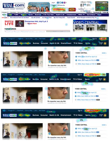
Indeed, the heatmaps that Chalkmark provides are as confounding as they are insightful. People clicked on headlines, navigation items, faces, and in empty spaces. It would seem that some people simply forgot they were taking a test and carried out the task that they came to WRAL.com for in the first place. Other people likely clicked accidentally, not realizing that their first click would immediately end the test.
However, these errant clicks don’t invalidate the test, because they show up in every variation in a consistent pattern. For example, compare Variations 3 and 4, which are identical except for the color of the search box. The stray clicks, while hard to explain, are amazingly consistent.
In some cases, the heatmaps offer real insight. Look at how many people clicked in the blank space at the very top of Variation 2, the hidden input design. In the absence of a search box, some participants seemed to click where they thought a search box should be.
Another caveat is that task times are pretty unreliable in unmoderated testing. We’d like to be able to exclude invalid task times from tests where the participant got a phone call or checked Facebook in the middle of the test, but we don’t have any idea which tests those were.
What we can do is remove the really long task times, or outliers, and an accepted way to do that is to remove all times further than three standard deviations from the mean. We can also express average task times as the median or the geometric mean, which are more resistant to the one-directional skew that comes with task times than a regular old arithmetic mean. Lastly, we should keep in mind that it’s safer to focus on how the task times compare to each other than trying to interpret meaning from absolute times.
Conclusion
One key takeaway from this research seems to be that for many users, the most salient representation of keyword search is the search box. Put another way, the most universally recognized icon for search isn’t a magnifying glass, it’s a wide rectangular box.