Refreshing Healthy Child: Managing Growing Content & Purpose

Viget had the opportunity to design a new online home for Healthy Child Healthy World two years ago when they were in the middle of a big rebranding endeavor. The outcome was a success and we launched a site that reinforced/helped spread the HealthyChild.org message of understanding environmental health risks for children. We were fortunate to continue our relationship with HealthyChild and have had the opportunity to support the site since launch. But two years is a long time, especially on the web. In that 24 month period, online trends are guaranteed to change, user expectations are bound to grow, and client goals/dreams will expand as they get a footing in the opportunities their newly redesigned site offers them.
In that time we've made tweaks and small modifications here and there as our client (and their online audience) grew. Recently we had the opportunity to step back and see where we could improve on the formula. We found that some areas of the site (the Blog & Shopping Recommendations to name two) had become a much larger entity then we had previously expected. A few seams were also showing, including the ability to add new elements to the page without visually clogging the layout.
Re-targeting the Demographic & Pushing the Concept
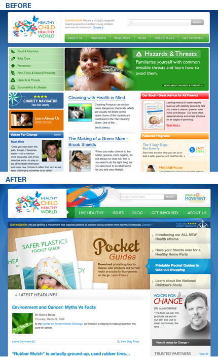
We started by examining what was working. The blog really took off after launch and has become a hub of activity on the site. Our original intent was to allow the blog to be a supplement to larger sections focused on research and issues. In reality that relationship was swapped and the blog was becoming the focal point. We decided to simplify the homepage and blur the distinction between the blog/lifestyle headlines and recent research articles, allowing more accessible content to push users to the deeper, research-oriented sections of the site. It felt like a much more natural flow of content, in that if you care about a specific topic you might care about the research behind it but not vice-versa.
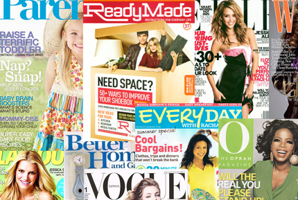
We also re-evaluated HealthyChild's demographic. After researching what content was winning on the site we drew conclusions that a majority of our clients users (and our target demo) were younger, first-time mothers. This helped to support the shift from a strictly research heavy homepage in favor of more issues/story based content. At the same time we rested on the visual concept by asking "What would HealthyChild look like if it was a hip magazine for young mothers?" Not a completely original concept by any stretch but one that helped us and our client quickly imagine the goals of the redesign while setting prescience of departure from where we currently were visually. We pulled together a variety of magazines off the rack as inspiration both for visual perspective as well as headline hierarchy.
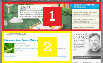
We then jumped right into the comp phase, roughing in the areas of the homepage that would be the foundation of our new concept, namely the blog content. We took our lead from the various magazines we researched and lead off with 4 main callouts (basically our magazine headlines) and created a zone that would be eye catching and allow us to create fresh graphic content that would be large enough to visually change the look of the site (our magazine cover image) on a regular basis (1). The last thing we want is for users to glaze over content that doesn't look like it's changed for a year. Next we carved out a zone for regularly added blog posts and articles that will be the main hub of activity on the site (2). Lastly Kara and I sat down and restructured the main navigation and general site structure to mirror the new focus of the site. We brought the editorial & lifestyle aspects of "Live Healthy" to the front and center and let "Issues" and "Research" fall into a supporting role across the site.
Pushing the Brand
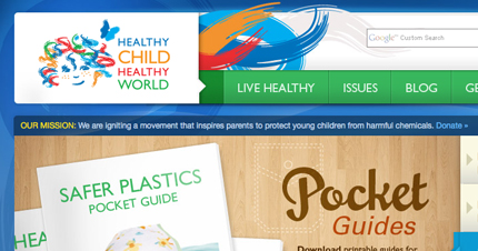
We also had the opportunity to visually push and expand the HealthyChild brand. Since our content was switching gears to a more lifestyle approach it was key that we present the refreshed site in a manner that mimicked it's content. First I dissected the logo and pulled elements that I thought would work on their own. For example the HealthyChild logo is really expressive on it's own, so it was easy to grab the paint swipes out and use them to really punch up the vibe and movement on the page. Other elements were inspired by traditional print design and pieces from the magazines we pulled for inspiration. Next was layering elements and brushing on a soft gloss that would help reinforce our magazine concept, bringing out the lifestyle and energized feel we hoped visitors would take away from their visit to the site.
That's A Wrap
Structurally HealthyChild is very much the same as it was before. All the content that previously lived on the site was left intact and the majority of the overhaul was done on the front-end. This allowed us to move quickly, adopt things that were working in the previous design, work in the framework that we currently had setup for the site in EE, and keep our costs down to give the greatest value to our client. By taking a few steps back we were able to better target the new needs of our client and in turn the needs of their users.
Below is a before (right before the refresh) and after shots.
Visit the site here.